What is CSS3

CSS3 language development is developing towards modularity. The previous specification was too large and complex as a module, so it was broken down into smaller modules and more new modules were added. These modules include: box model, list module, hyperlink method, language module, background and border, text effects, multi-column layout, etc.

When writing CSS3 styles, different browsers may require different prefixes. It means that the CSS property or rule has not yet become part of the W3C standard and is a private property of the browser. Although newer versions of browsers currently do not require prefixes, prefixes are still indispensable for better forward compatibility.
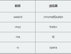
QQ截图20161014111933.png

Continuing Learning
||
<!DOCTYPE HTML> <html> <head> <meta http-equiv="Content-Type" content="text/html; charset=utf-8"> <title>Hello CSS3</title> <link href='http://fonts.googleapis.com/css?family=Fruktur' rel='stylesheet' type='text/css'> <style type="text/css"> body{ background:#000; } h1 { text-align:center; color:#fff; font-size:48px; font-family: 'Fruktur', cursive; text-shadow: 1px 1px 1px #ccc, 0 0 10px #fff, 0 0 20px #fff, 0 0 30px #fff, 0 0 40px #ff00de, 0 0 70px #ff00de, 0 0 80px #ff00de, 0 0 100px #ff00de, 0 0 150px #ff00de; transform-style: preserve-3d; -moz-transform-style: preserve-3d; -webkit-transform-style: preserve-3d; -ms-transform-style: preserve-3d; -o-transform-style: preserve-3d; animation: run ease-in-out 9s infinite; -moz-animation: run ease-in-out 9s infinite ; -webkit-animation: run ease-in-out 9s infinite; -ms-animation: run ease-in-out 9s infinite; -o-animation: run ease-in-out 9s infinite; } @keyframes run { 0% { transform:rotateX(-5deg) rotateY(0); } 50% { transform:rotateX(0) rotateY(180deg); text-shadow: 1px 1px 1px #ccc, 0 0 10px #fff, 0 0 20px #fff, 0 0 30px #fff, 0 0 40px #3EFF3E, 0 0 70px #3EFFff, 0 0 80px #3EFFff, 0 0 100px #3EFFee, 0 0 150px #3EFFee; } 100% { transform:rotateX(5deg) rotateY(360deg); } } @-moz-keyframes run { 0% { -moz-transform:rotateX(-5deg) rotateY(0); } 50% { -moz-transform:rotateX(0) rotateY(180deg); text-shadow: 1px 1px 1px #ccc, 0 0 10px #fff, 0 0 20px #fff, 0 0 30px #fff, 0 0 40px #3EFF3E, 0 0 70px #3EFFff, 0 0 80px #3EFFff, 0 0 100px #3EFFee, 0 0 150px #3EFFee; } 100% { -moz-transform:rotateX(5deg) rotateY(360deg); } } @-webkit-keyframes run { 0% { -webkit-transform:rotateX(-5deg) rotateY(0); } 50% { -webkit-transform:rotateX(0) rotateY(180deg); text-shadow: 1px 1px 1px #ccc, 0 0 10px #fff, 0 0 20px #fff, 0 0 30px #fff, 0 0 40px #3EFF3E, 0 0 70px #3EFFff, 0 0 80px #3EFFff, 0 0 100px #3EFFee, 0 0 150px #3EFFee; } 100% { -webkit-transform:rotateX(5deg) rotateY(360deg); } } @-ms-keyframes run { 0% { -ms-transform:rotateX(-5deg) rotateY(0); } 50% { -ms-transform:rotateX(0) rotateY(180deg); } 100% { -ms-transform:rotateX(5deg) rotateY(360deg); } } </style> </head> <body> <h1>Hello CSS3</h1> </body> </html>
submitReset Code