Designers generally like to choose colors according to their own taste, which is really unprofessional. To decide which colors are most applicable, you should always have your brand needs in mind, and then choose a color combination that specifies its own theme and target mood.
Great example of using color in web design
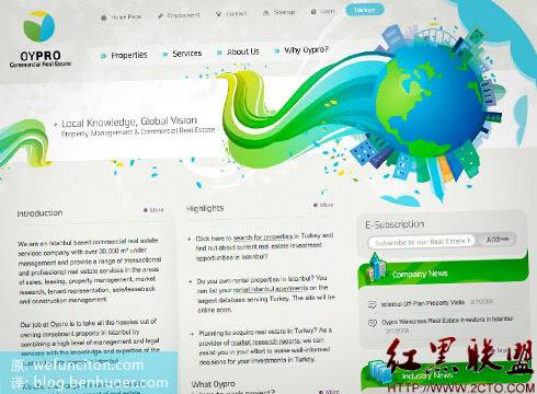
Boring does not mean colorless: Oypro
What I like about Oypro’s website is that they tell us about a “boring” industry Design accordingly doesn’t have to be “boring” either. Usually corporate websites do not allow designers to have too much visual creativity. Keeping it simple, monotonous, and pastel colors became the unwritten rule. However, the example of Oypro proves that you can create a website with enough "corporate feel" without restricting yourself.

Let the colors connect: Tennessee Summertime
Summertime in Tennessee is a vibrant, bright, and very warm site. Everything looks designed to promote summer activities. The site uses a wide range of highly saturated colors in varying hues, but each color hits the mark and none is inappropriate for the theme. The color combination of a high-quality design must be closely related to the service or product it is intended to present. Good design doesn't always require going to great lengths to choose some surprising colors. The colors that are most obvious and should be used can actually create better effects. For example, Hell Design (Hell Design), it is simply unreasonable not to use the fiery red color that symbolizes hell.

The background can also make a big difference: Saturized Studio
Just painting a dull background color will not make your design interesting. A slightly changing back is the best background. In this example we see a nice orange/red color being used with a variety of lighting and gradient effects. This approach of adding variety to the background effectively avoids blandness and dullness. Another thing to note is that the contrast between the dark orange background and the bright content area above creates a very dramatic and beautiful visual impact.

Tips for using color in web design
Color is always an area worth exploring and experimenting with. Experimenting with different combinations brings endless design possibilities. However, when choosing colors and color combinations, you should be aware of the following key points:
Try to break through
A boring theme does not necessarily have to use a boring color combination.
Variable
Try using gradients, repeating patterns, and brushes on your colorful backgrounds. It’s not easy to make a design look good with just color.
Stick to the theme
Make sure your colors are relevant to the product/service you need to present
That’s it for High-Quality Web Design: Examples and Tips No. 6 (Utilizing the Full Potential of Color) Content, please pay attention to the PHP Chinese website (www.php.cn) for more related content!


