Front-end development friends, we meet again. As we all know, in the world of CSS2, transitions are often very thin, either from one color to another, or from opaque to transparent, in short, from one state to another. This results in many pages that feel abrupt and without a smooth transition.
CSS3 has now been added to Webkit and is now supported by Apple Safari and Google Chrome. Fast forward a few months, and people were still debating whether to write these transitions in CSS3, with some insisting that transitions were not a style property and should be handled with scripts. After the efforts of many people, styles are not limited to static styles, dynamic styles are also very needed.
Let’s get to the point!
CSS3 Transitions:
With CSS3, we can add effects to elements as they transition from one style to another without using Flash animations or JavaScript.

Browser support:

Internet Explorer 10, Firefox, Chrome and Opera support the transition attribute.
Safari requires the prefix -webkit-.
Note: Internet Explorer 9 and earlier versions do not support the transition attribute.
Note: Chrome 25 and earlier require the prefix -webkit-.
How does it work?
CSS3 Transition is the effect of an element gradually changing from one style to another.
To achieve this, two things must be specified:
1. Specify which CSS property you want to add the effect to;
2. Specify the duration of the effect.
Example:
Transition effect applied to the width attribute with a duration of 2 seconds:
div
{
transition: width 2s;
-moz-transition: width 2s; /* Firefox 4 */
-webkit-transition: width 2s; /* Safari 和 Chrome */
-o-transition: width 2s; /* Opera */
}Note: If the duration is not specified, there will be no transition effect because the default The value is 0.
The effect starts when the specified CSS property changes value. The typical time when a CSS property changes is when the mouse pointer is over the element:
Example:
Specifies when the mouse pointer is hovering over the
div:hover
{
width:300px;
}Comments : When the pointer moves out of an element, it gradually changes back to its original style.
Multiple changes:
If you need to add transition effects to multiple styles, please add multiple attributes, separated by commas:
Example:
Add transition effects to width, height and transform:
div
{
transition: width 2s, height 2s, transform 2s;
-moz-transition: width 2s, height 2s, -moz-transform 2s;
-webkit-transition: width 2s, height 2s, -webkit-transform 2s;
-o-transition: width 2s, height 2s,-o-transform 2s;
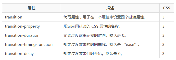
}Transition properties:
The following table lists all transition properties:

The following two examples set all transition properties:
Example:
Use all transition properties in one example:
div
{
transition-property: width;
transition-duration: 1s;
transition-timing-function: linear;
transition-delay: 2s;
/* Firefox 4 */
-moz-transition-property:width;
-moz-transition-duration:1s;
-moz-transition-timing-function:linear;
-moz-transition-delay:2s;
/* Safari 和 Chrome */
-webkit-transition-property:width;
-webkit-transition-duration:1s;
-webkit-transition-timing-function:linear;
-webkit-transition-delay:2s;
/* Opera */
-o-transition-property:width;
-o-transition-duration:1s;
-o-transition-timing-function:linear;
-o-transition-delay:2s;
}Example:
The same transition effect as the above example, but using the abbreviated transition attribute:
div
{
transition: width 1s linear 2s;
/* Firefox 4 */
-moz-transition:width 1s linear 2s;
/* Safari and Chrome */
-webkit-transition:width 1s linear 2s;
/* Opera */
-o-transition:width 1s linear 2s;
} The above is the content of CSS3 tutorial-transition. For more related content, please pay attention to the PHP Chinese website (www.php.cn) !


