CSS3 new width attribute value width:min-content can set the width value of the container to the largest unbreakable line in the container The width (the widest word, picture, or box element with a fixed width)
figure{
    width:min-content;
    margin: auto;
}We know the pseudo-element selector: only-child ,In fact, it can be equivalent to:first-child:last-child, that is, it is the first item and the last item at the same time, so logically it is unique. And :last-child is also a shortcut for :nth-last-child(1).
Then let’s think about a question, what does li:first-chidl:nth-last-child(4) represent? The result is _the first item in a list with exactly four list items_, ok , and then combine the sibling selector ~ to hit each item after it, you can achieve such a goal. When it contains exactly four list items, hit each item
li:first-child:nth-last-child(4),
li:first-child:nth-last-child(4) ~ li {

    background: red;
}Combined with SASS, it will Simplify reuse
/*定义混合器*/
@mixin n-items($n){
    &:first-child:nth-last-child(#{$n}),
    &:first-child:nth-last-child(#{$n}) ~ &{
        @content;
    }
}

/*调用*/
li {
    @include n-items(4){
        /*属性与值写在这里*/
        background: red;
    }
}nth-child() is powerful in that it accepts an expression in the form of an+b, so you can naturally use its variant nth -child(n+4) In this form, it will select all child elements except the 1st, 2nd, and 3rd child elements.
ul li:first-child:nth-last-child(n+4),
ul li:first-child:nth-last-child(n+4) ~ li{
    /*当列表中至少包含四项时,命中包括该项之后的所有列表项*/
}Of course, it’s more than that. How to play :nth-child() depends entirely on your imagination.
Sometimes, if we need to implement a layout with a background width that fills the screen and a fixed content width, maybe we will design the DOM structure like this
<footer>
    <p class="wrapper">
    </p>
</footer>
CSS style:
footer{
    background: #333;
}

.wrapper{
    max-width: 900px;
    margin: 1em auto;
    height: 200px;
}After using the calc() method, we don’t have to be so troublesome. We only need three lines of code to achieve it:
footer{
  background:#333;
  padding:1em calc(50% - 50px);
}Using clac(), we can perform simple calculations in CSS Arithmetic operation makes the DOM structure very concise without any redundancy. Of course, the shortcomings are also obvious. The code here will only see the effect when the parent of the footer element exceeds 900 px.
The percentage in calc() is parsed based on its parent
But, for the first time, we learned about the magic trick of cacl() in CSS3.
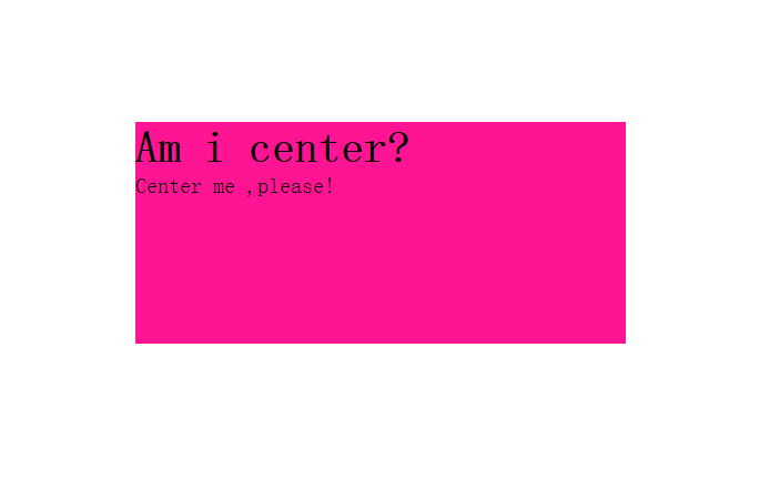
There is a very common phenomenon in CSS, and the real solution often comes from where we least expect it. For example, you can combine the positon:absolute and transform:translate() attributes to achieve vertical centering
Because the percentage in the translate() transformation function is converted based on the width and height of the element itself, so , you can completely eliminate the dependence on fixed sizes.
Example: DOM structure
<body>
    <p class="main">
        <h1>Am i center?</h1>
        <p>Center me ,please!</p>
    </p>
</body>
CSS code:
.main{
    position: absolute;
    left: 50%;
    top: 50%;
    transform: translate(-50%, -50%);
}
However, this method also has shortcomings:
1. In some browsers, this may cause blurry display because elements may be placed on half a pixel.
2. When absolute positioning is not suitable. And absolute positioning has too strong an impact on the entire layout.
There is no doubt that this is the best solution at present. Moreover, modern browser support for FlexBox is already quite high.
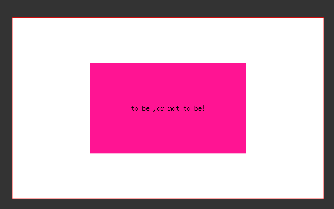
Using margin:auto for items based on FlexBox containers can be centered not only in the horizontal direction, but also in the vertical direction, even if no width is specified, because the width assigned to this element is equal to max-content.

Another benefit of FlexBox is that the text can also be vertically centered. Just add align-items:center and justify-content:center to the elements using display:flex.
.main{
    background: deeppink;
    width: 50%;
    height: 50%;
    margin: auto;
    display: flex;
    align-items: center;
    justify-content: center;
}
Sometimes, we expect the height of the header and footer to be determined by its internal factors, and the content area The height of the block can automatically shrink to fill all available space. Again, this is easy with FlexBox.
body {
    min-height: 100vh;
    display:flex;
    flex-flow: column;

    header{
        /*heaer style*/
    }

    .main{
        flex:1;
    }

    footer{
        /*footer style*/
    }
}We give body a height of min-height:100vh so that it will at least occupy the height of the entire viewport, and then give main a flex value greater than 0.
Question: What if the footer is fixed at the bottom of the screen? How to ensure that the footer does not cover the content area when the page is scrolled to the end?
For this question, it is purely a personal idea. You can add a p#_footer after footer.
The DOM structure at this time is as follows:
<body>
    <header><header>
    <p class="main"></p>
    <footer></footer>
    <p id="_footer"></p>
</body>
As for p#_footer, there is no need to add any content and style to it, as long as its height is equal to the height of the footer. , and for this, you can easily do it using jQuery.
$('#_footer').height($('footer').height())In this way, you don’t have to worry about the responsive layout. Although it is a bit hacky, it is a perfect solution. Bingo!


