When people first come into contact with layout, they tend to use positioning. Because the concept of positioning seems to be easier to grasp. Ostensibly you specify exactly where a block element is and it will sit there. But positioning is a little more complicated than when you first saw it. There are a few things about positioning that can trip up newbies, so you need to master them before it becomes a regular skill for you.
Once you understand more deeply how it works, you'll be able to do some better things.
Types of CSS box model and positioning
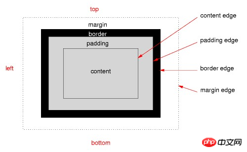
In order to understand positioning, you must first understand the CSS box model. The link in the previous sentence is an article I wrote about the box model in InstantShift. I explained it in detail in that article and will give a quick summary in this article.
In CSS, each element is contained by a rectangular box. Each box will have a content area, which is surrounded by a padding, a border of the box outside the padding, and a margin outside the border to separate it from other boxes. You can see this in the picture below.

Positioning mode specifies where a box should be located in the overall layout and what impact it will have on surrounding boxes. Positioning modes include regular document flow, floating, and several types of position positioned elements.
The CSS position attribute can take on 5 values:
position: absolute
position: relative
position: fixed
position: static
position: inherit
I will elaborate on the first three values below and briefly explain the last two values .
Static is the default attribute value of position. Any element to which position:static is applied is in regular document flow. Where it is located and how it affects surrounding elements is determined by the box model.
A statically positioned element ignores all declared values for the top, right, bottom, left, and z-index attributes. In order for your element to use any of these properties, you need to first apply one of these three values to its position property: absolute, relative, fixed
Elements with a position value of inherit and all others The inherited value of the attribute is the same, the element simply applies the same position value as the parent element.
Absolute Positioning
Absolutely positioned elements are completely separated from the regular document flow. It treats the absolutely positioned element as if it does not exist as far as the surrounding elements are concerned. It's as if the display property was set to none. If you want to keep the position it occupies without being filled by other elements, then you need to use other positioning methods.
You can set the position of absolutely positioned elements through the top, right, bottom, and left properties. But you usually only set two of them, top or bottom, and left or right. By default their values are auto.
The key to understanding absolute positioning is knowing where its starting point is. If top is set to 20px then you need to know where the 20px is calculated from.
The starting position of an absolutely positioned element is relative to its first parent element whose position value is not static. If there is no parent element that meets the condition in its parent element chain, an absolutely positioned element will be positioned relative to the document window. ha!
You may be a little confused about the concept of "relative", especially since there is something called relative positioning, which we haven't talked about yet.
When you set position:absolute on the style of an element, it means that the parent element needs to be considered, and if the position value of the parent element is not static, then the starting point of the absolutely positioned element is the upper left corner of the parent element.
If the parent element does not apply positioning other than static, then it will check whether the parent element of the parent element has non-static positioning applied. If positioning is applied to the element, its upper left corner becomes the absolute starting point of the element. If not, it will continue to traverse the DOM upwards until a positioned element is found or the search fails to reach the outermost browser window.
Relative Positioning
Relatively positioned elements also determine their position based on the four attributes of top, right, bottom, and left. But only relative to their original position. In a sense, setting relative positioning for an element is similar to adding margin to an element, but there is an important difference. The difference is that elements surrounding a relatively positioned element will ignore the movement of the relatively positioned element.
我们可以把它看做是一张图片的重像从真实的图片的位置开始进行了一点移动。它原始图片所占据的位置仍然保留,但我们已经没法再看到它,只能看到它的重像。这样就让元素之间可以进行位置的重叠,因为相对定位元素能够移动到其他元素所占据的空间中。
相对定位元素离开了正常文档流,但仍然影响着围绕着它的元素。那些元素表现地就好像这个相对定位元素仍然在正常文档流当中。
我们无需再追问这个相对的位置是在哪里。因为这个相对位置很显然是正常的文档流。相对定位有点儿像为元素添加了 margin ,对相邻元素来说却像是什么都没发生过。但实际上并没有增加任何的 margin 。
固定定位(Fixed Positioning)
固定定位的行为类似于绝对定位,但也有一些不同的地方。
首先,固定定位总是相对于浏览器窗口来进行定位的,并且通过哪些属性的 top, right, bottom, 和 left 属性来决定其位置。它抛弃了它的父元素,它就是定位中表现地有点儿反叛。
第二个不同点是其在名字上是继承的。固定定位的元素是固定的。它们并不随着页面的滚动而移动。你可以告诉元素它所处的位置并永远不再移动。噢~好像还挺乖巧的。
在某种意义上说固定定位元素有点儿类似固定的背景图片,只不过它的外层容器块总是浏览器窗口罢了。如果你在 body 中设置一个背景图片那么它与一个固定定位的元素的行为时非常像的,只不过在位置上的精度会略少一些。
背景图片也不能改变其在第三个维度的大小,也因而带来了 z-index 属性。
打破了平面的 Z-Index
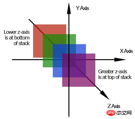
这个页面是一个二维平面。它具有宽度和高度。我们活在一个用 z-index 作为其深度的三维的世界当中。这个额外的维度能够穿越一个平面。

由上图可知,高的 z-index 位于低的 z-index 的上面并朝页面的上方运动。相反地,一个低的 z-index 在高的 z-index 的下面并朝页面下方运动。
没有的 z-index 的话,定位元素会有点儿麻烦。因为 z-index 能让一个定位元素位于另一个元素的上方或者下方,这或许能让你做出点创造性的东西。所有的元素的默认的 z-index 值都为0,并且我们可以对 z-index 使用负值。
z-index 实际上比我在这里描述的要更加地复杂,但细节写在了另一篇文章里。现在只需要记住这个额外维度的基本概念以及它的堆叠顺序,另外还要记住只有定位元素才能应用 z-index属性。
定位的问题
对于定位元素来说由几个比较常见的问题,都值得我们好好了解。
1.你不能在同一个属性当中应用定位属性和浮动。因为对使用什么样的定位方案来说两者的指令时相冲突的。如果你把两个属性都添加到一个相同的元素上,那么就期望在CSS中较后的那个属性时你想要使用的吧。
2.Margin 不会在绝对元素上折叠。假设你具有一个 margin-bottom 为20px的段落。在段落后面是一个具有30px的 margin-top 的图片。那么段落和图片之间的空间不会是50px(20px+30px)而是30px(30px > 20px)。这就是所谓的 margin-collapse,两个 margin 会合并(折叠)成一个 margin。
绝对定位元素不会像那样进行 margin 的折叠。这会使它们跟预期的不一样。
3.IE在 Z-index 上有一些BUG。在IE 6中 select 元素总是处于堆叠层级的最上方而不管它的 z-index 和其他元素的 z-index 是多少。
IE 6和IE 7在堆叠层级上又有另外一个问题。IE 6由最外层的定位元素的层级来决定哪一组的元素处于层级的最上面,而不是每一个单独的元素自身的层级决定。
<p style="z-index: ">
   <p style="z-index: 1"></p>
</p>
<img style="z-index: " />
对上面这段结构,你会预料段落元素处于堆叠层级的最上方。因为它具有最大的 z-index 值。但在IE 6和IE 7中,图片为处于段落的上方。因为 img 具有比 p 更加高的 z-index 层级。因此它会位于所有 p 的子元素的上方。
总结
The position attribute set on an element will operate according to one of the CSS positioning modes. You can set one of absolute, relative, fixed, static (default), and inherit for positioned elements.
Positioning mode and CSS positioning elements define where a box should be in the layout and the elements surrounding it will be affected by the positioning element.
The z-index attribute can only be applied to positioned elements. It adds a third dimension to the page and sets the hierarchical order of elements.
The positioning property may seem easy to understand, but its operation is a little different from what it seems on the surface. What you may think is that relative positioning is more similar to absolute positioning. When designing layouts you often want to use floats and apply positioning to specific elements to break up the layout.
For more articles related to analyzing CSS Position, please pay attention to the PHP Chinese website!


