

Pure CSS3 drawing lighter animation flame effect sample code

The example in this article shares the specific code for drawing the flame effect of lighter animation with pure CSS3 for your reference. The specific content is as follows
It mainly involves the following attributes:
<span style="font-family:Comic Sans MS;">animation(webkit-animation),
@keyframes name (@-webkit-keyframes name),
transform,
transform-origin,
transition,
box-shadow(spread属性),
text-shadow
z-index
linear-gradient。
radial-gradient
background-image
</span>
First the html code is as follows:
 <span style="font-family:Comic Sans MS;"><!DOCTYPE html>
<html>
 <head>
  <meta charset="UTF-8">
  <title>纯CSS绘制打火机动画火焰特效</title>
  <link rel="stylesheet" href="css/style.css">
 </head>
 <body class="keBody">
  <h1 class="keTitle">纯CSS3绘制打火机动画火焰特效</h1>
  <p class="kePublic">
   <p class="playground">
    <p class="flame"></p>
    <p class="lighterBody">
     <p class="hover">hover me</p>
    </p>
    <p class="lid"></p>
   </p>
   <p class="clear"></p>
  </p>
 </body>
</html></span>style.css file is as follows:
<span style="font-family:Comic Sans MS;">@charset "utf-8";
body{
margin:0;
padding:0;
color:#333;
text-align:center;
font:12px "微软雅黑";
}
:before,:after{
position:absolute;
content:"";
}
.keBody{
background:url(../images/bodyBg.jpg) repeat #333;
}
.keTitle{
height:100px;
line-height:100px;
font-size:30px;
font-family:'微软雅黑';
color:#fff;
text-align:center;
background:url(../images/bodyBg3.jpg) repeat-x bottombottom left;
font-weight:normal;
margin-bottom:0;
}
.kePublic{
background:#cccccc;
padding:50px;
}
.playground{
position:relative;
width:140px;
height:400px;
left:50%;
margin-left:-70px;
}
.flame{
opacity: 0;
position: absolute;
bottombottom: 60%;
left: 42%;
width: 14px;
height: 70px;
background-color: white;
border-radius: 100% 100% 0 0;
box-shadow: 0 0 20px #FFFEF0, 0 0 20px #FFFEE6, 0 0 20px #fefcc9, 10px -10px 30px #feec85, -20px -20px 40px #ffae34, 20px -40px 50px #ec760c, -20px -60px 60px #cd4606, 0 -80px 70px #973716, 10px -90px 80px #451b0e;
}
.playground:hover .flame {
opacity:1;
transition:opacity 3s linear;
-webkit-animation:flame 1s infinite linear;
}
.playground:hover .lid{
-webkit-animation:lidoff 1s linear;
/*把物体动画地从一个地方移动到另一个地方,并让它停留在那里:*/
-webkit-animation-fill-mode:forwards;
}
.lighterBody{
position:absolute;
width:140px;
height:130px;
top:200px;
left:0;
background-image:linear-gradient(to rightright,#959595 0%,#0d0d0d 46%,#010101 50%,#0a0a0a 53%,
#4e4e4e 76%,#383838 87%,#1b1b1b 100%);
border-radius:2% 2% 8% 8%;
box-shadow:inset 0 0 5px 5px #333;
}
.lighterBody:before{
width:47px;
height:47px;
top:-50px;
left: 42px;
content:"...";
color:#e6e6e6;
border-radius:6% 6% 0 0;
background-image:linear-gradient(to rightright,#f5f5f5 0%,#dbdce2 21%,#b8bac6 49%,#dddfe3 80%,#f5f6f6 100%);
font-size:30px;
font-weight:bold;
letter-spacing:7px;
line-height:16px;
text-shadow:0 0 5px black;
padding-top:3px;
padding-left:4px;
}
.lighterBody:after{
width:33px;
height:33px;
background-image:radial-gradient(ellipse at center,#7d737d 0%,#0e0e0e 100%);
border-radius:100%;
top:-33px;
left:10px;
box-shadow:inset 0 0 1px 2px gray;
}
.lid{
z-index:2;
position:absolute;
width:140px;
height:75px;
top:125px;
left:0;
background:linear-gradient(to rightright,#959595 0%,#0d0d0d 46%, #010101 50%, #0a0a0a 53%, #4e4e4e 76%, #383838 87%, #1b1b1b 100%);
border-radius:8% 8% 2% 2%;
box-shadow:inset 0 0 5px 5px #333;
/*border-bottom:3px solid #f2f2f2;*/
}
.lid:before{
width:10px;
height:10px;
top:70px;
left:133px;
background-image:radial-gradient(ellipse at center, #959595 0%, #0d0d0d 46%, #010101 50%, #0a0a0a 53%, #4e4e4e 76%, #383838 87%, #1b1b1b 100%);
border-radius:100%;
}
.hover{
z-index:1;
text-align:center;
margin-top:30%;
color:rgba(255,255,255,0.9);
text-shadow:0 1px 1px rgba(0,0,0,0.8);
font: 20px "微软雅黑";
}
.hover:before{
content:"";
z-index:1;
width:0;
height:0;
top:-50px;
left:20px;
border-bottom:35px solid #f2f2f2;
/*border-left:10px solid transparent;*/
}
@-webkit-keyframes flame{
0%{
height:70px;
transform:skewY(0deg);
border-radius:100% 100% 0 0;
}
25%{
height:60px;
transform:skewY(40deg);
border-radius:10% 100% 0 0;
}
60%{
height:65px;
transform:skewY(-20deg);
border-radius:90% 10% 0 0;
}
70%{
height:50px;
transform:skewY(10deg);
border-radius:10% 100% 0 0;
}
100%{
height:70px;
tranform:skewY(0deg);
}
}
@-webkit-keyframes lidoff{
from{
transform:rotate(0deg);
transform-origin:100% 100%;
}
to{
transform:rotate(130deg);
transform-origin:100% 100%;
}
}</span>Initial photo:
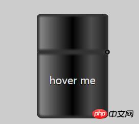
Dynamic photos
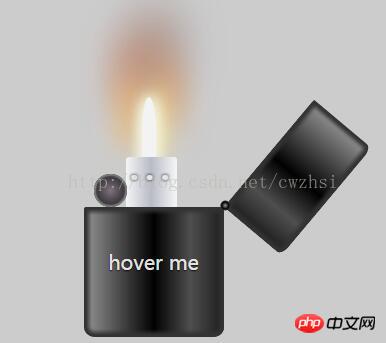
There are two main animation effects. One is when the mouse is hovering The situation when the lighter lid is opened when "hover me" is implemented by the following animation code:
 <span style="font-family:Comic Sans MS;font-size:12px;">@-webkit-keyframes lidoff{     注意这里要加上-webkit-
     from{
          transform:rotate(0deg);
          transform-origin:100% 100%;
     }
     to{
          transform:rotate(130deg);
          transform-origin:100% 100%;
     }
}
</span> The second animation is the realization of the candle lighting effect: the candle is controlled by the transition variable :opacity 3s linear; Realized,
The effect of the candle light swinging in the wind is achieved by the following code:
<span style="font-family:Comic Sans MS;font-size:12px;">@-webkit-keyframes lidoff{
    from{
         transform:rotate(0deg);
         transform-origin:100% 100%;
    }
    to{
         transform:rotate(130deg);
         transform-origin:100% 100%;
    }
</span> The effect of separating the lighter cover from the torso It is implemented by: box-shadow:inset 0 0 5px 5px #333; Mainly the inset here (be careful not to write it as insert).
The round ball and small white square that appear when the lighter is turned on are the effects achieved by :after :before combined with z-index.
The following will introduce some attributes that I learned through this example and need to pay attention to.
transform-origin: The default initial position is the center of the image, 100% 100% is equivalent to right bottom. 0% 0% is equivalent to left top.
before and :after : The injected content is a child element of the associated target element, but it will be placed "before" any content of this element or "after". The inserted content is invisible in the source code of the page and can only be seen in the css. Elements inserted at the same time are inline elements by default. Therefore, in order to give an inserted element height, padding, margins, etc., a block-level element (display:block) must usually be explicitly defined.
In addition, although no content may be inserted, content must be written. If no content is inserted, then content is written as content:"";
IE6 and IE7 is not compatible with these two elements. They are
pseudo elements (double colon), and the pseudo class in css3 is (single colon)
animation -fill-mode: none|forwards|backwards|both|initial|inherit;
Specifies that when the animation does not play (when the animation completes, or when the animation has a delay and does not start playing), it should be applied to The style of the element.
background-image: Solve the problem that p can only set one background, so that one p can set multiple background images.
box-shadow: An often forgotten parameter--spread (expanded shadow radius), this once-forgotten spread changes the size of the shadow---its value can be positive or negative, if the value is positive , the entire shadow will expand and expand, otherwise it will shrink if it is a negative value. With this parameter, you can use box-shadow to create a single-sided shadow effect like shadow work in photoshop. One thing to note here is that this extended shadow value needs to be used in conjunction with the shadow blur radius. The general situation is that "the extended shadow radius is generally set to be equal to the blur radius, and its negative values are removed."
The above is the entire content of this article. I hope it will be helpful to everyone's learning, and I also hope that everyone will support the PHP Chinese website.
For more pure CSS3 drawing lighter animation flame effect sample code related articles, please pay attention to the PHP Chinese website!

Hot AI Tools

Undresser.AI Undress
AI-powered app for creating realistic nude photos

AI Clothes Remover
Online AI tool for removing clothes from photos.

Undress AI Tool
Undress images for free

Clothoff.io
AI clothes remover

Video Face Swap
Swap faces in any video effortlessly with our completely free AI face swap tool!

Hot Article
Hot Tools

Notepad++7.3.1
Easy-to-use and free code editor

SublimeText3 Chinese version
Chinese version, very easy to use

Zend Studio 13.0.1
Powerful PHP integrated development environment

Dreamweaver CS6
Visual web development tools

SublimeText3 Mac version
God-level code editing software (SublimeText3)
Hot Topics
 1653
1653
 14
1413
52
1305
25
1251
29
1224
24
14
1413
52
1305
25
1251
29
1224
24

 Stacked Cards with Sticky Positioning and a Dash of Sass
Apr 03, 2025 am 10:30 AM
Stacked Cards with Sticky Positioning and a Dash of Sass
Apr 03, 2025 am 10:30 AM
The other day, I spotted this particularly lovely bit from Corey Ginnivan’s website where a collection of cards stack on top of one another as you scroll.
 Google Fonts Variable Fonts
Apr 09, 2025 am 10:42 AM
Google Fonts Variable Fonts
Apr 09, 2025 am 10:42 AM
I see Google Fonts rolled out a new design (Tweet). Compared to the last big redesign, this feels much more iterative. I can barely tell the difference
 How to Create an Animated Countdown Timer With HTML, CSS and JavaScript
Apr 11, 2025 am 11:29 AM
How to Create an Animated Countdown Timer With HTML, CSS and JavaScript
Apr 11, 2025 am 11:29 AM
Have you ever needed a countdown timer on a project? For something like that, it might be natural to reach for a plugin, but it’s actually a lot more
 HTML Data Attributes Guide
Apr 11, 2025 am 11:50 AM
HTML Data Attributes Guide
Apr 11, 2025 am 11:50 AM
Everything you ever wanted to know about data attributes in HTML, CSS, and JavaScript.
 How to select a child element with the first class name item through CSS?
Apr 05, 2025 pm 11:24 PM
How to select a child element with the first class name item through CSS?
Apr 05, 2025 pm 11:24 PM
When the number of elements is not fixed, how to select the first child element of the specified class name through CSS. When processing HTML structure, you often encounter different elements...
 Why are the purple slashed areas in the Flex layout mistakenly considered 'overflow space'?
Apr 05, 2025 pm 05:51 PM
Why are the purple slashed areas in the Flex layout mistakenly considered 'overflow space'?
Apr 05, 2025 pm 05:51 PM
Questions about purple slash areas in Flex layouts When using Flex layouts, you may encounter some confusing phenomena, such as in the developer tools (d...
 A Proof of Concept for Making Sass Faster
Apr 16, 2025 am 10:38 AM
A Proof of Concept for Making Sass Faster
Apr 16, 2025 am 10:38 AM
At the start of a new project, Sass compilation happens in the blink of an eye. This feels great, especially when it’s paired with Browsersync, which reloads
 In front-end development, how to use CSS and JavaScript to achieve searchlight effects similar to Windows 10 settings interface?
Apr 05, 2025 pm 10:21 PM
In front-end development, how to use CSS and JavaScript to achieve searchlight effects similar to Windows 10 settings interface?
Apr 05, 2025 pm 10:21 PM
How to implement Windows-like in front-end development...
