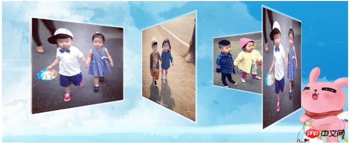
Share this dazzling three-dimensional photo album, I hope everyone likes it!
<!DOCTYPE html PUBLIC "-//W3C//DTD XHTML 1.0 Transitional//EN" "http://www.w3.org/TR/xhtml1/DTD/xhtml1-transitional.dtd">
<html xmlns="http://www.w3.org/1999/xhtml">
<head>
<meta http-equiv="Content-Type" content="text/html; charset=utf-8" />
<title>三维动画</title>
<style type="text/css">
* {
padding : 0px;
margin: 0px;
}
body {
background: url(images/758.jpg) no-repeat top center;
}
.product {
height: 400px;
position: fixed;
top: 20%;
right: 20%;
/*视距*/
perspective : 500px;
}
.scene {
height: 250px;
width: 250px;
transform-style: preserve-3d;
transform-origin: 50%;
margin: 100px;
/*定义一个名为slide的动画*/
animation: slide 12s linear infinite;
}
.scene ul li {
width: 230px;
height: 230px;
list-style: none;
border: 5px solid rgba(255, 255, 255, 0.5);
position: absolute;
}
@keyframes slide{
from{
transform: rotateY(0deg);
}
to{
transform: rotateY(360deg);
}
}
.s1 {
float: left;
}
.s1 ul li:nth-child(1) {
transform: rotateY(0deg) translateZ(118px);
}
.s1 ul li:nth-child(2) {
transform: rotateY(90deg) translateZ(118px);
}
.s1 ul li:nth-child(3) {
transform: rotateY(180deg) translateZ(118px);
}
.s1 ul li:nth-child(4) {
transform: rotateY(-90deg) translateZ(118px);
}
.s2 {
float: right;
}
.s2 ul li:nth-child(1) {
transform: rotateY(0deg) translateZ(200px);
}
.s2 ul li:nth-child(2) {
transform: rotateY(90deg) translateZ(200px);
}
.s2 ul li:nth-child(3) {
transform: rotateY(180deg) translateZ(200px);
}
.s2 ul li:nth-child(4) {
transform: rotateY(-90deg) translateZ(200px);
}
</style>
</head>
<body>
<p class='product'>
<!-- scene类是为了修饰两个p的相同点 -->
<!-- s1和s2是为了显示两个p的不同,一个左浮动,一个右浮动 -->
<p class='scene s1'>
<ul>
<li><img src="images/1.jpg"/ alt="Example of creating a cool three-dimensional photo album with CSS3" ></li>
<li><img src="images/2.jpg"/ alt="Example of creating a cool three-dimensional photo album with CSS3" ></li>
<li><img src="images/3.jpg"/ alt="Example of creating a cool three-dimensional photo album with CSS3" ></li>
<li><img src="images/4.jpg"/ alt="Example of creating a cool three-dimensional photo album with CSS3" ></li>
</ul>
</p>
<p class='scene s2'>
<ul>
<li><img src="images/1.jpg"/ alt="Example of creating a cool three-dimensional photo album with CSS3" ></li>
<li><img src="images/2.jpg"/ alt="Example of creating a cool three-dimensional photo album with CSS3" ></li>
<li><img src="images/3.jpg"/ alt="Example of creating a cool three-dimensional photo album with CSS3" ></li>
<li><img src="images/4.jpg"/ alt="Example of creating a cool three-dimensional photo album with CSS3" ></li>
</ul>
</p>
</p>
</body>
</html>The following is a screenshot:

The above is the detailed content of Example of creating a cool three-dimensional photo album with CSS3. For more information, please follow other related articles on the PHP Chinese website!
 The difference between i5 and i7
 wifi shows no ip assigned
 cdr file opening method
 The difference between win10 home version and professional version
 Where to watch Douyin live replays
 How to import old phone into new phone from Huawei mobile phone
 How to solve the problem that the phpstudy port is occupied
 Commonly used mysql management tools


