
This article mainly introduces the practical tutorial for sharing CSS3 stripe background production. It will be explained separately based on the Forefox browser and the webkit kernel browser. Friends in need can refer to it
mozilla kernel browser makes background background gradient
1. Make a simple horizontal stripe gradient background
-mozilla kernel browser Device css style:
body {
 background-color: #aaa;
 background-image:-moz-linear-gradient(#000 25%,#fc0 80%);
 background-size: 50px 50px;
}Represented by Firefox, the display effect is as follows: 
Change the value of background-size to control the background The height of the stripes. In the above example, the value of -moz-linear-gradient is divided into two groups, the start value and the end value. At the same time, the start position of the start value and the end position of the end value are set. The parts with different positions form a gradient. The part before the start position is filled with the starting color value, and the part after the end value is filled with the ending color value.
2. Change the direction of the stripes
body {
 background-image:-moz-linear-gradient(0deg,#000 25%,#fc0 80%);
}Add a set of parameters 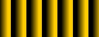

##3. We try to add a few more color gradients
body {
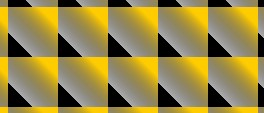
 background-image:-moz-linear-gradient(45deg,#000 25%,transparent 25%,#fc0 80%);
}
body {
 background-image:-moz-linear-gradient(0deg,#000 25%,transparent 25%,transparent 50%,#fc0 50%,#f00 75%,transparent 75%);
}
4. The prototype of the twill background
Now if you change the original 0deg to 45deg, what will it look like?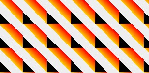
body {
    background-image:-moz-linear-gradient(45deg,#000 25%,transparent 25%,transparent 50%,#000 50%,#000 75%,transparent 75%);
    background-size:16px 16px;
}
5. Final effect
Although the twill background above has come out, it has not yet achieved the final effect we want. Let's modify the color value inside again and change it to white. The current color value is #fff, we change it to rgba in the form of rgba(255,255,255,1), the first three numbers are rgb, and the fourth number is alpha. Now we change this alpha to semi-transparent, code As follows:body {
background-color: #eee;
background-image: -moz-linear-gradient(45deg, rgba(255, 255, 255, 0.2) 25%, transparent 25%, transparent 50%, rgba(255, 255, 255, 0.2) 50%, rgba(255, 255, 255, 0.2) 75%, transparent 75%, transparent);
background-size: 16px 16px;
}webkit core
1. Make a simple vertical stripe background
body {
    background-color: #eee;
    background-image:-webkit-gradient(linear,0 0,100% 0,from(#fff),to(#000));
    background-size: 80px 80px;
}body {
background-image:-webkit-gradient(linear,0 100%,100% 0,from(#fff),to(#000));
}
body {
    background-image:-webkit-gradient(linear,0 0,100% 0,from(#fff),to(#000),color-stop(25%,#fc0),color-stop(50%,#0fc),color-stop(75%,#f0c))
}
The code is as follows:
background-image:-webkit-gradient(linear,0 0,100% 0,color-stop(25%,#0fc),color-stop(25%,transparent),color-stop(50%,transparent),color-stop(50%,#fc0),color-stop(75%,#f0c),color-stop(75%,transparent));
5. Follow step 2 to adjust the direction
The code is as follows:
background-image:-webkit-gradient(linear,0 100%,100% 0,color-stop(25%,#0fc),color-stop(25%,transparent),color-stop(50%,transparent),color-stop(50%,#fc0),color-stop(75%,#f0c),color-stop(75%,transparent));
6、调整颜色,调整background-size大小
body {
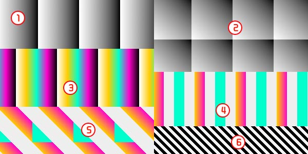
    background-image:-webkit-gradient(linear,0 100%,100% 0,color-stop(25%,#000),color-stop(25%,transparent),color-stop(50%,transparent),color-stop(50%,#000),color-stop(75%,#000),color-stop(75%,transparent));
    background-size: 16px 16px;
}
7、调整颜色值的透明度,最终效果如下:
虽然上面的斜纹背景已经出来了,但还没有达到我们想要的最终效果。我们再把里面的颜色值修改一下,换成白色。现在的颜色值为#fff,我们再把它换成rgba形式为rgba(255,255,255,1),前面的三个数字为rgb,第四个数字为alpha,现在我们把这个alpha改成半透明的,最终代码如下:
body {
    background-color: #eee;
    background-image: -moz-linear-gradient(45deg,#fff 25%, transparent 25%, transparent 50%,#fff 50%,#fff 75%, transparent 75%, transparent);
    background-image:-webkit-gradient(linear,0 100%,100% 0,color-stop(25%,rgba(255,255,255,0.2)),color-stop(25%,transparent),color-stop(50%,transparent),color-stop(50%,rgba(255,255,255,0.2)),color-stop(75%,rgba(255,255,255,0.2)),color-stop(75%,transparent));
    background-size: 16px 16px;
}上面的代码加上了上面讲的mozilla内核浏览器下的写法,在火狐、谷歌浏览器中测试显示正常。
The above is the detailed content of Share practical tutorials on making CSS3 striped backgrounds. For more information, please follow other related articles on the PHP Chinese website!
 How to round in Matlab
 What are the application scenarios of PHP singleton mode?
 Computer blue screen code 0xc0000225
 What are the main differences between linux and windows
 What are the data backup software?
 How to remove watermark on TikTok
 Usage of source command in linux
 How to solve the problem that the print processor does not exist
 Router default password


