This article mainly introduces the use of CSS3 to achieve ever-changing text shadowstext-shadowRelated information on effect design, interested friends can refer to it
The examples in this article are for everyone Shared the ever-changing text-shadowtext-shadow effect examples of CSS3 for your reference. The specific content is as follows
Syntax:
none |
or
none|
Simple explanation of the value:
represents the color;
represents the length value composed of floating point numbers and unit identifiers, which can be negative Value, specifies the horizontal extension distance of the shadow;
represents the length value composed of a floating point number and a unit identifier, which cannot be a negative value, and specifies the distance of the blur effect. If you only need a blur effect, set the first two lengths to 0.
Example:
<style type="text/css">
p{
    text-align:center;
    margin:0;
    font-family:helvetica,arial,sans-serif;
    color:#999;
    font-size:80px;
    font-weight:bold;
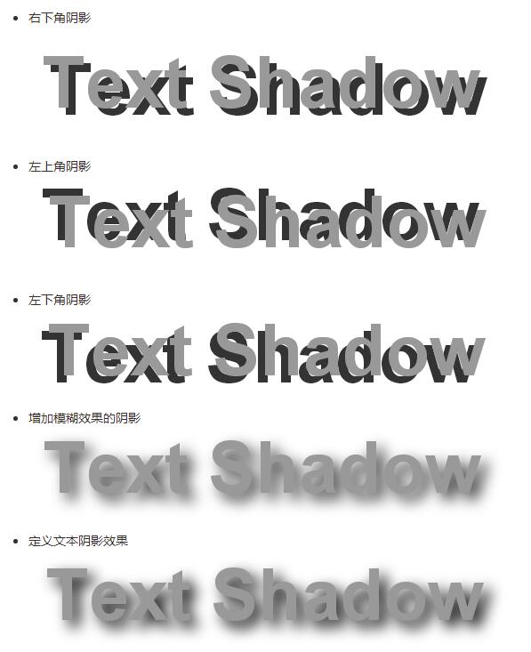
    text-shadow:0.1em 0.1em #333;//右下角阴影
    text-shadow:-0.1em -0.1em #333;//左上角阴影
    text-shadow:-0.1em 0.1em #333;//左下角阴影
    text-shadow:0.1em 0.1em 0.3em #333;//增加模糊效果的阴影
    text-shadow:0.1em 0.1em 0.3em black;//定义文本阴影效果
}
</style>
Example: Increase the contrast between foreground and background colors through shadows
p{
    text-align:center;
    margin:150px auto;
    font-family:helvetica,arial,sans-serif;
    font-size:80px;
    font-weight:bold;
    color:#fff;//设置文字颜色
    text-shadow:0.1em 0.1em 0.3em black;//通过阴影增加前景色和背景色的对比

}
The shadow offset is specified by two
After the shadow offset, you can specify a blur radius. The blur radius is a length value that specifies the range of the blur effect.
You can also specify a color value before or after the length value of the shadow effect. The color value will be used as the basis for the shadow effect. If no color is specified, the color attribute value will be used instead.
Example:Simulate complex text effectsp{
text-align:center;
margin:0;
padding:24px;
font-family:helvetica,arial,sans-serif;
font-size:80px;
font-weight:bold;
color:#000;//设置文字颜色
background:#000;//设置背景颜色
text-shadow:0 0 4px white,
0 -5px 4px #ff3,
2px -10px 6px #fd3,
-2px -15px 11px #f80,
2px -25px 18px #f20;//使用阴影叠加出燃烧的文字特效
}
 Note: Each shadow effect The shadow offset value must be specified, while the blur radius and shadow color are optional parameters separated by a comma between each shadow.
p{
    text-align:center;
    margin:0;
    padding:24px;
    font-family:helvetica,arial,sans-serif;
    font-size:80px;
    font-weight:bold;
    color:#D1D1D1;
    background:#CCC;
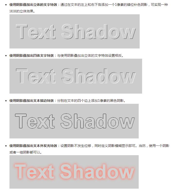
    text-shadow:-1px -1px white,
                -1px -1px #333;//使用阴影叠加出立体的文字特效

                1px 1px white,
                -1px -1px #444;//使用阴影叠加出凹体文字特效

                -1px 0 black,
                0 1px black,
                1px 0 black,
                0 -1px black;//使用阴影叠加出文本描边特效

                    0 0 0.2em #F87,
                    0 0 0.2em #F87;//使用阴影叠加出文本外发光特
}
The above is the detailed content of Use CSS3 to achieve ever-changing text shadow text-shadow effect design. For more information, please follow other related articles on the PHP Chinese website!
 How to configure web server
 Solution to the problem that setting the Chinese interface of vscode does not take effect
 hiberfil file deletion method
 Mysql database migration method
 Promoting ads
 499 error code ending solution
 How to solve tomcat startup crash
 The difference between PD fast charging and general fast charging


