Example of using css3 to create a ring progress bar
This article shares an example of using css3 to create a ring progress bar
Recently, a PC-side project has to create a page like this. Everything else is very simple. The key is the percentage ring effect. My initial plan was to use canvas to implement it directly, because it is very simple to implement a circle on canvas.

The code for the canvas implementation of the circle is posted below. If you need it, you can try it, because today I mainly talk about the CSS3 method, and I won’t explain more about the canvas
<!DOCTYPE html>
<html>
<head>
<meta charset="UTF-8">
<title></title>
</head>
<body>
<canvas id="canvas" width="200" height="200"></canvas>
<script>
var canvas = document.getElementById('canvas');
var process = 0;
var context = canvas.getContext('2d');
// 画外圆
context.beginPath();
context.arc(100, 100, 80, 0, Math.PI*2);
context.closePath();
context.fillStyle = '#666';
context.fill();
drawCricle(context, process);
function drawCricle(ctx, percent){
// 进度环
ctx.beginPath();
ctx.moveTo(100, 100);
ctx.arc(100, 100, 80, Math.PI * 1.5, Math.PI * (1.5 + 2 * percent / 100 ));
ctx.closePath();
ctx.fillStyle = 'red';
ctx.fill();
// 内圆
ctx.beginPath();
ctx.arc(100, 100, 75, 0, Math.PI * 2);
ctx.closePath();
ctx.fillStyle = 'white';
ctx.fill();
// 填充文字
ctx.font= "bold 30px microsoft yahei";
ctx.fillStyle = "black";
ctx.textAlign = "center";
ctx.textBaseline = 'middle';
ctx.moveTo(100, 100);
ctx.fillText(process + '%', 100, 100);
}
</script>
</body>
</html>The reason why I didn’t use canvas to implement it was because the product told me that there would be a lot of tasks in the future. I asked if there would be more than 99 tasks? He said it was possible, and you could set the upper limit at 999.
If 999 canvas rings are used to render. . . Hundreds of them are enough, so I have no choice but to use css3, at least it will be much faster. But it seems that there is no way to directly draw a progress ring in CSS.
I will post the complete code later, but here is the general structure.
To achieve the style of progress bar using css, the only way we can think of seems to be to use circles of different sizes to overlap. If you want the loading effect of the animation constantly rotating, that would be too much. If it were simple, I would be very happy, but it's a pity. .
First we need to create a background circle, like this
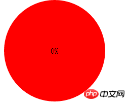
Then we need to create an inner circle to mask
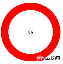
It looks a bit like it, then our next focus is how to make it change with the percentage such as dynamic display. js is necessary, let me talk about the style first
Next step we need to create two semicircles, like this
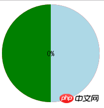
css to achieve semicircle There are many methods, you can use Baidu by yourself. I use clip:rect(); this method to cut into a semicircle. After doing this, we only need to use js to control the rotation angle of the left and right semicircles rotate(). .
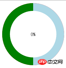
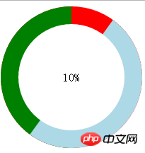
Remember to unify the colors of the left and right semicircles at the end, I will post it below Source code, you can introduce a jq and use it directly
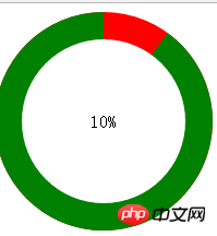
<!DOCTYPE html>
<html>
<head>
<meta charset="UTF-8">
<title></title>
<style>
.circle {
width: 200px;
height: 200px;
position: relative;
border-radius: 50%;
background: red;
}
.clip_left,.clip_right{
width:200px;
height:200px;
position: absolute;
top: 0px;left: 0px;
}
.circle_left, .circle_right{
width:200px;
height:200px;
position: absolute;
border-radius: 50%;
top: 0px;left: 0px;
background: green;
}
/*出于展示用的改变背景色*/
/*.circle_left{
background: green;
}
.circle_right{
background: lightblue;
}*/
.circle_right,.clip_right {
clip:rect(0,auto,auto,100px);
}
.circle_left , .clip_left{
clip:rect(0,100px,auto,0);
}
/*
*当top和left取值为auto时,相当于0
*当bottom和right取值为auto时,相当于100%
*/
.mask {
width: 150px;
height: 150px;
border-radius: 50%;
left: 25px;
top: 25px;
background: #FFF;
position: absolute;
text-align: center;
line-height: 150px;
font-size: 16px;
}
</style>
</head>
<body>
<!--背景圆-->
<p class="circle">
<!--左半边圆-->
<p class="circle_left">
<p class="clip_left">
</p>
</p>
<!--右半边圆-->
<p class="circle_right">
<p class="clip_right"></p>
</p>
<p class="mask">
<span>10</span>%
</p>
</p>
<script src="../jquery-2.2.3.min.js"></script>
<script>
$(function(){
if( $('.mask span').text() <= 50 ){
$('.circle_right').css('transform','rotate('+($('.mask span').text()*3.6)+'deg)');
}else{
$('.circle_right').css({
'transform':'rotate(0deg)',
"background":"red"
});
$('.circle_left').css('transform','rotate('+(($('.mask span').text()-50)*3.6)+'deg)');
}
})
</script>
</body>
</html>The above is the detailed content of Example of using css3 to create a ring progress bar. For more information, please follow other related articles on the PHP Chinese website!

Hot AI Tools

Undresser.AI Undress
AI-powered app for creating realistic nude photos

AI Clothes Remover
Online AI tool for removing clothes from photos.

Undress AI Tool
Undress images for free

Clothoff.io
AI clothes remover

Video Face Swap
Swap faces in any video effortlessly with our completely free AI face swap tool!

Hot Article

Hot Tools

Notepad++7.3.1
Easy-to-use and free code editor

SublimeText3 Chinese version
Chinese version, very easy to use

Zend Studio 13.0.1
Powerful PHP integrated development environment

Dreamweaver CS6
Visual web development tools

SublimeText3 Mac version
God-level code editing software (SublimeText3)

Hot Topics
 1677
1677
 14
14
 1430
1430
 52
52
 1333
1333
 25
25
 1278
1278
 29
29
 1257
1257
 24
24
 A Comparison of Static Form Providers
Apr 16, 2025 am 11:20 AM
Let’s attempt to coin a term here: "Static Form Provider." You bring your HTML
 Weekly Platform News: HTML Loading Attribute, the Main ARIA Specifications, and Moving from iFrame to Shadow DOM
Apr 17, 2025 am 10:55 AM
In this week's roundup of platform news, Chrome introduces a new attribute for loading, accessibility specifications for web developers, and the BBC moves
 A Proof of Concept for Making Sass Faster
Apr 16, 2025 am 10:38 AM
At the start of a new project, Sass compilation happens in the blink of an eye. This feels great, especially when it’s paired with Browsersync, which reloads
 Some Hands-On with the HTML Dialog Element
Apr 16, 2025 am 11:33 AM
This is me looking at the HTML element for the first time. I've been aware of it for a while, but haven't taken it for a spin yet. It has some pretty cool and
 Paperform
Apr 16, 2025 am 11:24 AM
Buy or build is a classic debate in technology. Building things yourself might feel less expensive because there is no line item on your credit card bill, but
 Weekly Platform News: Text Spacing Bookmarklet, Top-Level Await, New AMP Loading Indicator
Apr 17, 2025 am 11:26 AM
In this week's roundup, a handy bookmarklet for inspecting typography, using await to tinker with how JavaScript modules import one another, plus Facebook's
 Quick Gulp Cache Busting
Apr 18, 2025 am 11:23 AM
You should for sure be setting far-out cache headers on your assets like CSS and JavaScript (and images and fonts and whatever else). That tells the browser
 Where should 'Subscribe to Podcast' link to?
Apr 16, 2025 pm 12:04 PM
For a while, iTunes was the big dog in podcasting, so if you linked "Subscribe to Podcast" to like:


