Home > Web Front-end > CSS Tutorial > Detailed explanation of CSS3 page layout browser compatibility and front-end performance optimization methods

Detailed explanation of CSS3 page layout browser compatibility and front-end performance optimization methods

高洛峰
Release: 2017-03-20 16:19:52
Original
1823 people have browsed it

The question of how to vertically center an element in css is already a commonplace question. Whether it is a newbie or a veteran, this question is often asked during the interview process. I was watching a flex video tutorial two days ago, and it mentioned the centering of elements, so today I will take a look at some common methods. Please criticize and correct any shortcomings (all codes are typed by myself and available)

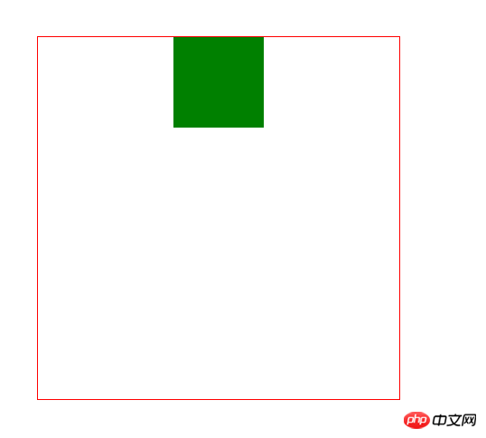
1. Horizontal centering (margin: 0 auto;) 

About This should be familiar to everyone, whether it is in a training class or self-study. This should be the first method taught by the teacher (horizontally), but it has a premise that the wrapped elements cannot have floating attributes. Otherwise, this property will be invalid. The specific code is as follows:

<style>
        body{margin: 0;}
        .box{
            width: 400px;
            height: 400px;
            border:1px solid red;
        }
        item{            margin:0 auto;
            width: 100px;
            height: 100x;
            background: green;
        }
</style>
<body>
    <p class="box">
        <p class="item"></p>
     </p>
</body>
Copy after login

 Detailed explanation of CSS3 page layout browser compatibility and front-end performance optimization methods

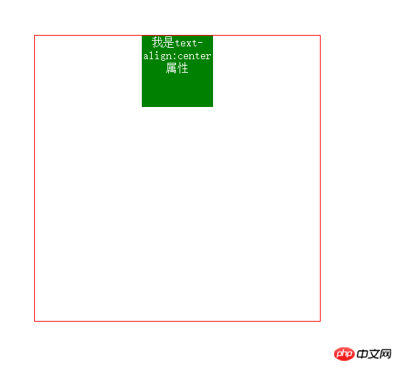
2. Horizontal centering (text-align: center;)

If this attribute does not float, we can convert it to inline/inline-block, and then add the text-align:center; attribute to its parent element to center it

<style>
        body{margin: 0;}
        .box{
            width: 400px;
            height: 400px;
            border:1px solid red;            text-align:center;
        }
        item{            display:inline/inline-block;
            width: 100px;
            height: 100x;
            background: green;
        }
</style>
<body>
    <p class="box">
        <p class="item"></p>
     </p>
</body>
Copy after login

Detailed explanation of CSS3 page layout browser compatibility and front-end performance optimization methods 

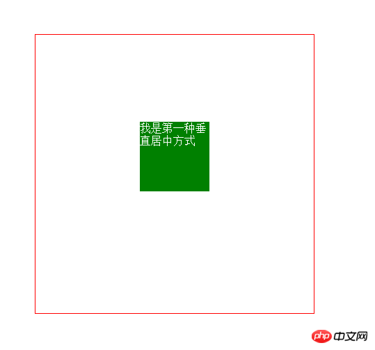
3. Horizontal and vertical centering (1) The child element is absolutely positioned relative to the parent element, and the margin value is subtracted from itself Half of the width and height

This method has certain limitations, because it must know the width and height of the child element itself

<style>
        body{margin: 0;}
        .box{
            width: 400px;
            height: 400px;
            border:1px solid red;
           position: relative;
        }
        item{
            position: absolute;
            top: 50%;
            left: 50%;
            margin-top: -50px;
            margin-left: -50px;
            width: 100px;
            height: 100x;
            background: green;
        }</style><body>
    <p class="box">
        <p class="item"></p>
     </p></body>
Copy after login

Detailed explanation of CSS3 page layout browser compatibility and front-end performance optimization methods

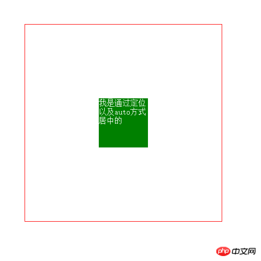
4. Horizontal and vertical centering (2) The child element is absolutely positioned relative to the parent element, and the margin value is auto

This method is not affected by the width of the element High limit, easier to use (recommended)

<style>
        body{margin: 0;}
        .box{
            width: 400px;
            height: 400px;
            border:1px solid red;
           position: relative;
        }
        item{
            position: absolute;
            left: 0;
            right: 0;
            bottom: 0;
            top:0;
            margin: auto;
            width: 100px;
            height: 100x;
            background: green;
        }</style><body>
    <p class="box">
        <p class="item"></p>
     </p></body>
Copy after login

Detailed explanation of CSS3 page layout browser compatibility and front-end performance optimization methods

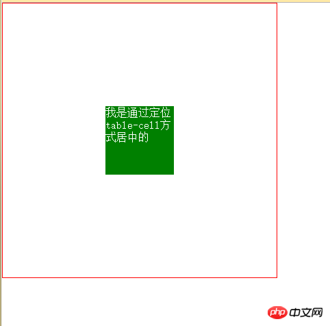
5. Horizontal and vertical centering (3) diplay: table-cell

This method is to convert the element into a table style, and then use the table style to center (recommended)

<style>
        body{margin: 0;}
        .box{
            width: 400px;
            height: 400px;
            border:1px solid red;
            display: table-cell;
            vertical-align: middle;
        }
        item{
            margin:0 auto;
            width: 100px;
            height: 100x;
            background: green;
        }</style><body>
    <p class="box">
        <p class="item"></p>
     </p></body>
Copy after login

Detailed explanation of CSS3 page layout browser compatibility and front-end performance optimization methods

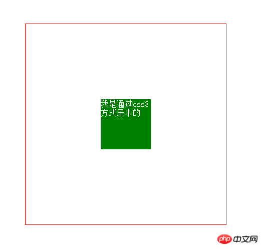
6. Horizontal and vertical centering (4) Absolute positioning and transfrom

This method is the most pretentious and uses css3 deformation. When the interviewer sees something like this in your code, your coolness will instantly rise. Of course, you know that cool stuff has compatibility issues

<style>
        body{margin: 0;}
        .box{
            width: 400px;
            height: 400px;
            border:1px solid red;
            position:relative;
        }
        item{
            width: 100px;
            height: 100x;
            background: green;
            position: absolute;
            left: 50%;
            top: 50%;
            transform: translate(-50%,-50%);
        }</style><body>
    <p class="box">
        <p class="item"></p>
     </p></body>
Copy after login

Detailed explanation of CSS3 page layout browser compatibility and front-end performance optimization methods

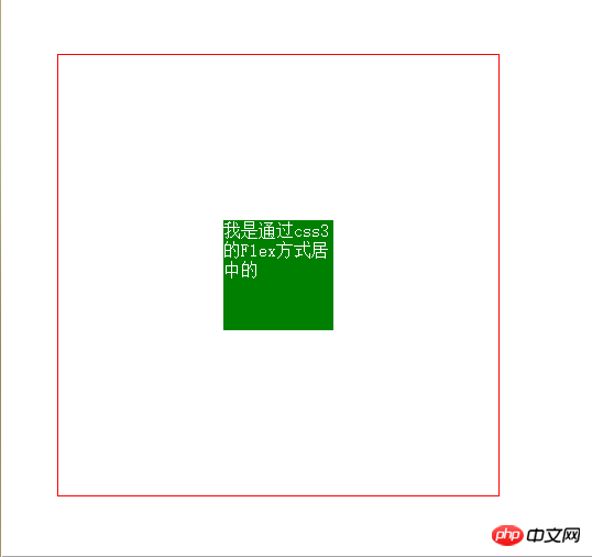
7. Horizontal and vertical centering (5) The flex attribute in css3

This attribute is very useful, but it is absolutely not compatible. If you have sexual problems, users should pay attention

<style>
        body{margin: 0;}
        .box{
            width: 400px;
            height: 400px;
            border:1px solid red;
            display: flex;
            justify-content: center;
            align-items: center;
        }
        item{
            width: 100px;
            height: 100x;
            background: green;
            
        }</style><body>
    <p class="box">
        <p class="item"></p>
     </p></body>
Copy after login

Detailed explanation of CSS3 page layout browser compatibility and front-end performance optimization methods

The above is the detailed content of Detailed explanation of CSS3 page layout browser compatibility and front-end performance optimization methods. For more information, please follow other related articles on the PHP Chinese website!

Related labels:
source:php.cn
Statement of this Website
The content of this article is voluntarily contributed by netizens, and the copyright belongs to the original author. This site does not assume corresponding legal responsibility. If you find any content suspected of plagiarism or infringement, please contact admin@php.cn
Popular Tutorials
More>
Latest Downloads
More>
Web Effects
Website Source Code
Website Materials
Front End Template