 Web Front-end
 CSS Tutorial
 An example of adding a frosted glass blur effect to an image using the css3 filter attribute
An example of adding a frosted glass blur effect to an image using the css3 filter attribute
Record the processing of image blur effects in the project. Requirements: The background image must be passed in through the img tag, and the avatar must be made into a round shape.
Example image:

HTML code:
<div class="introBox">
    <!--个人头像-->
    <div class="imgShow">
        <img class="imgBground" src="resources/images/1.jpg" alt="">
        <ul class="details">
            <li class="smallImg">
                <img class="roundImg" src="resources/images/1.jpg" alt="">
            </li>
            <li><p class="uname">吕良伟</p></li>
            <li><p class="cellPhone">13218888888</p></li>
        </ul>
    </div>
</div>CSS code:
/*背景图模糊效果*/
.imgBground{
    width:100%;
    height:28vh;
    filter: url(blur.svg#blur); /* FireFox, Chrome, Opera */
    -webkit-filter: blur(5px); /* Chrome, Opera */
    -moz-filter: blur(5px);
    -ms-filter: blur(5px);
    filter: blur(5px);
    filter: progid:DXImageTransform.Microsoft.Blur(PixelRadius=5, MakeShadow=false); /* IE6~IE9 */
}
.details{position:absolute; left:0; right:0; top:8%; margin:auto;}/*调整个人信息的位置*/
.smallImg{width:100px; height:100px; margin:2% auto; overflow:hidden;}
/*把头像处理成圆形*/
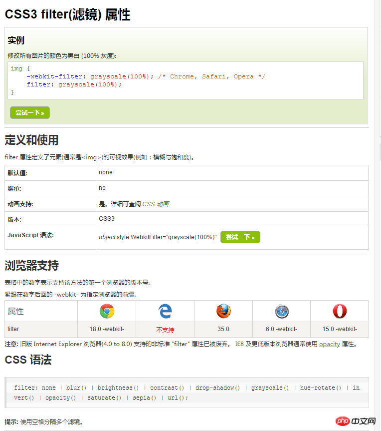
.roundImg{display:block;width:100px; height:100px; -webkit-border-radius:50%; -moz-border-radius:50%; border-radius:50%;}About the CSS3 filter attribute, the manual introduces it like this

Brightness
The Brightness filter is used to control the brightness of the image. The accepted value of the parameter is greater than or equal to 0. 0% will output pure black, and 100% will output the original brightness of the image. , when it is greater than 100%, the brightness of the picture can be increased, such as 150%, which means the brightness will be increased by 1.5 times
HTML:
<div id="container">
    <img class="imgA" src="images/1.jpeg" alt="">
    <img class="imgB" src="images/1.jpeg" alt="">
</div>CSS:
#container{width:600px; height:800px;}
#container img{width:200px;}
.imgB{
    filter:brightness(150%); /*firefox*/
    -webkit-filter:brightness(150%);/*chrome, safari, opera*/
}Rendering (supported Chrome, Firefox, Opera, Safari, does not support any version of IE)

Contrast
The Contrast filter is used to control the contrast of the image, such as the brightness filter Like the filter, which accepts values greater than or equal to 0, this filter controls the difference between the dark and light parts of the CSS image. Therefore, setting 0% is gray, 100% is the original image, and greater than 100% further improves the contrast of the image
CSS:
.imgA{
    filter:contrast(80%);
    -webkit-filter:contrast(80%);
}
.imgB{
    filter:contrast(150%);
    -webkit-filter:contrast(150%);
}
Grayscale
The Grayscale filter is used to control the grayscale of the image. This filter gradually converts all the colors in our image into some shades of gray. Setting 0% has no effect, and 100% will turn it into full gray. No Negative values are allowed
CSS:
.imgA{
    filter:grayscale(30%); /*firefox*/
    -webkit-filter:grayscale(30%);/*chrome, safari, opera*/
}
.imgB{
    filter:grayscale(80%); /*firefox*/
    -webkit-filter:grayscale(80%);/*chrome, safari, opera*/
}
Saturate
The Saturate filter controls the color saturation of the image, Setting 0% will completely remove all color from the image, setting 100% will look like the original image, and over 100% will saturate the image, disallowing negative values
CSS:
.imgA{
    filter:saturate(30%); /*firefox*/
    -webkit-filter:saturate(30%);/*chrome, safari, opera*/
}
.imgB{
    filter:saturate(150%); /*firefox*/
    -webkit-filter:saturate(150%);/*chrome, safari, opera*/
}
BrownSepia
The Sepia filter is used to control the brown tone of the image, which means to adjust the image to a retro-style old photo effect. Set 0% to the original image. , set 100% to the old photo effect
CSS:
.imgA{
    filter:sepia(50%); /*firefox*/
    -webkit-filter:sepia(50%);/*chrome, safari, opera*/
}
.imgB{
    filter:sepia(100%); /*firefox*/
    -webkit-filter:sepia(100%);/*chrome, safari, opera*/
}
Hue-rotate
Hue-rotate filter The mirror applies a hue rotation to all colors in the image. There is no effect when setting 0deg. There is no maximum value. When the value exceeds 360deg, it is equivalent to a cycle. That is to say, the effect of setting the value 90deg and 450deg is the same.
CSS:
.imgA{
    filter:hue-rotate(90deg); /*firefox*/
    -webkit-filter:hue-rotate(90deg);/*chrome, safari, opera*/
}
.imgB{
    filter:hue-rotate(150deg); /*firefox*/
    -webkit-filter:hue-rotate(150deg);/*chrome, safari, opera*/
}
Invert Color Invert
The Invert filter inverts all colors. The amount of inversion depends on the set value. There is no inversion when it is set to 0%, and it is set to 100%. When inverting all colors
CSS:
.imgA{
    filter:invert(60%); /*firefox*/
    -webkit-filter:invert(60%);/*chrome, safari, opera*/
}
.imgB{
    filter:invert(90%); /*firefox*/
    -webkit-filter:invert(90%);/*chrome, safari, opera*/
}
Blur Blur
The Blur filter is suitable for Gaussian blurred images. The colors are blended together and spread over the edges of the image. The radius parameter passed to this filter determines how many pixels on the screen the blend will advance. The larger the value, the more obvious the blur effect. This filter can accept any length value, except percentage
CSS:
.imgA{
    filter:blur(1px); /*firefox*/
    -webkit-filter:blur(1px);/*chrome, safari, opera*/
}
.imgB{
    filter:blur(0.5em); /*firefox*/
    -webkit-filter:blur(0.5em);/*chrome, safari, opera*/
}
透明度Opacity
Opacity滤镜使图像变透明,取值0%时,完全透明;取值100%时,完全不透明。这个滤镜跟已知的opacity属性相似,唯一的区别就是性能,opacity滤镜属性在支持硬件加速的浏览器上性能会更好
CSS:
.imgA{
    filter:opacity(25%); /*firefox*/
    -webkit-filter:opacity(25%);/*chrome, safari, opera*/
}
.imgB{
    filter:opacity(75%); /*firefox*/
    -webkit-filter:opacity(75%);/*chrome, safari, opera*/
}
阴影Drop Shadow
Drop Shadow滤镜增加了一个阴影效果,此属性需要X和Y的偏移,以及隐隐的颜色,也可以设置一个模糊半径
CSS:
.imgA{
    filter:drop-shadow(5px 5px 10px #666); /*firefox*/
    -webkit-filter:drop-shadow(5px 5px 10px #666);/*chrome, safari, opera*/
}
.imgB{
    filter:drop-shadow(10px 10px 10px #eee); /*firefox*/
    -webkit-filter:drop-shadow(10px 10px 10px #eee);/*chrome, safari, opera*/
}
URL()
虽然我们讨论过的所有的滤镜非常有用,他们其实是通用的滤镜,但是你的项目可能需要更多的效果,如果上面滤镜没有能满足你的要求的,你可以创建自己的SVG滤镜然后使用其id通过url()引用。
HTML:
<div id="container">
    <img class="imgA" src="images/1.jpeg" alt="">
    <img class="imgB" src="images/1.jpeg" alt="">
</div>
CSS:
.imgA{
    filter: url('#greenish');
    -webkit-filter: url('#greenish');
}
.imgB{
    filter:url('#bluish');
    -webkit-filter: url('#bluish');
}
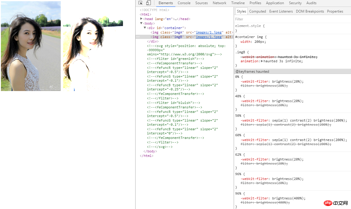
组合滤镜和动画滤镜(Combining and Animating Filters)
您也可以组合多个滤镜来获得各种效果。在大多数情况下,滤镜的顺序并没有多大关系。但是如果在灰度滤镜后再加上一个褐色滤镜,还是会显示一个灰度图像。
CSS:
.imgB{
    -webkit-animation: haunted 3s infinite;
    animation: haunted 3s infinite;
}

@keyframes haunted {
    0% {
        -webkit-filter: brightness(20%);
        filter: brightness(20%);
    }
    48% {
        -webkit-filter: brightness(20%);
        filter: brightness(20%);
    }
    50% {
        -webkit-filter: sepia(1) contrast(2) brightness(200%);
        filter: sepia(1) contrast(2) brightness(200%);
    }
    60% {
        -webkit-filter: sepia(1) contrast(2) brightness(200%);
        filter: sepia(1) contrast(2) brightness(200%);
    }
    62% {
        -webkit-filter: brightness(20%);
        filter: brightness(20%);
    }
    96% {
        -webkit-filter: brightness(20%);
        filter: brightness(20%);
    }
    96% {
        -webkit-filter: brightness(400%);
        filter: brightness(400%);
    }
(有动态效果,但是截图的缘故,只能看静态的了)
The above is the detailed content of An example of adding a frosted glass blur effect to an image using the css3 filter attribute. For more information, please follow other related articles on the PHP Chinese website!

Hot AI Tools

Undresser.AI Undress
AI-powered app for creating realistic nude photos

AI Clothes Remover
Online AI tool for removing clothes from photos.

Undress AI Tool
Undress images for free

Clothoff.io
AI clothes remover

Video Face Swap
Swap faces in any video effortlessly with our completely free AI face swap tool!

Hot Article

Hot Tools

Notepad++7.3.1
Easy-to-use and free code editor

SublimeText3 Chinese version
Chinese version, very easy to use

Zend Studio 13.0.1
Powerful PHP integrated development environment

Dreamweaver CS6
Visual web development tools

SublimeText3 Mac version
God-level code editing software (SublimeText3)

Hot Topics
 1659
1659
 14
14
 1415
1415
 52
52
 1309
1309
 25
25
 1257
1257
 29
29
 1231
1231
 24
24
 Google Fonts Variable Fonts
Apr 09, 2025 am 10:42 AM
I see Google Fonts rolled out a new design (Tweet). Compared to the last big redesign, this feels much more iterative. I can barely tell the difference
 How to Create an Animated Countdown Timer With HTML, CSS and JavaScript
Apr 11, 2025 am 11:29 AM
Have you ever needed a countdown timer on a project? For something like that, it might be natural to reach for a plugin, but it’s actually a lot more
 HTML Data Attributes Guide
Apr 11, 2025 am 11:50 AM
Everything you ever wanted to know about data attributes in HTML, CSS, and JavaScript.
 A Proof of Concept for Making Sass Faster
Apr 16, 2025 am 10:38 AM
At the start of a new project, Sass compilation happens in the blink of an eye. This feels great, especially when it’s paired with Browsersync, which reloads
 How We Created a Static Site That Generates Tartan Patterns in SVG
Apr 09, 2025 am 11:29 AM
Tartan is a patterned cloth that’s typically associated with Scotland, particularly their fashionable kilts. On tartanify.com, we gathered over 5,000 tartan
 How to Build Vue Components in a WordPress Theme
Apr 11, 2025 am 11:03 AM
The inline-template directive allows us to build rich Vue components as a progressive enhancement over existing WordPress markup.
 PHP is A-OK for Templating
Apr 11, 2025 am 11:04 AM
PHP templating often gets a bad rap for facilitating subpar code — but that doesn't have to be the case. Let’s look at how PHP projects can enforce a basic
 Programming Sass to Create Accessible Color Combinations
Apr 09, 2025 am 11:30 AM
We are always looking to make the web more accessible. Color contrast is just math, so Sass can help cover edge cases that designers might have missed.


