Force the page to horizontal screen
Recently, the company is going to develop a mobile development web game (just click on various buttons and you will find a girlfriend in the end =. =), which requires horizontal screen display, not vertical screen.
If you have experience, you will definitely know that when the user opens the screen vertically, it is very silly to be prompted that you need to turn the phone around. At this time, if the user has not turned on the landscape mode on the phone, the user will be forced to turn it on. At this time, the user has already impatiently turned off your game.
I conducted research first to see if there was any ready-made api. After referring to screen's API and manifest method, the experimental results are of course not good.
The only solution I can think of now is to write a horizontal p in portrait mode and then turn it around.
Okay, my test page structure is as follows:
<body class="webpBack">
  <p id="print">
      <p>lol</p>
   </p>
</body>
It’s very simple, right? The final ideal state is to turn lol horizontally in a very harmonious way.
Okay, let’s take a look at the css that distinguishes horizontal and vertical screens:
@media screen and (orientation: portrait) {
      html{
         width : 100% ;
         height : 100% ;
          background-color: white ;
          overflow : hidden;
      }
      body{
          width : 100% ;
         height : 100% ;
         background-color: red ;
          overflow : hidden;
      }
      #print{
         position : absolute ;
         background-color: yellow ;
      }
}
@media screen and (orientation: landscape) {
       html{
         width : 100% ;
         height : 100% ;
         background-color: white ;
      }
       body{
          width : 100% ;
         height : 100% ;
         background-color: white ;
      }
           #print{
            position : absolute ;
            top : 0 ;
            left : 0 ;
            width : 100% ;
            height : 100% ;
            background-color: yellow ;
         }
}
#print p{
        margin: auto ;
        margin-top : 20px ;
        text-align: center;
}To put it bluntly, the print p should be turned horizontally in portrait mode and unchanged in landscape mode. So under portrait, its width and height are not defined. It will be filled in through the following js.
var width = document.documentElement.clientWidth;
var height = document.documentElement.clientHeight;
if( width < height ){
console.log(width + " " + height);
$print = $('#print');
$print.width(height);
$print.height(width);
$print.css('top', (height-width)/2 );
$print.css('left', 0-(height-width)/2 );
$print.css('transform' , 'rotate(90deg)');
$print.css('transform-origin' , '50% 50%');
}Here we first obtain the width and height of the available area on the screen, and then determine whether it is a horizontal or vertical screen based on the relationship between the width and height. If it is a portrait screen, set the width and height of the print p, align it, and then rotate it.
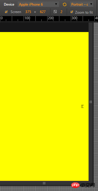
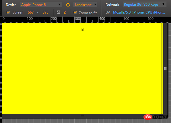
The final effect is as follows:

Vertical screen

Horizontal screen
Finally, the consequence of this is that if the rotate screen button of the user's phone is turned on, then when the phone is turned sideways, it will cause a certain tragedy. The solution is as follows:
 var evt = "onorientationchange" in window ? "orientationchange" : "resize";

    window.addEventListener(evt, function() {
        console.log(evt);
        var width = document.documentElement.clientWidth;
         var height =  document.documentElement.clientHeight;
          $print =  $('#print');
         if( width > height ){

            $print.width(width);
            $print.height(height);
            $print.css('top',  0 );
            $print.css('left',  0 );
            $print.css('transform' , 'none');
            $print.css('transform-origin' , '50% 50%');
         }
         else{
            $print.width(height);
            $print.height(width);
            $print.css('top',  (height-width)/2 );
            $print.css('left',  0-(height-width)/2 );
            $print.css('transform' , 'rotate(90deg)');
            $print.css('transform-origin' , '50% 50%');
         }

    }, false);
The above is the detailed content of Force the page to horizontal screen. For more information, please follow other related articles on the PHP Chinese website!

Hot AI Tools

Undresser.AI Undress
AI-powered app for creating realistic nude photos

AI Clothes Remover
Online AI tool for removing clothes from photos.

Undress AI Tool
Undress images for free

Clothoff.io
AI clothes remover

Video Face Swap
Swap faces in any video effortlessly with our completely free AI face swap tool!

Hot Article

Hot Tools

Notepad++7.3.1
Easy-to-use and free code editor

SublimeText3 Chinese version
Chinese version, very easy to use

Zend Studio 13.0.1
Powerful PHP integrated development environment

Dreamweaver CS6
Visual web development tools

SublimeText3 Mac version
God-level code editing software (SublimeText3)

Hot Topics
 1668
1668
 14
14
 1428
1428
 52
52
 1329
1329
 25
25
 1273
1273
 29
29
 1256
1256
 24
24
 A Comparison of Static Form Providers
Apr 16, 2025 am 11:20 AM
Let’s attempt to coin a term here: "Static Form Provider." You bring your HTML
 A Proof of Concept for Making Sass Faster
Apr 16, 2025 am 10:38 AM
At the start of a new project, Sass compilation happens in the blink of an eye. This feels great, especially when it’s paired with Browsersync, which reloads
 Weekly Platform News: HTML Loading Attribute, the Main ARIA Specifications, and Moving from iFrame to Shadow DOM
Apr 17, 2025 am 10:55 AM
In this week's roundup of platform news, Chrome introduces a new attribute for loading, accessibility specifications for web developers, and the BBC moves
 Some Hands-On with the HTML Dialog Element
Apr 16, 2025 am 11:33 AM
This is me looking at the HTML element for the first time. I've been aware of it for a while, but haven't taken it for a spin yet. It has some pretty cool and
 Paperform
Apr 16, 2025 am 11:24 AM
Buy or build is a classic debate in technology. Building things yourself might feel less expensive because there is no line item on your credit card bill, but
 Where should 'Subscribe to Podcast' link to?
Apr 16, 2025 pm 12:04 PM
For a while, iTunes was the big dog in podcasting, so if you linked "Subscribe to Podcast" to like:
 Weekly Platform News: Text Spacing Bookmarklet, Top-Level Await, New AMP Loading Indicator
Apr 17, 2025 am 11:26 AM
In this week's roundup, a handy bookmarklet for inspecting typography, using await to tinker with how JavaScript modules import one another, plus Facebook's
 It's All In the Head: Managing the Document Head of a React Powered Site With React Helmet
Apr 15, 2025 am 11:01 AM
The document head might not be the most glamorous part of a website, but what goes into it is arguably just as important to the success of your website as its


