Detailed implementation example of CSS translucent border (picture)
1. Translucent border
Question:
If we want to set a red background and a black translucent border for a container, we might write like this:
border: 20px solid rgba(0,0,0,0.5);
background: red;
Copy after login
But the effect is like this (picture 1-1.png); Why does our translucent color not implement a translucent border?
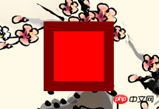
Figure 1-1.png
Solution:
We can pass background-clipAttribute To adjust the default behavior above, set its value to padding-box, and then the effect we want will appear (Figure 1-2.png);
border: 20px solid rgba(0,0,0,0.5);
background: red;
background-clip: padding-box;
Copy after login
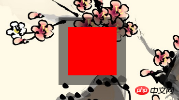
Figure 1-2.png
2.background-clip
Since the background-clip attribute is used, let's take a look at this attribute;
background-clip:
Set the background of the element (backgroundPicture or color) extends below the border.
| Values (values) | Description |
|---|
| border-box | Default initial value, the background extends to the outer edge of the border (but under the border) |
| padding-box | Nothing under the border Background, that is, the background extends to the inner margin outer edge |
| content-box | The background is cropped to the outer edge of the content area (content-box) |
| text | ExperimentAPI, the background is cropped into the foreground text. |
示例
CSS content
span {
   border: 10px blue;
   border-style: dotted double;
   margin: 1em;
   padding: 2em;
   background: #F8D575;
}
.border-box { background-clip: border-box; }
.padding-box { background-clip: padding-box; }
.content-box { background-clip: content-box; }
.text { background-clip: text; }
Copy after login
HTML content
border-box
padding-box
content-box
text
Copy after login
效果:(图2-1.png)
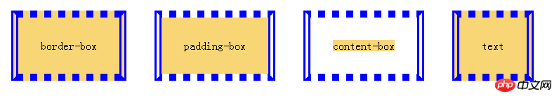
图2-1.png
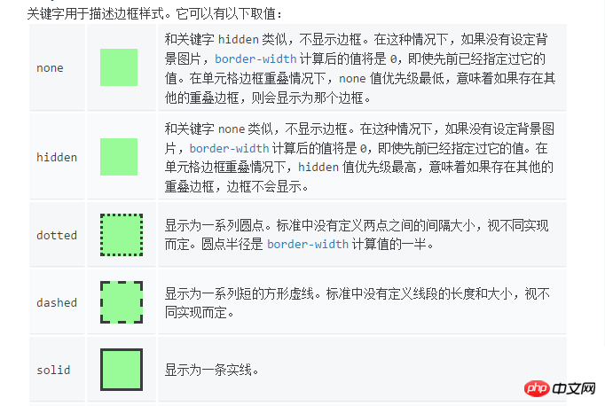
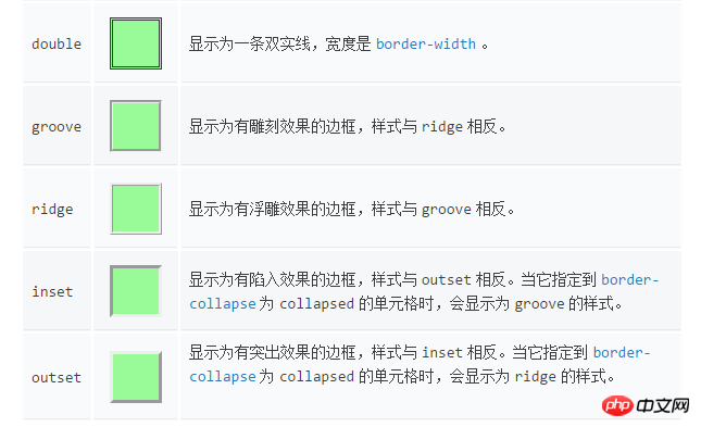
3.border-style
4.border-image
初始值:
4.1 border-image-source: none |
where
= | | | | |
where
= image([ [ | ]? , ? ]!)
= image-set(#)
= element( )
= cross-fade(,?)
= | | |
Gradient示例:
= linear-gradient( [ | to ]?, )
CSS content
.gradient {
    border: 30px solid;
    border-image-source: linear-gradient(to right, red, green, blue);
    /*border-image-source: linear-gradient(90deg, red, green, blue);*/
    border-image-slice: 10;
    padding: 20px;
}
Copy after login
HTML content
The image is stretched to fill the area.
Copy after login
效果:(图4-1.png)
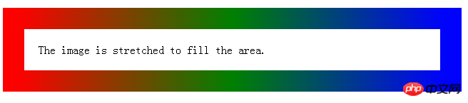
图4-1.png
4.2 border-image-slice: [ | ]{1,4}&& fill?
这个 border-imge-slice 属性传入1~4个参数(number没有单位专指像素或百分比值)将图片分割成9个部分,1,2,3,4四个区块是不会拉伸,不会平铺,称之为盲区,5,6,7,8四个区块可以通过 border-image-repeat 来控制拉伸平铺和重复( stretch:默认值,拉伸; repeat:平铺; round:整数次平铺; ),第9区块不显示,传入参数 fill 则显示第9区块,分割情况如下图(图4-2.png && 图2-3.png):
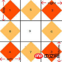
图4-2.png
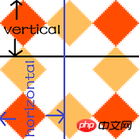
图4-3.png
我们通过上面这张图片(81px^81px)来看传入不同个数的参数是如何分割这张图片的;
1个参数
/* border-image-slice: slice */
border-image-slice: 27;
border: 30px solid transparent;
padding: 20px;
border-image-source:url([https://mdn.mozillademos.org/files/4127/border.png](https://mdn.mozillademos.org/files/4127/border.png));
Copy after login
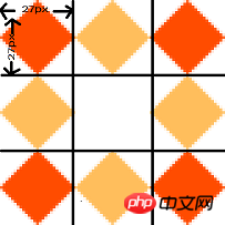
图4-4.png

图4-5.png(效果图)
2个参数(参考图4-3.png)
/* border-image-slice: vertical horizontal */
border-image-slice: 40 40.5;
border: 30px solid transparent;
padding: 20px;
border-image-source:url([https://mdn.mozillademos.org/files/4127/border.png](https://mdn.mozillademos.org/files/4127/border.png));
Copy after login
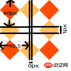
图4-6.png

图4-7.png(效果图)
3个参数
/* border-image-slice: top horizontal bottom */
border-image-slice: 27 40 27;
border: 30px solid transparent;
padding: 20px;
border-image-source:url([https://mdn.mozillademos.org/files/4127/border.png](https://mdn.mozillademos.org/files/4127/border.png));
Copy after login

图4-8.png(效果图)
4个参数(参考图4-2.png)
/* border-image-slice: top right bottom left */
border-image-slice: 27 40 27 27;
border: 30px solid transparent;
padding: 20px;
border-image-source:url([https://mdn.mozillademos.org/files/4127/border.png](https://mdn.mozillademos.org/files/4127/border.png));
Copy after login

图4-9.png(效果图)
4.3 border-image-width: [ | | | auto ]{1,4}
语法:
border-image-width: all                        /* One-value syntax */
E.g. border-image-width: 3;
border-image-width: vertical horizontal        /* Two-value syntax */
E.g. border-image-width: 2em 3em;
border-image-width: top horizontal bottom      /* Three-value syntax */
E.g. border-image-width: 5% 15% 10%;
border-image-width: top right bottom left      /* Four-value syntax */
E.g. border-image-width: 5% 2em 10% auto;
Copy after login
设置边框图片的width,如果超出了设置的border-width,会向内扩展;查看下方示例,比较(图4-10.png && 图4-11.png);
示例:
border: 30px solid transparent;
padding: 20px;
border-image-source: url("https://mdn.mozillademos.org/files/4127/border.png");
border-image-slice: 27;
Copy after login
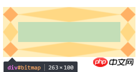
图4-10.png
border: 30px solid transparent;
padding: 20px;
border-image-source:url([https://mdn.mozillademos.org/files/4127/border.png](https://mdn.mozillademos.org/files/4127/border.png));
border-image-slice: 27;
border-image-width: 1 2 1 1;
Copy after login
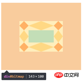
图4-11.png
4.4 border-image-outset: [ | ]{1,4}
语法:
/* border-image-outset: sides */
border-image-outset: 30%;
/* border-image-outset:vertical horizontal */
border-image-outset: 10% 30%;
/* border-image-outset: top horizontal bottom */
border-image-outset: 30px 30% 45px;
/* border-image-outset:top right bottom left  */
border-image-outset: 7px 12px 14px 5px;
Copy after login
效果是将边框图片延伸到盒子外面,查看下放示例,比较(图4-12.png && 图4-13.png);
示例:
border: 30px solid transparent;
 padding: 20px;
 border-image-source:url([https://mdn.mozillademos.org/files/4127/border.png](https://mdn.mozillademos.org/files/4127/border.png));
 border-image-slice: 27;
 margin: 60px;
Copy after login
图4-12.png
border: 30px solid transparent;
padding: 20px;
border-image-source:url([https://mdn.mozillademos.org/files/4127/border.png](https://mdn.mozillademos.org/files/4127/border.png));
border-image-slice: 27;
margin: 60px;
border-image-outset: 2 1 1 1;
Copy after login
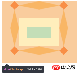
图4-13.png
4.4 border-image-repeat: [ stretch | repeat | round ]{1,2}
| 值(value) | 说明 |
|---|
| stretch | 默认初始值 ,;拉伸 |
| repeat | 平铺 |
| round | 整数次平铺 |
语法:
border-image-repeat: type                      /* One-value syntax */
E.g. border-image-value: stretch;
border-image-repeat: horizontal vertical       /* Two-value syntax */
E.g. border-image-width: round space;
Copy after login
The above is the detailed content of Detailed explanation of implementation examples of CSS translucent borders (picture). For more information, please follow other related articles on the PHP Chinese website!


![[Web front-end] Node.js quick start](https://img.php.cn/upload/course/000/000/067/662b5d34ba7c0227.png)


