CSS positioning mechanism
CSS has three basic positioning mechanisms: normal flow, floating and absolute positioning.
All boxes are positioned in the normal flow unless specifically specified. That is, the position of an element in the normal flow is determined by the element's position in (X)HTML.
Block-level boxes are arranged one after another from top to bottom, and the vertical distance between boxes is calculated from the vertical margin of the box.
Inline boxes are arranged horizontally in a row. Their spacing can be adjusted using horizontal padding, borders, and margins. However, vertical padding, borders, and margins do not affect the height of the inline box. The horizontal box formed by a line is called a line box (Line Box). The height of the line box is always high enough to accommodate all the inline boxes it contains. However, setting the row height can increase the height of this box.
In the following chapters, we will explain relative positioning, absolute positioning and floating in detail.
CSS position property
By using the position property, we can choose from 4 different types of positioning, which affects the way the element box is generated.
The meaning of position attribute value:
static
Default value. Without positioning, the element appears in normal flow (ignoring top, bottom, left, right or z-index declarations). The element box is generated normally. Block-level elements create a rectangular box as part of the document flow, while inline elements create one or more line boxes that are placed within their parent element.
relative
The element box is offset by a certain distance. The element retains its unpositioned shape and the space it originally occupied.
absolute
The element box is completely removed from the document flow and positioned relative to its containing block. The containing block may be another element in the document or the initial containing block. The space previously occupied by the element in normal document flow is closed, as if the element did not exist. The element generates a block-level box after positioning, regardless of what type of box it originally generated in the normal flow.
fixed
The element box behaves like setting position to absolute, except that its containing block is the viewport itself.
inherit
Specifies that the value of the position attribute should be inherited from the parent element.
Tip: Relative positioning is actually considered part of the normal flow positioning model, because the position of an element is relative to its position in the normal flow.
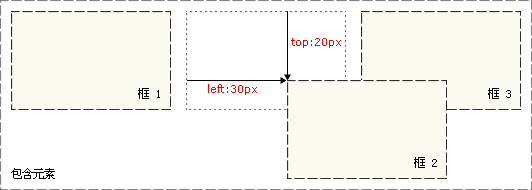
Relative positioning is a very easy concept to grasp. If an element is positioned relatively, it will appear where it is. You can then move the element "relative to" its origin by setting a vertical or horizontal position.

Note that when using relative positioning, the element still occupies the original space regardless of whether it is moved or not. Therefore, moving an element causes it to cover other boxes.
An element box set to absolute positioning is completely removed from the document flow and positioned relative to its containing block, which may be another element in the document or is the initial containing block. The space previously occupied by the element in normal document flow is closed, as if the element did not exist. The element generates a block-level box after positioning, regardless of what type of box it originally generated in the normal flow.
Absolute positioning makes the position of the element independent of the document flow, so it does not occupy space. This is different from relative positioning, which is actually considered part of the normal flow positioning model because the element's position is relative to its position in the normal flow.
Other elements in the normal flow are laid out as if the absolutely positioned element did not exist.

#The main issue with positioning is to remember what each positioning means. So, now let’s review what we’ve learned: Relative positioning is “relative to” the element’s initial position in the document, while absolutely positioned elements are positioned relative to the nearest positioned ancestor element, if the element has no positioned ancestor elements, then its position is relative to the original containing block. Note: Depending on the user agent, the initial containing block may be a canvas or HTML element. Tip: Because absolutely positioned boxes have nothing to do with document flow, they can cover other elements on the page. Can be set by
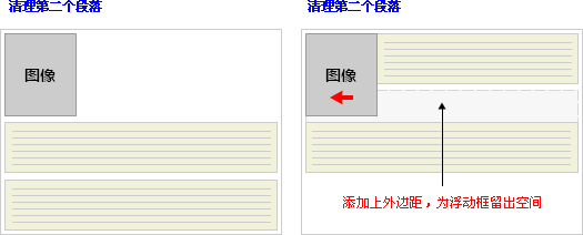
z-index attribute to control the stacking order of these boxes. A floating box can be moved left or right until its outer edge touches the border of the containing box or another floating box. Because the floated box is not in the document's normal flow, a block box in the document's normal flow behaves as if the floated box does not exist. The float attribute defines in which direction the element floats. Historically this property has always been applied to images, causing the text to wrap around the image, but in CSS, any element can be floated. A floated element creates a block-level box, regardless of what type of element it is. If floating non-replaced elements, specify an explicit width; otherwise, they are made as narrow as possible. Line boxes and cleanup Line boxes next to floats are shortened to make room for the float, and the line boxes surround the float. So creating a floated box allows text to wrap around the image: To stop the line box from wrapping around the floated box, you need to apply
clear attribute. The value of the clear attribute can be left, right, both, or none, and it indicates which sides of the box should not be next to the floating box. To achieve this effect, add enough space to the top margin of the cleared element so that the top edge of the element drops vertically below the float: This is a useful tool that allows surrounding elements to leave space for the floated element. Let's look at float and cleanup in more detail. Suppose you want an image to float to the left of a text block, and you want the image and text to be contained within another element with a background color and border. You might write the following code: In this case, a problem arises. Because the floated element is out of the document flow, the p surrounding the image and text takes up no space. How to make the surrounding element visually surround the floating element? Clear needs to be applied somewhere within this element: #Unfortunately a new problem arises, since there is no existing element to which clean can be applied, So we can just add an empty element and clean it. This can achieve the effect we want, but it requires adding extra code. There are often elements that can be cleared, but sometimes you have to add meaningless markup for layout purposes. But we have another way, which is to float the container p: This will get the effect we want. Unfortunately, the next element will be affected by this floated element. To solve this problem, some people choose to float everything in the layout, and then clean up those floats using an appropriate meaningful element (often the site's footer). This helps reduce or eliminate unnecessary markup. Using negative margins on floating modules can cover the corresponding floating modules. The margin attributes of negative margins do not affect the position of other modules. Its movement reference point is based on itself. for reference. This is very different from positive margins. The positive margin moves based on the position of adjacent modules as a reference point, and reasonably crowds out surrounding modules. Using CSS to center the element is not It’s a simple thing—the same valid CSS centering behavior behaves differently in different browsers. Let’s first take a look at several common methods in CSS to center elements horizontally. 1.使用自动外边距实现居中 在大多数主流浏览器中,这种方法都非常有效,即使是Windows平台上的IE6,在其标准兼容模式(compliance mode)下也能够正常显示。但不幸的是,在更低版本的IE中,这种设置却并不能实现居中效果。所以若想在实际项目中使用这种方法,那么就要确保用户的IE浏览器版本不低于6.0。 之后会出现什么问题吗?body的所有子孙元素都会被居中显示。 可以想象这条附加的规则将带来一些不便。另外,真正完全遵循标准的浏览器并不会改变容器的位置,而只会让其中的文字居中显示。 可是这始终是个hack,无论如何也算不上完美。我们还是需要为居中容器中的文本编写附加的规则,但至少在各个浏览器中看起来都不错。 看,没有任何hack!虽然这并不是首选的解决方案,但也是个不错的方法,且适用性极广—甚至在Netscape Navigator 4.x中都没有任何问题,很令人吃惊,不是吗?所以若想得到最广泛的浏览器支持,那么这种方法将会是最好的选择。 元素是文档结构的基础,在CSS中,每个元素生成了一个包含了元素内容的框(box,也译为“盒子”)。但是不同的元素显示的方式会有所不同,例如 和就不同,而和 也不一样。在文档类型定义(DTD)中对不同的元素规定了不同的类型,这也是DTD对文档之所以重要的原因之一。 1. 替换和不可替换元素 从元素本身的特点来讲,可以分为替换和不可替换元素。 a) 替换元素 替换元素就是浏览器根据元素的标签和属性,来决定元素的具体显示内容。 例如浏览器会根据 (X)HTML中的CSS Floating


.news {
background-color: gray;
border: solid 1px black;
}
.news img {
float: left;
}
.news p {
float: right;
}
<p class="news">
<img src="news-pic.jpg" />
<p>some text</p>
</p>
.news {
background-color: gray;
border: solid 1px black;
}
.news img {
float: left;
}
.news p {
float: right;
}
<p class="news">
<img src="news-pic.jpg" />
<p>some text</p>
</p>.news {
background-color: gray;
border: solid 1px black;
float: left;
}
.news img {
float: left;
}
.news p {
float: right;
}
<p class="news">
<img src="news-pic.jpg" />
<p>some text</p>
</p> Center the element:
CSS中首选的让元素水平居中的方法就是使用margin属性—将元素的margin-left和margin-right属性设置为auto即可。在实际使用中,我们可以为这些需要居中的元素创建一个起容器作用的p。需要特别注意的一点就是,必须为该容器指定宽度: p#container {
margin-left: auto;
margin-right: auto;
width: 168px;
}
尽管在支持上不尽如人意,但大多数设计师都建议尽可能地使用这种方法。该方法也被认为是在各种用CSS实现元素水平居中方法中最正确、最合理的一种。
2.使用text-align实现居中
另一种实现元素居中的方法是使用text-align属性,将该属性值设置为center并应用到body元素上即可。这种做法是彻头彻尾的hack,但它却能兼容大多数浏览器,所以在某些情况下也自然必不可少。
之所以说它是hack,是因为这种方法并没有将文本属性应用到文本上,而是应用到了作为容器的元素上。这也给我们带来了额外的工作。在创建好布局必须的p之后,我们要按照如下代码为body应用text-align属性: body{
text-align:center;
}
因此,我们就需要用再写一条规则,让其中的文本回到默认的居左对齐: p {
text-align:left;
}
3.组合使用自动外边距和文本对齐
因为文本对齐居中方式有着良好的向下兼容性,且自动外边距方式也被大多数当代浏览器支持,所以很多设计师将二者组合起来使用,以期让居中效果得到最大限度的跨浏览器支持: body {
text-align: center;
}
#container {
margin-left: auto;
margin-right: auto;
border: 1px solid red;
width: 168px;
text-align: left
}
4.负外边距解决方案
负外边距解决方案远不是仅仅为元素添加负外边距这么简单。这种方法需要同时使用绝对定位和负外边距两种技巧。
下面是该方案的具体实现方法。首先,创建一个包含居中元素的容器,然后将其绝对定位于相对页面左边边缘50%的位置。这样,该容器的左外边距将从页面50%宽度的位置开始算起。
然后,将容器的左外边距值设置为负的容器宽度的一半。这样即可将该容器固定在页面水平方向的中点。 #container {
background: #ffc url(mid.jpg) repeat-y center;
position: absolute;
left: 50%;
width: 760px;
margin-left: -380px;
}替换和不可替换元素:
标签的src属性的值来读取图片信息并显示出来,而如果查看(X)HTML代码,则看不到图片的实际内容;又例如根据标签的type属性来决定是显示输入框,还是单选按钮等。
、、