 Web Front-end
 CSS Tutorial
 An in-depth explanation of the oblique linear gradient lineaer-gradient in CSS3
An in-depth explanation of the oblique linear gradient lineaer-gradient in CSS3
background-color: rgb(255, 255, 255);">1. The question is not as simple as I thought
Ask a question, use CSS3 gradient to implement a (100px, 100px) to (200px, 200px) from red to yellow on a 400*300 p layer How to achieve oblique linear gradient?
//zxx: The CSS3 gradient discussed here is based on the new standard writing method, and ignores the private prefix
We may know the implementation of horizontal gradient, similar to this:
{background-image:linear-gradient(left, red 100px, yellow 200px);} The effect may be similar to this:

It is very natural, then from (100px, 100px) to (200px, 200px) should start from the upper left corner, it should be like this Sub:
{background-image:linear-gradient(left top, red 100px, yellow 200px);}
The effect may be similar to this:

Wow, handsome, well, that should be the effect we want! ——
This is obviously impossible. If it were really that simple, I wouldn’t say it~
Let’s open PhotoshopwaitdrawingSoftware, draw a gradient that meets the above requirements and see the effect:
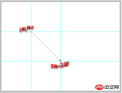
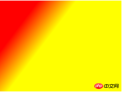
Compare with the above CSS implementation:

The size of the red area is obviously very different. What's going on?
I can only tell you that things are far from as simple as you think!
2. Use lazy and slow thinking and start from scratch
When we encounter a problem, if our first reaction is to ask for help from others, we will only get superficial things; if we analyze deeply by ourselves, we will often get what we have. It's something real. The first type of person seems to be studious, but in fact he is a lazy person who diligently uses fast thinking that is easy and consumes less energy. This kind of person is suitable for sales and public relations, but not for technology; but it does not mean that he earns money. It will be less.
Enough with the digression. Take a deep breath, come on, breathe in... Okay, now we re-examine the standard writing method of CSS3 gradient linear gradient (because webkit does not support it, so it is omitted here):
background-image: linear-gradient( [ <angle> | <side-or-corner> ,]? <color-stop> [, <color-stop>]+ );
We have the above CSS syntax It is often seen, but some people may not understand the specific meaning. In fact, the meaning of the above symbols has many similarities with the regular expression:
[] means in the regular expression A character class, here, you can understand it as a small unit.
|Indicates candidate. That is, "or" means either the former or the latter.
? is the quantifier, which means 0 or 1. The implication is that you can directly change the color without specifying the direction. For example:
background:linear-gradient(red, yellow);
is the effect of red and yellow stripes from top to bottom.
+ is also a quantifier, indicating 1 or more. Therefore, the termination color is indispensable. For example: linear-gradient(red) is soy sauce, a blank slate.
<> are keywords, mainly to let developers know what content should be placed here.
Linear gradient keyword
1. angle
angle represents the angle of the gradient. However, this angle changes tens of millions. Don’t take it for granted. For example:
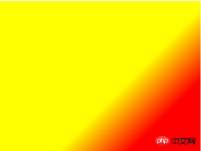
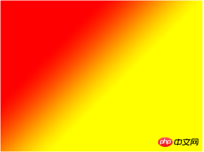
If the angle is 45deg, or a gradient from red to yellow, the following picture is the correct representation:
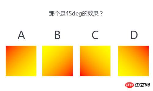
is A Or B? Or C? Or D?
This is simpler than your girlfriend showing you four pieces of clothing and asking you which one looks better.
5 seconds countdown, 5, 4, 3, 2, 1, ...
Okay, the answer is: C
Dear friend, is the answer correct? ?
I guarantee that many people have answered it wrong (including myself). Why do they make mistakes? The reason is simple, the "familiarity effect".
想让人们相信谬误有个可靠的方法,那就是不断重复,因为人们很难对熟悉感和真相加以区别。——丹尼尔·卡尼曼
我们,譬如我,非常多次地接触CSS3 transform中的旋转,rotate(45deg)效果就是元素默认态顺时针旋转45°;于是,这种熟悉感会让我们觉得渐变的旋转也应该如此。默认渐变从上到下,那么旋转45°应该是D啊(参见下gif示意),怎么会是C呢?
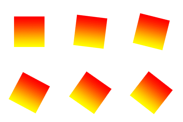
photoshop与CSS3走得越来越近了,我们可以从photoshop中找到答案。
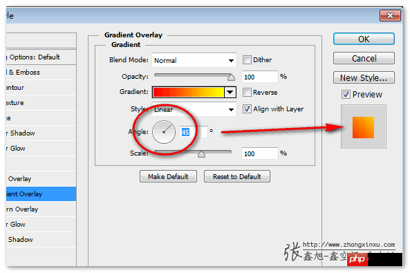
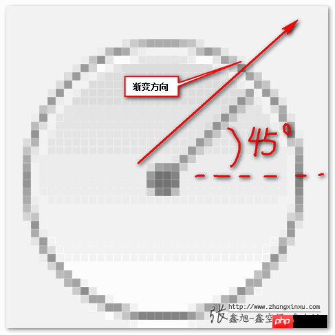
从上图那个圈中的圆环可以看出,渐变的角度与旋转的那个角度完全不是一回事。线性渐变的这个角度为圆心为起点的发散方向。大图示意就是:
2. side-or-corner
side-or-corner中文意思就是“边或角”,可选值有:
[left | right] || [top | bottom]
表示,你可以有如下的写法或组合:
left, right, top, bottom, left top, left bottom, right top, right bottom. 分别表示,从左往右,从右往左,从上往下,从下往上,从左上往右下,从……(都懂的,不全写了)
其中的left top(从左上往右下)正好我们一开始的例子使用了,现在看看,稍微想想,就知道我们使用错了!
显然,从(100,100)到(300,300)是个45度倍数角;而left top的角度是直奔右下角的,而容器是400*300,显然,不是45度倍数角。根据我们上面对angle的认识,角度应该是-45°,-45°为圆心网右下方向45度的一条线,正好符合从(100,100)到(300,300)的方向!
3. color-stop
渐变关键颜色结点,语法为:
<color> [ <percentage> | <length> ]
中文解释就是,颜色值+空格+百分比或长度值。例如red 100px. 记住,这里的颜色值只能一个,因此, red 100px 100px是完全错误滴!
OK,现在我们定义重新梳理了一遍,现在实现一开始的渐变效果应该OK了吧,试试呗~
如下CSS:
{background-image:linear-gradient(-45deg, red 100px, yellow 200px);}如下效果:
肉眼看上去好像那么回事,我们来对比下photoshop中的正确实现:
额~ 貌似还是不对啊,而且差得更远了,怎么回事???
我只能告诉你,事情远没有你想的那么简单!
三、深入理解线性渐变的角度坐标
上面的代码我们稍微修改下,加上-webkit前缀以及-moz前缀看看:
{background-image:-webkit-linear-gradient(-45deg, red 100px, yellow 200px);}如下效果(非webkit内核截图):
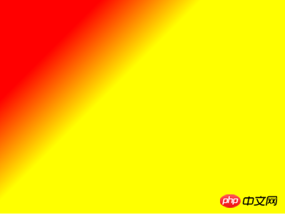
哎呀,貌似角度对了嘛!咋回事。
这是Chrome浏览器下的一个奇葩问题,最近,Chrome浏览器已经去掉了CSS3渐变的私有前缀,但是,其中的解析也有了写变化:
background-image:-webkit-linear-gradient(-45deg, red, yellow)
与
background-image:linear-gradient(-45deg, red, yellow)
在Chrome浏览器下的渐变方向居然是相反的!45deg是正常的。
Firefox浏览器下也是如此,有前缀和没有前缀方向相反!咋回事?
原因很简单,CSS3目前还是草案阶段!
从浏览器去掉前缀前后的变化可以推测,之前,W3C的渐变坐标是与photoshop中一致的,但是,后来,由于某些原因,修改了。
至于什么原因,根据我草草的查找,可能与下面几个关键字之一有联系:animation/transition动画、write-mode书写方向、flex box模型、以及radial-gradient渐变等。
using angles
For the purpose of this argument, ‘0deg’ points upward, and positive angles represent clockwise rotation, so ‘90deg’ point toward the right.
也就是:
使用angles
参数释义如下,‘0deg’指向上面,同时正角度顺时针旋转,因此‘90deg’指向右边。
我们画一下就是:
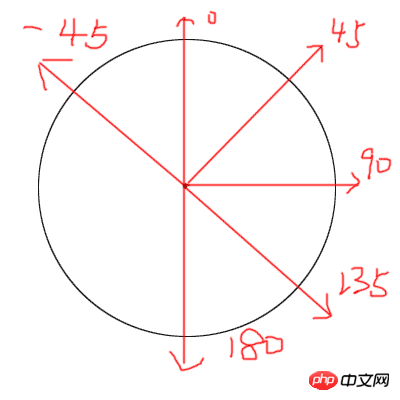
可见,目前,规范的渐变坐标系与photoshop是有差异的。
同时,也告诫我们,私有前缀可不能乱用哦!
面向未来,显然我们都要跟着规范走,于是有CSS:
{background-image:linear-gradient(135deg, red 100px, yellow 200px);}效果为:
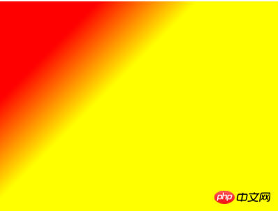
与PS图比一下:
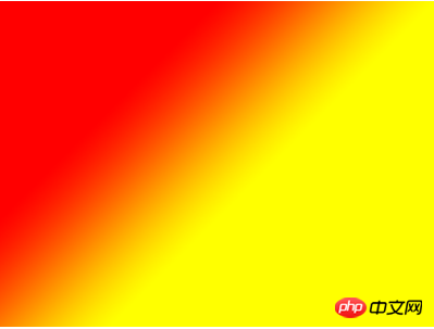
我去~怎么还是有出入啊?——红色区域大小明显不一样嘛!
我只能告诉你,事情远没有你想的那么简单!
四、深入理解角度坐标与位置关系
对于斜向线性渐变,点到点的渐变可不是直接把点的横坐标放上去就可以的。因为当渐变倾斜的时候,渐变的起止点的坐标也发生变化了。下图是官方规范的一张示意图,演示的是45deg渐变的起止点以及方向。
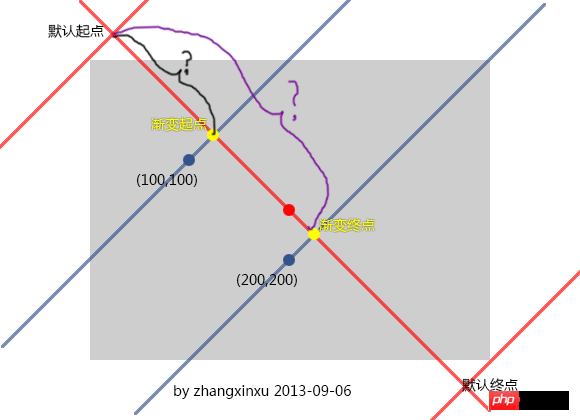
记住一个关键点,渐变的起点和终点(默认)在过中心的渐变线的垂直线上,于是,我们就可以确定起点与终点的位置了。按照这个理解,我们就可以画出400*300 p上135deg起始点在哪里,然后再确定(100,100)和(200,200)的位置就轻松多了。
如下示意图:

一图顶前言,反正上面这张图我是看懂了。于是,我们的坐标起止点值其实就变成了,黑色括弧的长度以及紫色括弧的长度值分别多少!
虽然很多人不喜欢数学,但是几何应该都还不错,我们来一起算一下……
//zxx: 长度计算中……
结果为,起点:
100 * Math.sqrt(2) = 141.4213562373095;
终点为:
200 * Math.sqrt(2) = 282.842712474619;
CSS用上:
{background-image:linear-gradient(135deg, red 141.4213562373095px, yellow 282.842712474619px);}效果:
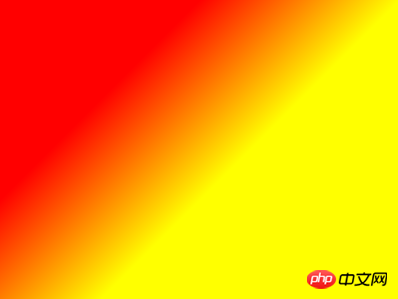
与PS的效果比对下:
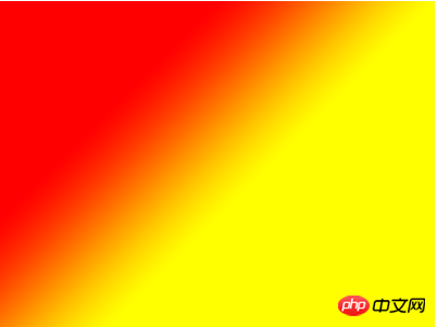
【相关推荐】
1. CSS3免费视频教程
2. 关于CSS3中linear-gradient参数的详解
3. CSS linear-gradient() 的语法详解
5. 详解CSS3中lineaer-gradient使用方法
The above is the detailed content of An in-depth explanation of the oblique linear gradient lineaer-gradient in CSS3. For more information, please follow other related articles on the PHP Chinese website!

Hot AI Tools

Undresser.AI Undress
AI-powered app for creating realistic nude photos

AI Clothes Remover
Online AI tool for removing clothes from photos.

Undress AI Tool
Undress images for free

Clothoff.io
AI clothes remover

Video Face Swap
Swap faces in any video effortlessly with our completely free AI face swap tool!

Hot Article

Hot Tools

Notepad++7.3.1
Easy-to-use and free code editor

SublimeText3 Chinese version
Chinese version, very easy to use

Zend Studio 13.0.1
Powerful PHP integrated development environment

Dreamweaver CS6
Visual web development tools

SublimeText3 Mac version
God-level code editing software (SublimeText3)

Hot Topics
 1670
1670
 14
14
 1428
1428
 52
52
 1329
1329
 25
25
 1274
1274
 29
29
 1256
1256
 24
24
 How to achieve wave effect with pure CSS3? (code example)
Jun 28, 2022 pm 01:39 PM
How to achieve wave effect with pure CSS3? This article will introduce to you how to use SVG and CSS animation to create wave effects. I hope it will be helpful to you!
 Use CSS skillfully to realize various strange-shaped buttons (with code)
Jul 19, 2022 am 11:28 AM
This article will show you how to use CSS to easily realize various weird-shaped buttons that appear frequently. I hope it will be helpful to you!
 How to hide elements in css without taking up space
Jun 01, 2022 pm 07:15 PM
Two methods: 1. Using the display attribute, just add the "display:none;" style to the element. 2. Use the position and top attributes to set the absolute positioning of the element to hide the element. Just add the "position:absolute;top:-9999px;" style to the element.
 It turns out that text carousel and image carousel can also be realized using pure CSS!
Jun 10, 2022 pm 01:00 PM
How to create text carousel and image carousel? The first thing everyone thinks of is whether to use js. In fact, text carousel and image carousel can also be realized using pure CSS. Let’s take a look at the implementation method. I hope it will be helpful to everyone!
 How to implement lace borders in css3
Sep 16, 2022 pm 07:11 PM
In CSS, you can use the border-image attribute to achieve a lace border. The border-image attribute can use images to create borders, that is, add a background image to the border. You only need to specify the background image as a lace style; the syntax "border-image: url (image path) offsets the image border width inward. Whether outset is repeated;".
 How to enlarge the image by clicking the mouse in css3
Apr 25, 2022 pm 04:52 PM
Implementation method: 1. Use the ":active" selector to select the state of the mouse click on the picture; 2. Use the transform attribute and scale() function to achieve the picture magnification effect, the syntax "img:active {transform: scale(x-axis magnification, y Axis magnification);}".
 How to set animation rotation speed in css3
Apr 28, 2022 pm 04:32 PM
In CSS3, you can use the "animation-timing-function" attribute to set the animation rotation speed. This attribute is used to specify how the animation will complete a cycle and set the speed curve of the animation. The syntax is "element {animation-timing-function: speed attribute value;}".
 Can css3 linear gradient achieve triangles?
Apr 25, 2022 pm 02:47 PM
CSS3 linear gradient can realize triangles; just create a 45-degree linear gradient and set the gradient color to two fixed colors, one is the color of the triangle and the other is transparent color. The syntax "linear-gradient(45deg, color value , color value 50%, transparent color 50%, transparent color 100%)".


