Today I started to sort out the knowledge of CSS3
In fact, I should have written it last night, but it seemed to be acute gastroenteritis. I was in so much pain that I couldn’t sleep all night. Blue Slim Shiitake Mushroom
It’s okay I'll be fine if I take an intravenous drip and sleep today. It seems like I'd better be careful about what I eat. My gastrointestinal tract took revenge.
CSS is not difficult, but you have to try it on the browser while reading. Try it again. Just remember
It’s all in vain if you don’t see it
CSS3 browsers have compatibility issues
Different browsers have private properties with different prefixes. Indicates that the attribute or rule has not yet become a standard
In other words, before the official announcement of the standard, various browsers have secretly implemented it
But the real standard may not necessarily look like in the future. What to do, then add a prefix Bar
Although the new version of the browser does not need to add a prefix, to ensure compatibility you still need to write
| Browser | Prefix |
|---|
| chrome/safari | -webkit |
| firefox | - moz |
| IE | -ms |
| opear | -o |
border-radius Detailed explanation of CSS3 rounded corners, box shadows and border imagesed corners
The word radius means radius
If you want to achieve this effect before CSS3, the best way is probably to usePhotoshop了
Through this attribute, we can add "Detailed explanation of CSS3 rounded corners, box shadows and border imagesed corners" to our elements
For example, we turn an element into a circle
.demo { width: 100px; height: 100px; backgDetailed explanation of CSS3 rounded corners, box shadows and border images-color: gold; border-radius: 50%;}Copy after login

Why If the value of the border-radius attribute is 50%, it becomes a circle?
Based on our understanding of CSS, it must be a composite attribute, which is equivalent to border-radius: 50% 50% 50% 50%;
border-radius can be split into
border-top-left-radius: The arc of the upper left corner of the border
border-top-rigtht-radius: The upper right corner of the border The arc of the corner
border-bottom-left-radius: The arc of the lower left corner of the border
border-bottom- rigtht-radius: The arc of the lower right corner of the border
So it is equivalent to the code below, but let’s not write such a troublesome
.demo { width: 100px; height: 100px; backgDetailed explanation of CSS3 rounded corners, box shadows and border images-color: gold; border-top-left-radius: 50%; border-top-right-radius: 50%; border-bottom-left-radius: 50%; border-bottom-right-radius: 50%;}Copy after login
Just take this border-top-left-radius: 50%

In fact, it is equivalent to drawing a rectangle on the seat of the element box. The width and height of the rectangle are Half of the element (50%)
And draw an arc with the point close to the inside of the element as the center of the circle
So the four attributes together become a circle

This attribute can be more complex
The following code is equivalent
.demo { width: 100px; height: 100px; backgDetailed explanation of CSS3 rounded corners, box shadows and border images-color: gold; border-top-left-radius: 10px 20px; border-top-right-radius: 20px 30px; border-bottom-right-radius: 30px 40px; border-bottom-left-radius: 40px 50px;}Copy after login
.demo { width: 100px; height: 100px; backgDetailed explanation of CSS3 rounded corners, box shadows and border images-color: gold; border-radius: 10px 20px 30px 40px / 20px 30px 40px 50px;}Copy after login
Note that the order is clockwise: upper left, upper right, lower right, lower left
It’s really not possible to write in such a crazy way Common
sub-attributes appear to be composite attributes border-top-left-radius: 10px 20px;
But it is not. Out of curiosity, I tried it and found that there is no border-top -left-radius-xThis attribute
The first number represents the distance in the x-axis direction of the rectangle, and the second number represents the distance in the y-axis direction of the rectangle.
Don’t let the previous top-left mislead you
All similar attributes in css have the x-axis in front and the y-axis in the back.
For example, backgDetailed explanation of CSS3 rounded corners, box shadows and border images-positionthe composite property is backgDetailed explanation of CSS3 rounded corners, box shadows and border images-position-xIn front, backgDetailed explanation of CSS3 rounded corners, box shadows and border images-position-yIn back
With this fun attribute, we can make a semicircle
.demo { width: 200px; height: 100px; backgDetailed explanation of CSS3 rounded corners, box shadows and border images-color: orangered; border-radius: 100px 100px 0 0 / 100px 100px 0 0;}Copy after login

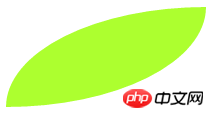
A leaf
.demo { width: 200px; height: 100px; backgDetailed explanation of CSS3 rounded corners, box shadows and border images-color: greenyellow; border-radius: 200px 0 200px 0 / 100px 0 100px 0;}Copy after login
is similar to our padding, margin and other composite attributes
Write 1 valueborder-radius : 10px –> ↖/↗/↘/↙
Write 2 valuesborder-radius: 10px 20px –> ↖/↘,↗/↙
Write 3 values Value border-radius: 10px 20px 30px –> ↖, ↗/↙, ↘
Write 4 values border-radius: 10px 20px 30px 40px –> ↖, ↗, ↘, ↙
I believe everyone understands what I mean
box-shadow box-shadow
I add a line of code to the leaf we wrote above
.demo { width: 200px; height: 100px; backgDetailed explanation of CSS3 rounded corners, box shadows and border images-color: greenyellow; border-radius: 200px 0 200px 0 / 100px 0 100px 0; box-shadow: 10px 20px;}Copy after login
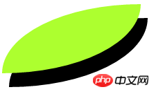
The shadow effect is produced. The attribute value is the offset of the x-axis and the offset of the y-axis.
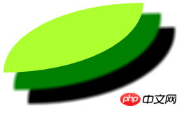
In addition, there are some optional attribute values: shadow blur radius, shadow Expansion radius, shadow color, projection method
A box can have multiple shadows at the same time, just separate them with commas
.demo { width: 200px; height: 100px; backgDetailed explanation of CSS3 rounded corners, box shadows and border images-color: greenyellow; border-radius: 200px 0 200px 0 / 100px 0 100px 0; box-shadow: 20px 20px 5px 5px green, 40px 40px 5px 5px;}Copy after login
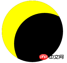
As for the projection method, the default is external projection , we can set the attribute value inset to become an inner projection
For example, to create the effect of a lunar eclipse
.demo { width: 200px; height: 200px; backgDetailed explanation of CSS3 rounded corners, box shadows and border images-color: black; border-radius: 50%; box-shadow: 40px 40px 0 0 yellow inset;}Copy after login
border-image border picture
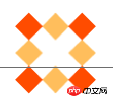
First I need a resource as a border image

The size of the image I took is 81px*81px
border-image is also a Composite attributes, sub-attributes include these
border-image-source: image source path
border-image-slice: specifies the border of the image Offset inward
border-image-Detailed explanation of CSS3 Detailed explanation of CSS3 rounded corners, box shadows and border imagesed corners, box shadows and border images: The tiling method of the border image
border-image-width :Detailed explanation of CSS3 Detailed explanation of CSS3 rounded corners, box shadows and border imagesed corners, box shadows and border images宽度
(border-image-outset用不上不讲了)
.demo { width: 54px; height: 54px; border: 27px solid transparent; border-image: url('border.png');}Copy after login
只写一个Detailed explanation of CSS3 Detailed explanation of CSS3 rounded corners, box shadows and border imagesed corners, box shadows and border images资源样子会很奇怪
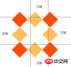
我们先加上裁剪属性值
.demo { width: 54px; height: 54px; border: 27px solid transparent; border-image: url('border.png') 27;}Copy after login

注意它没有单位(默认px),也可以用百分比的形式
这里的27表示对Detailed explanation of CSS3 Detailed explanation of CSS3 rounded corners, box shadows and border imagesed corners, box shadows and border images四个方向(上右下左)都从外向里裁剪27px变成一个Detailed explanation of CSS3 Detailed explanation of CSS3 rounded corners, box shadows and border imagesed corners, box shadows and border images
然后将四个角的Detailed explanation of CSS3 Detailed explanation of CSS3 rounded corners, box shadows and border imagesed corners, box shadows and border images放到Detailed explanation of CSS3 Detailed explanation of CSS3 rounded corners, box shadows and border imagesed corners, box shadows and border images的四个角
将剩下的部分(中间的扔掉)拉伸(默认)放到Detailed explanation of CSS3 Detailed explanation of CSS3 rounded corners, box shadows and border imagesed corners, box shadows and border images余下的位置
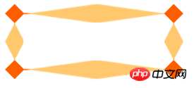
如果你想裁剪不同像素,可以分开写
比如border-image: url('border.png') 10% 20% 30% 40%;
Detailed explanation of CSS3 Detailed explanation of CSS3 rounded corners, box shadows and border imagesed corners, box shadows and border images就会被划成这样
平铺方式一下有几种
Detailed explanation of CSS3 Detailed explanation of CSS3 rounded corners, box shadows and border imagesed corners, box shadows and border images 拉伸
Detailed explanation of CSS3 Detailed explanation of CSS3 rounded corners, box shadows and border imagesed corners, box shadows and border images 平铺
Detailed explanation of CSS3 rounded corners, box shadows and border images 铺满(拉伸平铺)
默认的就是Detailed explanation of CSS3 Detailed explanation of CSS3 rounded corners, box shadows and border imagesed corners, box shadows and border images拉伸
现在我把盒子宽度变为200px,再来比较这三种方式的区别
.demo { /*①拉伸*/
    width: 200px;    height: 54px;    border: 27px solid transparent;    border-image: url('border.png') 27 Detailed explanation of CSS3 Detailed explanation of CSS3 rounded corners, box shadows and border imagesed corners, box shadows and border images;}
Copy after login
拉伸就是把Detailed explanation of CSS3 Detailed explanation of CSS3 rounded corners, box shadows and border imagesed corners, box shadows and border images自适应拉开
.demo { /*②平铺*/
    width: 200px;    height: 54px;    border: 27px solid transparent;    border-image: url('border.png') 27 Detailed explanation of CSS3 Detailed explanation of CSS3 rounded corners, box shadows and border imagesed corners, box shadows and border images;}
Copy after login
平铺会把裁剪的Detailed explanation of CSS3 Detailed explanation of CSS3 rounded corners, box shadows and border imagesed corners, box shadows and border images放到中间的位置,然后向两边重复
.demo { /*③铺满*/
    width: 200px;    height: 54px;    border: 27px solid transparent;    border-image: url('border.png') 27 Detailed explanation of CSS3 rounded corners, box shadows and border images;}
Copy after login
铺满是拉伸和平铺的结合,不会造成上面的切割效果(毫无违和感)
当然它会尽可能重复多个小方格
我们可以再调整Detailed explanation of CSS3 Detailed explanation of CSS3 rounded corners, box shadows and border imagesed corners, box shadows and border imagesDetailed explanation of CSS3 Detailed explanation of CSS3 rounded corners, box shadows and border imagesed corners, box shadows and border images的宽度
比如说我要调整为20px
在裁剪属性值后加‘/’写上要调整的宽度值
.demo { width: 200px; height: 54px; border: 27px solid transparent; border-image: url('border.png') 27/20px Detailed explanation of CSS3 rounded corners, box shadows and border images;}Copy after login
今天这个就不总结了,都在上面了
The above is the detailed content of Detailed explanation of CSS3 rounded corners, box shadows and border images. For more information, please follow other related articles on the PHP Chinese website!


![[Web front-end] Node.js quick start](https://img.php.cn/upload/course/000/000/067/662b5d34ba7c0227.png)


