Introducing several new technologies in CSS3
Webpage production Webjx article introduction: Webpage Teaching Network will show you 5 interesting new technologies in CSS in this article: rounded corners, individual rounded corners, opacity, shadow and adjusting element size.
CSS is a well-known and widely used website style language. In its version three (CSS3) plan, some new features have been added that can save time
Script House will show you 5 interesting new technologies in CSS in this article: rounded corners, individual rounded corners, opacity, shadow and resizing elements.
CSS is a well-known and widely used website style language. In its version three (CSS3) plan, some new features that can save time have been added. Although these effects are only supported by the latest browser versions, it is still necessary and interesting to understand them. Script House will show you 5 interesting new technologies in CSS in this article: rounded corners, individual rounded corners, opacity, shadows and resizing elements.
Related articles: Introducing 5 tips for using CSS3
1: Basic tags 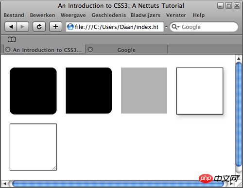
Before we start this tutorial, let’s create the basic tags that will be used throughout the tutorial.
Our xHTML requires the p element:
#round, use CSS3 code to achieve rounded corners.
#indie, use individual rounded corners.
#opacity, demonstrates the new CSS3 way of implementing opacity.
#shadow, shows how to use CSS3 to achieve the shadow effect without using Photoshop.
#resize, shows how to use some CSS to achieve the resize effect.
To summarize, our xHTML should look like this:
<!DOCTYPE html PUBLIC “-//
W3C
//
DTD
 XHTML 1.0 Transitional//EN” “http://www.w3.org/TR/xhtml1/DTD/xhtml1-transitional.dtd”>
<html
xml
ns=”http://www.w3.org/1999/xhtml”>
<
head
>
<meta http-equiv=”Content-Type” content=”text/html; char
set
=utf-8″ />
<title>An Introduction to CSS3; A Nettuts Tutorial</title>
<link href=”style.css” rel=”stylesheet” type=”text/css” />
</head>
<body>
<p id=”wrapper”>
<p id=”round”> </p>
<p id=”indie”> </p>
<p id=”opacity”> </p>
<p id=”shadow”> </p>
<p id=”resize”>
<img class="alignnone size-full wp-image-2157 lazy"  src="/static/imghw/default1.png"  data-src="https://img.php.cn/upload/article/000/001/505/8634c49225d2d852dacdbbadecbfda3a-1.png"  src=”image.jpg” alt=”resizable image” width=”200″ height=”200″>
</p>
</p>
</body>
</html>
Let’s create the basic CSS file:
body {
background-color: #fff;
}
#wrapper {
width: 100%;
height: 100%;
}
p {
width: 300px;
height: 300px;
margin: 10px;
float: left;
} As you can see above, we give each p element 300px width and height, and let them float to the left. The p of the entire page is left for us to add styles in the later work. Seeing this information means that the article comes from Script House www.jb51.net. If the article is incomplete, please go to Script House jb51.net to browse!
2: Rounded corners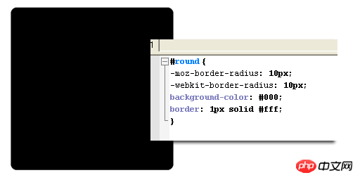
Currently, there are many ways to create rounded corners, but they are all troublesome. The most commonly used method: First, you have to create a image with rounded corners; then, you have to create a lot of html elements and use a background image to display the rounded corners . You and I know the specific process very well.
This problem will be solved very simply in CSS3, that is the property called "border-radius". We first create a black p element and set a black border to it. The border is the prerequisite for achieving the effect of the "border-radius" attribute.
Like this:
#round {
background-color: #000;
border: 1px solid #000;
}Now that you have created the p element, it looks just like you expected, 300px tall, angular, and black. Now let's add the code to implement rounded corners. It is so simple and requires only two lines of code.
#round {
background-color: #000;
border: 1px solid #000;
-moz-border-radius: 10px;
-webkit-border-radius: 10px;
}Here, we add two similar lines of code, -moz- is for Firefox browser, and -webkit- is for Safari/Chrome browser.
Note: So far IE browser does not support the border-radius attribute, so if you want IE to have a rounded corner effect, you need to add rounded corners separately.
border-radius This attribute is literally translated as the border radius. Just like Photoshop, the larger its value, the larger the fillet will be.
【Related recommendations】
2. Share 22 H5 and CSS3 help Tools
4. Detailed explanation of examples of selectors in CSS3
5. Integrate 20 common CSS/CSS3 properties
The above is the detailed content of Introducing several new technologies in CSS3. For more information, please follow other related articles on the PHP Chinese website!

Hot AI Tools

Undresser.AI Undress
AI-powered app for creating realistic nude photos

AI Clothes Remover
Online AI tool for removing clothes from photos.

Undress AI Tool
Undress images for free

Clothoff.io
AI clothes remover

Video Face Swap
Swap faces in any video effortlessly with our completely free AI face swap tool!

Hot Article

Hot Tools

Notepad++7.3.1
Easy-to-use and free code editor

SublimeText3 Chinese version
Chinese version, very easy to use

Zend Studio 13.0.1
Powerful PHP integrated development environment

Dreamweaver CS6
Visual web development tools

SublimeText3 Mac version
God-level code editing software (SublimeText3)

Hot Topics
 What to do if the blue screen code 0x0000001 occurs
Feb 23, 2024 am 08:09 AM
What to do with blue screen code 0x0000001? The blue screen error is a warning mechanism when there is a problem with the computer system or hardware. Code 0x0000001 usually indicates a hardware or driver failure. When users suddenly encounter a blue screen error while using their computer, they may feel panicked and at a loss. Fortunately, most blue screen errors can be troubleshooted and dealt with with a few simple steps. This article will introduce readers to some methods to solve the blue screen error code 0x0000001. First, when encountering a blue screen error, we can try to restart
 The computer frequently blue screens and the code is different every time
Jan 06, 2024 pm 10:53 PM
The win10 system is a very excellent high-intelligence system. Its powerful intelligence can bring the best user experience to users. Under normal circumstances, users’ win10 system computers will not have any problems! However, it is inevitable that various faults will occur in excellent computers. Recently, friends have been reporting that their win10 systems have encountered frequent blue screens! Today, the editor will bring you solutions to different codes that cause frequent blue screens in Windows 10 computers. Let’s take a look. Solutions to frequent computer blue screens with different codes each time: causes of various fault codes and solution suggestions 1. Cause of 0×000000116 fault: It should be that the graphics card driver is incompatible. Solution: It is recommended to replace the original manufacturer's driver. 2,
 GE universal remote codes program on any device
Mar 02, 2024 pm 01:58 PM
If you need to program any device remotely, this article will help you. We will share the top GE universal remote codes for programming any device. What is a GE remote control? GEUniversalRemote is a remote control that can be used to control multiple devices such as smart TVs, LG, Vizio, Sony, Blu-ray, DVD, DVR, Roku, AppleTV, streaming media players and more. GEUniversal remote controls come in various models with different features and functions. GEUniversalRemote can control up to four devices. Top Universal Remote Codes to Program on Any Device GE remotes come with a set of codes that allow them to work with different devices. you may
 Resolve code 0xc000007b error
Feb 18, 2024 pm 07:34 PM
Termination Code 0xc000007b While using your computer, you sometimes encounter various problems and error codes. Among them, the termination code is the most disturbing, especially the termination code 0xc000007b. This code indicates that an application cannot start properly, causing inconvenience to the user. First, let’s understand the meaning of termination code 0xc000007b. This code is a Windows operating system error code that usually occurs when a 32-bit application tries to run on a 64-bit operating system. It means it should
 How to use Copilot to generate code
Mar 23, 2024 am 10:41 AM
As a programmer, I get excited about tools that simplify the coding experience. With the help of artificial intelligence tools, we can generate demo code and make necessary modifications as per the requirement. The newly introduced Copilot tool in Visual Studio Code allows us to create AI-generated code with natural language chat interactions. By explaining functionality, we can better understand the meaning of existing code. How to use Copilot to generate code? To get started, we first need to get the latest PowerPlatformTools extension. To achieve this, you need to go to the extension page, search for "PowerPlatformTool" and click the Install button
 A quick guide to learning Python drawing: code example for drawing ice cubes
Jan 13, 2024 pm 02:00 PM
Quickly get started with Python drawing: code example for drawing Bingdundun Python is an easy-to-learn and powerful programming language. By using Python's drawing library, we can easily realize various drawing needs. In this article, we will use Python's drawing library matplotlib to draw a simple graph of ice. Bingdundun is a cute panda who is very popular among children. First, we need to install the matplotlib library. You can do this by running in the terminal
 What does the blue screen code 0x000000d1 represent?
Feb 18, 2024 pm 01:35 PM
What does the 0x000000d1 blue screen code mean? In recent years, with the popularization of computers and the rapid development of the Internet, the stability and security issues of the operating system have become increasingly prominent. A common problem is blue screen errors, code 0x000000d1 is one of them. A blue screen error, or "Blue Screen of Death," is a condition that occurs when a computer experiences a severe system failure. When the system cannot recover from the error, the Windows operating system displays a blue screen with the error code on the screen. These error codes
 Create and run Linux ".a" files
Mar 20, 2024 pm 04:46 PM
Working with files in the Linux operating system requires the use of various commands and techniques that enable developers to efficiently create and execute files, code, programs, scripts, and other things. In the Linux environment, files with the extension ".a" have great importance as static libraries. These libraries play an important role in software development, allowing developers to efficiently manage and share common functionality across multiple programs. For effective software development in a Linux environment, it is crucial to understand how to create and run ".a" files. This article will introduce how to comprehensively install and configure the Linux ".a" file. Let's explore the definition, purpose, structure, and methods of creating and executing the Linux ".a" file. What is L


