
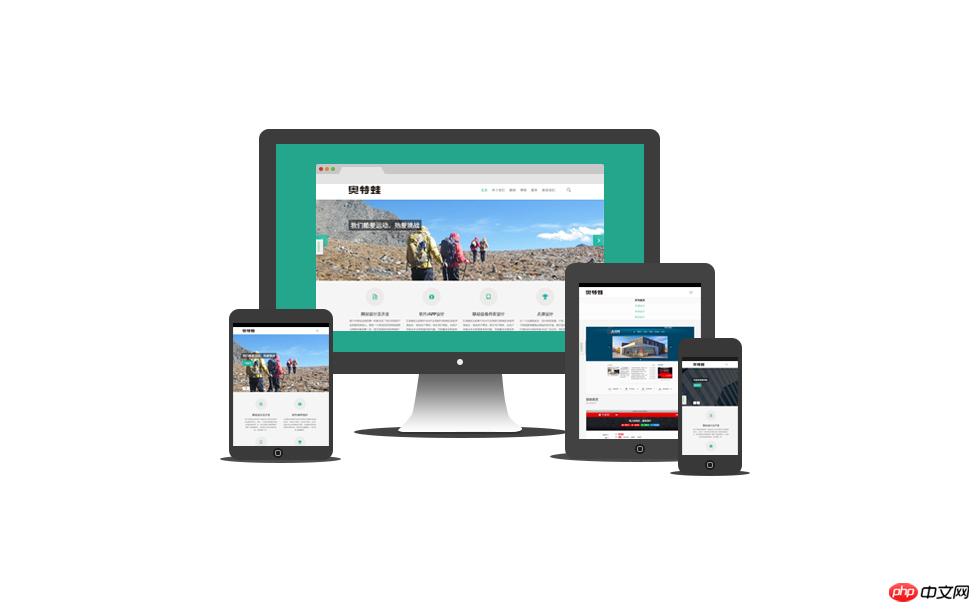
One of the most popular forms of web pages currently is full-screen large images. This article will use the simplest way to achieve this effect. The CSS property background-size is used ,no javascript required.
Core Concept
## Use the background-size attribute to fill the entire viewport
Use media queries to provide smaller-sized background images for mobile devices
But there is no need to use such large images on mobile devices. At the same time, large images will cause slower loading, especially on mobile networks.
It should be noted that providing a small background image for mobile devices is optional for this technical solution.
Practice
##<!doctype html>
<html>
<body>
...Your content goes here...
</body>
</html>
body {
/* 加载背景图 */
background-image: url(images/background-photo.jpg);

/* 背景图垂直、水平均居中 */
background-position: center center;

/* 背景图不平铺 */
background-repeat: no-repeat;

/* 当内容高度大于图片高度时,背景图像的位置相对于viewport固定 */
background-attachment: fixed;

/* 让背景图基于容器大小伸缩 */
background-size: cover;

/* 设置背景颜色,背景图加载过程中会显示背景色 */
background-color: #**46;
}
background-size: cover;
One thing to note here is that if the background image is smaller than the size of the body tag (for example, on a high-resolution monitor, or when the page content is particularly large), the browser will stretch the image. We all know that when an image is stretched, it becomes blurry. Therefore, when choosing a background image, pay special attention to the size. In order to take care of the large screen size, the image size used in the demo is 5498px * 3615px.
At the same time, in order to keep the background image always centered relative to the viewport, we declare:
background-position: center center;
The above rules will position the origin of the background image scaling to the center of the viewport.
The next problem we need to solve is: when the height of the content is greater than the height of the viewport, a scroll bar will appear. We want the background image to remain fixed relative to the viewport, even as the user scrolls.
The solution is:
background-attachment: fixed;
## (Optional) Use media queries to deal with small screens
In order to cope with the small screen, I used photoshop to scale the background image to 768px * 505px, and then used smush.it Compress image size. This reduces the image size from 1741KB to 114KB, saving 93%. The following is how the media query is written:
@media only screen and (max-width: 767px) {
  body {
    background-image: url(images/background-photo-mobile-devices.jpg);
  }
}The above is the detailed content of CSS implements responsive full-screen background image. For more information, please follow other related articles on the PHP Chinese website!


![[Web front-end] Node.js quick start](https://img.php.cn/upload/course/000/000/067/662b5d34ba7c0227.png)


