
 Web Front-end
CSS Tutorial
Detailed explanation of how to solve the gap caused by display:inline-block in CSS layout
Web Front-end
CSS Tutorial
Detailed explanation of how to solve the gap caused by display:inline-block in CSS layout
Detailed explanation of how to solve the gap caused by display:inline-block in CSS layout

I used display:inline-block; when making H5 horizontal sliding cards, but found that there were gaps between elements on the same horizontal line. This was obviously not the effect I wanted, so I I changed it to left floating, which solved the problem of gaps, but the width of the parent element needs to be set to achieve horizontal left and right scrolling, which increases the amount of code. Because the number of cards is not fixed, the width of its parent element needs to be set in real time. Width requires js, so the amount of code increases, which is not the best choice. It seems that the best solution is to use display:inline-block;, so the gap problem arises. The code is as follows:
<!DOCTYPE html>
<html>
<head>
<meta name="viewport" content="width=device-width, initial-scale=1.0, maximum-scale=1.0, user-scalable=no">
<title>document</title>
<style>
*{margin:0;padding:0;}
.box{overflow-x:auto;background:#fff;white-space:nowrap;}
.box span{display:inline-block;width:100px;height:30px;line-height:30px;text-align:center;background:#f00;color:#fff;}
</style>
</head>
<body>
<p class="box">
    <span>111</span>
    <span>111</span>
    <span>111</span>
    <span>111</span>
</p>
</body>
</html>The effect is as follows:
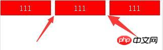
This gap obviously exists. It is said that this performance is what it should be in compliance with the specifications. It is caused by whitespace characters caused by line breaks. But this effect is obviously not what we want. The gap we want is the margin we set according to our actual needs. So how to eliminate this gap? There are three methods:
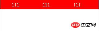
Method one: No line breaks between elements, the code is as follows:
<p class="box">  <span>111</span><span>111</span><span>111</span><span>111</span>
</p>
The effect is as follows:
Method 2: Set font-size:0 for its parent element; set the actual required font size for itself. The bad thing is that some browsers, such as chrome and opera, have minimum font settings, but chrome doesn’t seem to have this setting anymore. The code is as follows:
css:
.box{overflow-x:auto;background:#fff;white-space:nowrap;font-size:0;}
.box span{display:inline-block;width:100px;height:30px;line-height:30px;text-align:center;background:#f00;color:#fff;font-size:14px;}html:
<p class="box">
    <span>111</span>
    <span>111</span>
    <span>111</span>
    <span>111</span>
</p>The effect is as follows:
Method 3: Negative margin method, what needs to be paid attention to is the gap and the font size The size is related, so the gap is not a definite value.
Of the above three methods, the first two are better solutions, and the third method is not recommended. There are other solutions online, but I think the first two are better.
The above is the detailed content of Detailed explanation of how to solve the gap caused by display:inline-block in CSS layout. For more information, please follow other related articles on the PHP Chinese website!

Hot AI Tools

Undresser.AI Undress
AI-powered app for creating realistic nude photos

AI Clothes Remover
Online AI tool for removing clothes from photos.

Undress AI Tool
Undress images for free

Clothoff.io
AI clothes remover

Video Face Swap
Swap faces in any video effortlessly with our completely free AI face swap tool!

Hot Article
Hot Tools

Notepad++7.3.1
Easy-to-use and free code editor

SublimeText3 Chinese version
Chinese version, very easy to use

Zend Studio 13.0.1
Powerful PHP integrated development environment

Dreamweaver CS6
Visual web development tools

SublimeText3 Mac version
God-level code editing software (SublimeText3)
Hot Topics
 1653
1653
 14
1413
52
1305
25
1251
29
1224
24
14
1413
52
1305
25
1251
29
1224
24

 How to use bootstrap in vue
Apr 07, 2025 pm 11:33 PM
How to use bootstrap in vue
Apr 07, 2025 pm 11:33 PM
Using Bootstrap in Vue.js is divided into five steps: Install Bootstrap. Import Bootstrap in main.js. Use the Bootstrap component directly in the template. Optional: Custom style. Optional: Use plug-ins.
 Understanding HTML, CSS, and JavaScript: A Beginner's Guide
Apr 12, 2025 am 12:02 AM
Understanding HTML, CSS, and JavaScript: A Beginner's Guide
Apr 12, 2025 am 12:02 AM
WebdevelopmentreliesonHTML,CSS,andJavaScript:1)HTMLstructurescontent,2)CSSstylesit,and3)JavaScriptaddsinteractivity,formingthebasisofmodernwebexperiences.
 The Roles of HTML, CSS, and JavaScript: Core Responsibilities
Apr 08, 2025 pm 07:05 PM
The Roles of HTML, CSS, and JavaScript: Core Responsibilities
Apr 08, 2025 pm 07:05 PM
HTML defines the web structure, CSS is responsible for style and layout, and JavaScript gives dynamic interaction. The three perform their duties in web development and jointly build a colorful website.
 How to write split lines on bootstrap
Apr 07, 2025 pm 03:12 PM
How to write split lines on bootstrap
Apr 07, 2025 pm 03:12 PM
There are two ways to create a Bootstrap split line: using the tag, which creates a horizontal split line. Use the CSS border property to create custom style split lines.
 How to insert pictures on bootstrap
Apr 07, 2025 pm 03:30 PM
How to insert pictures on bootstrap
Apr 07, 2025 pm 03:30 PM
There are several ways to insert images in Bootstrap: insert images directly, using the HTML img tag. With the Bootstrap image component, you can provide responsive images and more styles. Set the image size, use the img-fluid class to make the image adaptable. Set the border, using the img-bordered class. Set the rounded corners and use the img-rounded class. Set the shadow, use the shadow class. Resize and position the image, using CSS style. Using the background image, use the background-image CSS property.
 How to use bootstrap button
Apr 07, 2025 pm 03:09 PM
How to use bootstrap button
Apr 07, 2025 pm 03:09 PM
How to use the Bootstrap button? Introduce Bootstrap CSS to create button elements and add Bootstrap button class to add button text
 How to set up the framework for bootstrap
Apr 07, 2025 pm 03:27 PM
How to set up the framework for bootstrap
Apr 07, 2025 pm 03:27 PM
To set up the Bootstrap framework, you need to follow these steps: 1. Reference the Bootstrap file via CDN; 2. Download and host the file on your own server; 3. Include the Bootstrap file in HTML; 4. Compile Sass/Less as needed; 5. Import a custom file (optional). Once setup is complete, you can use Bootstrap's grid systems, components, and styles to create responsive websites and applications.
 How to resize bootstrap
Apr 07, 2025 pm 03:18 PM
How to resize bootstrap
Apr 07, 2025 pm 03:18 PM
To adjust the size of elements in Bootstrap, you can use the dimension class, which includes: adjusting width: .col-, .w-, .mw-adjust height: .h-, .min-h-, .max-h-
