
First of all, I would like to introduce that I think front-end development is very sharing spirit. Many people have written many excellent summary experiences for the reference of novices. I am just a porter, translating other people's excellent articles. To summarize, this article is mainly reproduced from Da Mo’s article http://www.w3cplus.com/css3/introducing-css-clip-path-property.html
In Web pages, rectangles are mainly used Distribution. Print media, on the other hand, tends to have more different shapes. The reason for this disparity is the lack of appropriate tools to realize the content in our print media. This has also caused many designers to use their creativity. Even if they are creative, front-end implementation will also incur huge development costs.
Although the specification of CSS Shapes Module Level 1 (CSS Shape Module Standard 1) appears, the limitations of rectangular design can be broken. But some irregular graphics are still needed. In the past, to implement some irregular graphics, you needed to use other element functions, such as CSS to draw graphics, which often relied on pseudo-elements or multiple elements. As a result, CSS Shapes still cannot exert its powerful functions, allowing our Web to break the conventional rectangular layout. But thankfully, CSS clip-path appears, which can help us draw many special graphics (irregular graphics). The address is http://bennettfeely.com/clippy/ For example:

So in this article, we will learn about this attribute together.
Before learning this attribute, let’s first understand the compatibility
Seeing this, everyone will definitely ask, browser compatibility How was the sex?
IE and Edge do not support this attribute. Firefox only partially supports clip-path (it only supports the url() syntax). However, for versions 47 and above, activating Firefox's layout.css.clip-path-shapes.enabled option can support this attribute.
Chrome, Safari and Opera need to use the -webkit- prefix to support this attribute. Unfortunately, they don't support external SVG shapes yet. More browser support information is as follows:

clip-pathFrom the literal translation of the word "clip path" Say, it represents the clipping path. Now that there is tailoring, let's understand a few simple concepts here.
Cutting is to cut a piece from something. For example, on the <img src="/static/imghw/default1.png" data-src="https://img.php.cn/upload/article/000/000/007/cd75ccc79aef3e041fa2332d811a2ed3-2.png" class="lazy" alt="CSS clip-path" > element, we cut off part of the area that needs to be left as needed. In the entire cropping process, you will encounter two related concepts: Clipping Path(Clipping Path) and Clipping Region(Clipping Region).
Clipping path is the path we use to clip elements, which marks the area we need to clip. It can be a simple shape (such as a common rectangle in the Web) or a complex polygon (irregular polygon).
Crop area is the entire area included after the clipping path is closed.

In this way, the element is divided into two parts, the clipping area and outside the clipping area. The browser will crop the area outside the cropping area, not only the background and other similar content, but also border, text-shadow wait. What's even better is that the browser will not capture events such as hover and click outside the element's clipping area.
Even though some specific elements are now not restricted by the rectangle, the content around the element will actually consider the element to be in its original shape (rectangular) and layout the document flow accordingly. To make surrounding elements layout according to the clipped shape of the element, you can use the shape-outside attribute. For a detailed introduction to shape-outside, you can read the tutorials related to CSS Shapes. I won’t go into too much elaboration here.
CSS Masking Module Level 1 also provides a clip property. It can be said that clip is the first clipping technology that appeared in CSS. In fact, students who have learned about clip know that it hides elements outside the clipping area through overflow:hidden. It's not a true crop, so to speak.
clip attribute so far only supports the rect() function, which is to cut out a rectangle (other shapes cannot be implemented yet).
clip: rect(<top>, <right>, <bottom>, <left>);</left></bottom></right></top>
In CSS2.1, rect() and <top></top> and <bottom></bottom>The specified offset is calculated from the top edge of the element box; <left></left> The offset specified with <right></right> is calculated from the left edge of the element box.
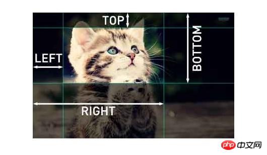
What’s even more frustrating is that the clip attribute can only be set on the element position:absolute or position:fixed works. Not working on settings position:relative and position:static.
In CSS, the clip attribute is obsolete, which means that it is no longer recommended to be used because there is a newer, standardized version. Individual browsers will also focus their efforts on using it.
Of course, clip also has some advantages: because clip runs in the browser,It maywill always be valid. And browser support for it is very strong: almost every browser ever made. In addition, I have also heard that the animation effect it produces is better than other new methods.
But compared to its advantages, clip has two more important weaknesses, which also makes it difficult to be widely used:
clip Only valid for absolutely positioned elements
clip Can only be used for rectangles, that is, rect()Function
This is really a very big limitation! So let's move on to the next more important property clip-path.
如果你是第一次接触过clip属性,我建议您花点时间阅读一下这篇文章,它能帮助你对clip有一个简单的了解。
clip-path provided by W3C official specification:
clip-path: <clip-source> | [ <basic-shape> || <geometry-box> ] | none
其默认值是none。另外简单介绍clip-path几个属性值:
clip-source: Can be internal or external SVG<clipPath> ;The URL reference of the element
basic-shape: Use some basic shapes A shape created by the function. Mainly include circle(), ellipse(), inset() and polygon(). For specific instructions, please see the instructions in CSS Shapes. It is also introduced in detail in the article CSS Shapes 101.
geometry-box: is an optional parameter. When this parameter is used together with the basic-shape function, it can provide a reference box for the clipping work of basic-shape. If geometry-box is specified by itself, then it will use the specified box shape as the clipping path, including any corners (provided by border-radius) shape.
Before you start using clip-path to draw graphics, or crop graphics, There are two points that everyone needs to pay attention to:
Use clip-path to draw from the same direction, if you draw clockwise, It is always clockwise, and it is always counterclockwise , because polygon is a continuous line segment. If the line segments intersect with each other, the clipping area will be subtracted. Of course, except if you specifically need such an effect.
如果绘制时采用比例的方式绘制,长宽就必须要先行设定,不然有可能绘制出来的长宽和我们想像的就会有差距,使用像素绘制就不会有这样的现象。
先来看一个使用<span style="background-color: #c0c0c0;">polygon</span>()函数绘制的示例:
img {
  clip-path: polygon(50% 0%, 100% 50%, 50% 100%, 0% 50%);
}这段代码会将所有的图片裁剪为菱形。但是为什么图片会被裁剪为菱形而不是梯形或平行四边形之类的呢?这主要取决于函数顶点的值。下图将说明一切:
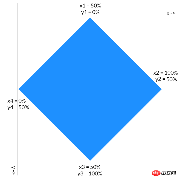
每个点的第一个坐标值决定了它在 x 轴上的位置,第二个坐标值指定了它在 y 轴的位置,所有点是顺时针绘制的。比如菱形最右边的点,它位于 y 轴下方一半处,所以它的 y 坐标是 50%。同时这个点位于 x 轴的最右侧,所以它的 x 坐标是 100%。其它点的坐标同理可得。
最后效果如下所示:


1 <!DOCTYPE html> 2 <html lang="en"> 3 <head> 4 <meta charset="UTF-8"> 5 <title>Clip path</title> 6 <style type="text/css"> 7 body { 8 margin: 20px auto; 9 text-align: center; 10 font-family: 'Lato'; 11 max-width: 640px; 12 } 13 14 h1 { 15 margin-bottom: 100px; 16 font-size: 1.8em; 17 } 18 19 p { 20 display: inline-block; 21 margin: 50px 0px; 22 width: 250px; 23 height: 250px; 24 border-radius: 200px; 25 filter: grayscale(0.9); 26 cursor: pointer; 27 } 28 29 p:hover { 30 filter: none; 31 } 32 33 p:hover .text { 34 opacity: 1; 35 } 36 37 .text { 38 position: absolute; 39 background: rgba(200, 0, 0, 0.5); 40 padding: 20px 0; 41 top: 90px; 42 width: 250px; 43 opacity: 0; 44 text-align: center; 45 color: white; 46 font-size: 1.4em; 47 } 48 49 .left .text { 50 background: rgba(0, 0, 200, .5); 51 } 52 53 .right .text { 54 background: rgba(200, 100, 0, 0.5); 55 } 56 57 .bottom .text { 58 background: rgba(0, 200, 0, 0.5); 59 } 60 61 .top { 62 background: url('http://t.imgbox.com/KXaGvTFB.jpg'); 63 clip-path: polygon(50% 0%, 100% 50%, 50% 100%, 0% 50%); 64 background-size: contain; 65 position: relative; 66 left: -125px; 67 top: -130px; 68 } 69 70 .left { 71 background: url('http://t.imgbox.com/LHPFYSYE.jpg'); 72 clip-path: polygon(50% 0%, 100% 50%, 50% 100%, 0% 50%); 73 background-size: contain; 74 position: relative; 75 } 76 77 .right { 78 background: url('http://t.imgbox.com/tlgvPjwn.jpg'); 79 clip-path: polygon(50% 0%, 100% 50%, 50% 100%, 0% 50%); 80 background-size: contain; 81 position: relative; 82 top: -352px; 83 left: 256px; 84 } 85 86 .bottom { 87 background: url('http://t.imgbox.com/R7h6VtZr.jpg'); 88 clip-path: polygon(50% 0%, 100% 50%, 50% 100%, 0% 50%); 89 background-size: contain; 90 position: relative; 91 top: -220px; 92 left: -126px; 93 } 94 </style> 95 </head> 96 <body> 97 <h1>Images clipped with <code>clip-path</code> Property</h1> 98 <p class="left"><p class="text">SPORTS</p></p> 99 <p class="top"><p class="text">TECHNOLOGY</p></p>100 <p class="right"><p class="text">FOOD</p></p>101 <p class="bottom"><p class="text">NATURE</p></p>102 </body>103 </html>View Code
效果图如下:
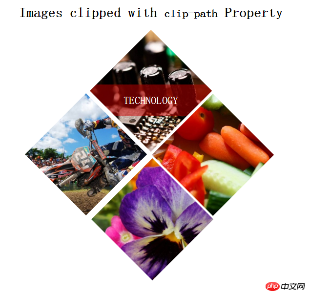
记得以前CSS绘制图形总得束手束脚,而且还得想法设法,使用clip-path绘制什么六边形、八边形、五角形、心形等,都不再是难事了。OXXO.STUDIO有一篇文章《運用 clip-path 的純 CSS 形狀變換》详细介绍了这些图形是如何绘制的。当然除此之外,在线的CSS clip-path maker提供了很多不规则的图形案例:
在具体使用geometry-box来裁剪元素之前,对geometry-box做一下相关的了解。
geometry-box可以是CSS clip-path、fill、stroke或者view-box。其中CSS clip-path应用于HTML元素,它具有四种值:margin-box、border-box、padding-box和content-box。
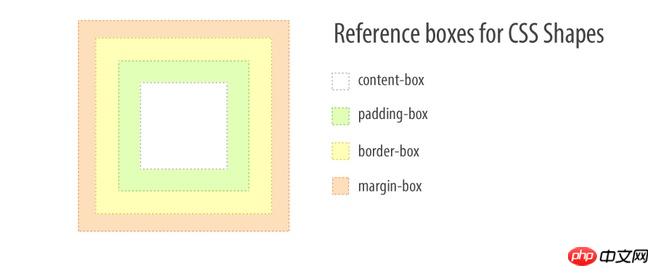
来看个简单的示例:


.clip-me {
    clip-path: polygon(10% 20%, 20% 30%, 50% 80%) margin-box;
    margin: 10%;
}View Code
在上例中,元素的 margin-box 会作为参考,来决定裁剪点的实际位置。点(10%,10%)是 margin-box 的左上角,所以clip-path 的定位会根据此点进行计算。
其实CSS clip-path和CSS Shapes中的引用框概念非常类似,有关于这方面的介绍,可以花点时间阅读《理解CSS Shapes的引用框》一文。
如果geometry-box和basic-shape一起使用,可以引用basic-shape提供的引用框。其作用和shape-outside属性类似,更多的细节可以看看shape-outside的属性介绍。
如果geometry-box由自身指定,那么它会使用指定盒子形状作为裁剪的路径,包括任何(由border-radius提供的)的角的形状。
除了CSS clip-path值,还可以运用SVG元素上,它具有另外三个值:fill、stroke和view-box。
在SVG中有一个clipPath元素。<<span style="background-color: #c0c0c0;">clipPath</span>>元素不会直接在页面上呈现,他唯一的作用就是可以通过clip-path来引用。它和CSS的clip-path还是有很大的区别。有关于两者的详细介绍可以阅读《CSS和SVG中的剪切:clip-path属性和<clipPath>元素》一文。
而很多时候两者可以结合一起使用。
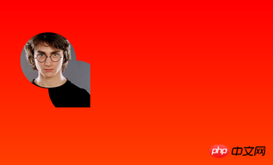
你不需要在CSS中定义clip-path的值,因为它能够引用SVG中定义的 <<span style="background-color: #c0c0c0;">clipPath</span>>标签元素。下面是它的使用示例:
HTML


1 <img class="clip-svg lazy" src="/static/imghw/default1.png" data-src="https://s3-us-west-2.amazonaws.com/s.cdpn.io/3/Harry-Potter-1-.jpg" alt="" > 2 3 <svg width="0" style="max-width:90%"> 4 <defs> 5 <clipPath id="myClip"> 6 <circle cx="100" cy="100" r="40"/> 7 <circle cx="60" cy="60" r="40"/> 8 </clipPath> 9 </defs>10 </svg>
View Code
CSS


.clip-svg {
    clip-path: url(#myClip);
}View Code
效果如下图
剪裁和遮罩都是用来隐藏元素的一些部分、显示其他部分的。当然了,这两者还是有区别的。区别主要在于这几方面:他们能做的东西,不同的语法,涉及到的不同技术,是新的还是旧的,以及浏览器支持的差异。
两者最主要的区别:遮罩使用的是图像,剪裁使用的是路径。
想象一张从左到右、从黑到白渐变的正方形图像,它可以是一个遮罩。对于应用了这个渐变遮罩图像的元素,它在遮罩图像的黑色部分是透明(透视)的,而在遮罩图像的白色的部分是不透明(正常)的。所以作出的结论是:这个元素是从左到右淡入的。
而剪裁一直都是矢量路径的。路径之外的部分是透明的,路径里边的部分是不透明的。
个人觉得有点混乱。因为很多时候可能会碰到某个关于遮罩的教程用的是一个在黑色上有白色矢量形状的遮罩图像,这和剪裁基本是同一个原理。但这还好,它只是混淆了一点东西。
有关于两者相关的详细介绍可以点击这里阅读。
前面已经多次提到CSS Shapes了,是的,因为CSS Shapes可以帮助我们打破常规则的Web排版,让Web页面可以像媒体杂志一样布局,这将是激动人心的一件事情。
而在CSS Shapes中同样会有clip-path的身影。
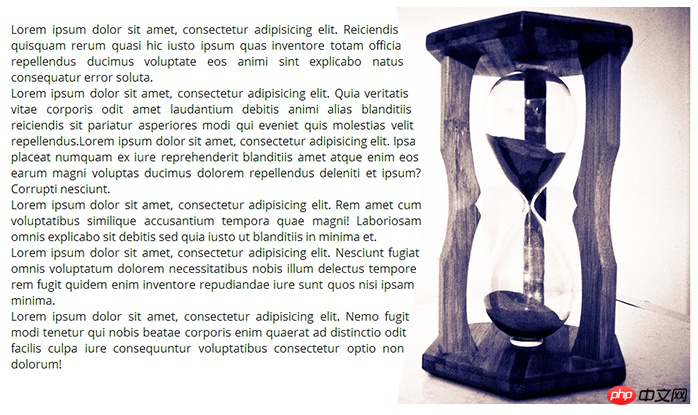
clip-path接收与basic-shape相同的形状函数和值(前面提到过)。如果我们定义相同的多边形形状,同时用于shape-outside与clip-path属性上,它将裁掉图像上你定义的形状之外的图像。


1 img.right {2 float: right;3 height: 100vh;4 width: calc(100vh + 100vh/4);5 shape-outside: polygon(40% 0, 100% 0, 100% 100%, 40% 100%, 45% 60%, 45% 40%);6 /* clip the image to the defined shape */7 clip-path: polygon(40% 0, 100% 0, 100% 100%, 40% 100%, 45% 60%, 45% 40%);8 }View Code
结果如下:
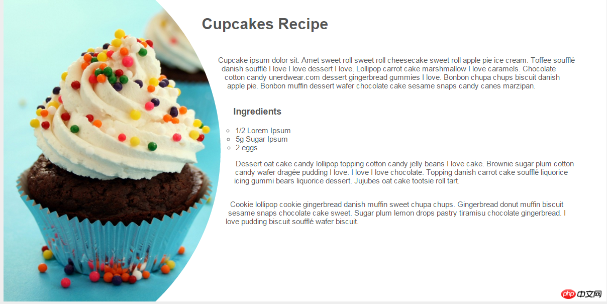
下面有个示例
HTML


 1 <p class="container"> 2   <p class="element"> 3   </p> 4   <h1>Cupcakes Recipe</h1> 5   <p> 6     Cupcake ipsum dolor sit. Amet sweet roll sweet roll cheesecake sweet roll apple pie ice cream. Toffee soufflé danish soufflé I love I love dessert I love. Lollipop carrot cake marshmallow I love caramels. Chocolate cotton candy unerdwear.com dessert gingerbread gummies I love. Bonbon chupa chups biscuit danish apple pie. Bonbon muffin dessert wafer chocolate cake sesame snaps candy canes marzipan. 7   </p> 8   <h3>Ingredients</h3> 9   <ul>10     <li>1/2 Lorem Ipsum</li>11     <li>5g Sugar Ipsum</li>12     <li>2 eggs</li>13   </ul>14   <p>15     Dessert oat cake candy lollipop topping cotton candy jelly beans I love cake. Brownie sugar plum cotton candy wafer dragée pudding I love. I love I love chocolate. Topping danish carrot cake soufflé liquorice icing gummi bears liquorice dessert. Jujubes oat cake tootsie roll tart.
16   </p>17   <p>18     Cookie lollipop cookie gingerbread danish muffin sweet chupa chups. Gingerbread donut muffin biscuit sesame snaps chocolate cake sweet. Sugar plum lemon drops pastry tiramisu chocolate gingerbread. I love pudding biscuit soufflé wafer biscuit.19   </p>20   <p class="clear"></p>21 </p>
View Code
CSS


1 * { 2 margin: 0; 3 padding: 0; 4 box-sizing: border-box; 5 } 6 7 body { 8 color: #555; 9 font-size: 0.95em;10 background-color: #eee;11 font-family: 'Helvetica Neue', Helvetica, Arial, sans-serif;12 }13 14 .container {15 width: 100%;16 max-width: 1200px;17 margin: 20px auto;18 background-color: white;19 }20 21 .element {22 width: 40%;23 height: 600px;24 float: left;25 background-image: url(http://tympanus.net/codrops-playground/assets/images/cssref/properties/clip-path/cupcakes.jpg);26 background-size: cover;27 background-position: -100px 0;28 background-repeat: no-repeat;29 -webkit-clip-path: ellipse(90% 70% at 0% 50%);30 clip-path: ellipse(90% 70% at 0% 50%);31 -webkit-shape-outside: ellipse(90% 70% at 0% 50%);32 shape-outside: ellipse(90% 70% at 0% 50%);33 -webkit-shape-margin: 2em;34 shape-margin: 2em;35 }36 37 p,38 h1,39 h3 {40 padding: 1em 0;41 }42 43 p {44 margin-right: 4em;45 }46 47 ul {48 list-style: circle;49 }View Code
效果图如下
前面内容简单的提到过了,<span style="background-color: #c0c0c0;">clip-path</span>是一个强大的属性,除了自身能实现一些特殊效果之外,还可以和SVG结合在一起。另外还可以和Masking以及CSS Shapes在一起,做出我们意想不到的效果。那么有关于clip-path相关的案例,网上已经有大把了。除此之外,clip-path还有一些在线的工具,可以直接帮助我们做一些事情。比如Chrome插件CSS Shapes 编辑器、Clip Path生成器和CSS clip-path Maker: Clippy。
最后强列建议大家收藏好下面这篇文章,因为这篇文章整理了18个有关于clip-path的教程、案例和工具:

W3C官方规范
clip-path(WBP)
clip-path(CSS Reference)
Introducing the CSS clip-path Property
本文介绍了有关 clip-path 的基本内容,可以帮助你入门。学习使用这个属性并不会花费太多的时间,但是创造性的使用就需要多多练习了。当浏览器广泛支持此属性时,你就可以使用 clip-path制作出酷炫的效果了。
The above is the detailed content of CSS clip-path. For more information, please follow other related articles on the PHP Chinese website!


