This article mainly introduces the sample code of CSS grid layout, hoping to help everyone master more CSS skills.
Browser Compatibility

CSS Grid Layout can be seen from Safari 10.1, Firefox 52, Chrome 60, Edge 15 Start getting support.
Grid layout
Basic elements of the page:
    <p class="wrapper">
        <p class="box box1">One</p>
        <p class="box box2">Two</p>
        <p class="box box3">Three</p>
        <p class="box box4">Four</p>
        <p class="box box5">Five</p>
</p>Style:
        .wrapper {
            border: 2px solid #f76707;
            border-radius: 5px;
            background-color: #fff4e6;
        }
        .box {
            border: 2px solid #FDC180;
}Create a grid container by declaring display:grid or display:inline-grid on the element:
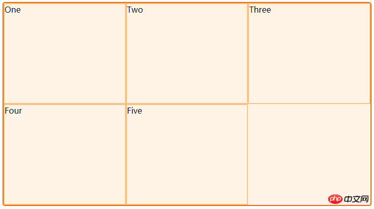
    .wrapper {
        display: grid;
}The following effect:

Define the rows and columns in the grid
Through grid-template-columns and The grid-template-rows property defines the rows and columns in the grid. These properties define the grid's orbits. A grid track is the space between any two lines in the grid.
The following grid contains three 200 pixel wide column tracks:
    .wrapper {
        display: grid;
        grid-template-columns: 200px 200px 200px;
    }
fr unit
The new fr unit represents an equal portion of the available space in the grid container. The next grid definition creates three equal-width tracks that grow and shrink with the available space.
    .wrapper {
        display: grid;
        grid-template-columns: 1fr 1fr 1fr;
    }
can also be mixed with pixel units:
        .wrapper {
            display: grid;
            grid-template-columns: 500px 1fr 2fr;
        }
Using repeat() in the track list
The syntax of repeat is as follows:
repeat(number of columns/rows, the column width we want);
Large grids with multiple tracks can use the repeat() tag to repeat part or the entire track list. The following grid definition:
    .wrapper {
        display: grid;
        grid-template-columns: 1fr 1fr 1fr;
}can be written as:
    .wrapper {
        display: grid;
        grid-template-columns: repeat(3, 1fr);
}Repeat statement Can be used to repeat part of a track list. In the example below I created a grid that started with a 20 pixel track, then repeated 6 1fr tracks, and finally added a 20 pixel track.
    .wrapper {
        display: grid;
        grid-template-columns: 20px repeat(6, 1fr) 20px;
}The Repeat statement can be passed in a track list, so you can use it to create a repeating track list in multi-track mode. In the next example, the grid will have a total of 10 tracks, with a 1fr track followed by a 2fr track, with this pattern repeated 5 times.
    .wrapper {
        display: grid;
        grid-template-columns: repeat(5, 1fr 2fr);
}grid-auto-rows and grid-auto-columns
When creating the grid example above , we define our own column track using the grid-template-columns property, but let the grid create rows as needed, which will be created in the implicit grid. An explicit grid contains the rows and columns you define in the grid-template-columns and grid-template-rows properties. If you put something outside the grid definition, or if the amount of content requires more grid tracks, the grid will create rows and columns in the implicit grid. By default, these tracks will be automatically sized, so they will change size based on the content inside them.
You can use the grid-auto-rows and grid-auto-columns properties to define a sized track in an implicit grid.
In the example below we use the grid-auto-rows property to ensure that the tracks created in the implicit grid are 200 pixels high.
    .wrapper {
        display: grid;
        grid-template-columns: repeat(3, 1fr);
        grid-auto-rows: 200px;
    }
minmax()
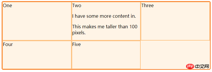
In setting an explicit network When creating grids or defining the sizes of automatically created rows and columns, we may want to give the grid a minimum size, but make sure they can grow to accommodate the content added to them. For example, I want my row height to never shrink below 100 pixels, but if my content stretches to 300 pixels tall I want my row height to stretch to that height as well.
The grid uses the minmax() function to solve this problem. In the next example I use minmax() as the value for grid-auto-rows. Automatically created row heights will be a minimum of 100 pixels and a maximum of auto. Using auto means that the size of the row will automatically change according to the size of the content: according to the tallest unit in the row, the space will be expanded to accommodate that unit.
    .wrapper {
        display: grid;
        grid-template-columns: repeat(3, 1fr);
        grid-auto-rows: minmax(100px, auto);
}<p class="wrapper">
<p class="box">One</p>
<p class="box">Two
<p>I have some more content in.</p>
<p>This makes me taller than 100 pixels.</p>
</p>
<p class="box">Three</p>
<p class="box">Four</p>
<p class="box">Five</p>
</p>
Placing Grid Items Across Tracks
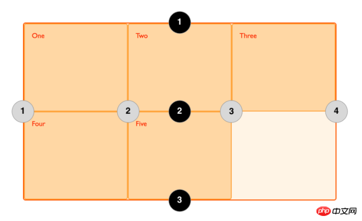
There are four vertical grid lines and three horizontal grid lines as follows:

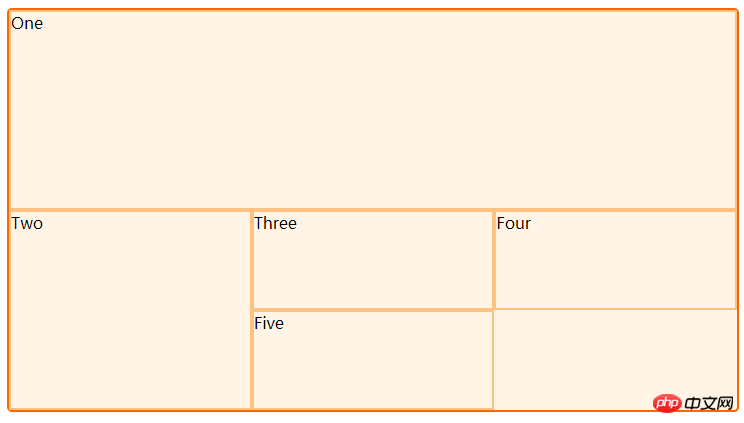
使用了grid-column-start, grid-column-end, grid-row-start 和 grid-row-end 属性,把前两个元素放到了我们的三列网格中。从左至右,第一个元素从列线1开始,延伸至列线4,也就是我们这个例子中最右边的列线。并从行线1延伸到行线3,占据了两个行轨道。
第二个元素从列线1开始,延伸了一个轨道。因为这是默认行为,所以我不用指定结束线。并且它从行线3到行线5,跨越了两个行轨道。剩下的元素会把自己安放到网格空余的空间中。
   .wrapper {
        display: grid;
        grid-template-columns: repeat(3, 1fr);
        grid-auto-rows: 100px;
    }
    .box1 {
        grid-column-start: 1;
        grid-column-end: 4;
        grid-row-start: 1;
        grid-row-end: 3;
    }
    .box2 {
        grid-column-start: 1;
        grid-row-start: 3;
        grid-row-end: 5;
    }
网格间距
在两个网格单元之间的 网格横向间距 或 网格纵向间距可使用 grid-column-gap 和 grid-row-gap 属性来创建,或者直接使用两个合并的缩写形式 grid-gap。在下面的例子中,我会创建一个横向间距为10px、纵向间距为1em的网格元素。

嵌套网格
一个网格项目可以也成为一个网格容器。在接下来的例子中我事先有了一个3列的网格元素,并有两个跨轨道的网格。在这个例子中,第一个网格项目含有几个子级项目。当这些项目不是网格容器的直接子级元素时,它们不会参与到网格布局中,并显示为正常的文档流。
html:
    <p class="wrapper">
        <p class="box box1">
            <p class="nested">a</p>
            <p class="nested">b</p>
            <p class="nested">c</p>
        </p>
        <p class="box box2">Two</p>
        <p class="box box3">Three</p>
        <p class="box box4">Four</p>
        <p class="box box5">Five</p>
</p>css:
   .wrapper {
        display: grid;
        grid-template-columns: repeat(3, 1fr);
    }

    .wrapper {
        border: 2px solid #f76707;
        border-radius: 5px;
        background-color: #fff4e6;
    }
    .box1 {
        grid-column-start: 1;
        grid-column-end: 4;
        grid-row-start: 1;
        grid-row-end: 3;
    }
    .box2 {
        grid-column-start: 1;
        grid-row-start: 3;
        grid-row-end: 5;
    }
    .box {
        border: 2px solid #FDC180;
        background: #FFD7A4;
        padding: 10px;
        color: #FB2E10;
    }
    .nested {
        border: 2px solid #FFF1A2;
        background: #FFFAD9;
    }
如果我把 box1 设置成 display: grid 我可以给它定义轨道然后它也会变成一个网格元素,它的子级元素也会排列在这个新网格元素中。
    .box1 {
        grid-column-start: 1;
        grid-column-end: 4;
        grid-row-start: 1;
        grid-row-end: 3;
        display: grid;
        grid-template-columns: repeat(3, 1fr);
    }
以上内容就是CSS网格布局的示例代码,希望能帮助到大家。
相关推荐:
详解jQuery移动页面开发中的ui-grid网格布局使用_jquery
The above is the detailed content of Sample code for CSS grid layout. For more information, please follow other related articles on the PHP Chinese website!


