css In front-end development, Grid layout is the basis of website design, and CSS Grid is the most powerful and simplest tool for creating grid layout. In this article, we mainly introduce how to learn CSS Grid layout in five minutes. We hope it can help everyone.

##CSS Grid also received native support from major browsers (Safari, Chrome, Firefox, Edge) this year, so I believe all of front-end developers will have to learn this technology in the near future.
In this article, I will cover the basics of CSS grid as quickly as possible. I'm leaving out everything you shouldn't care about just to get you down to the basics.
Your first Grid layout
CSS Grid layout consists of two core components: wrapper (parent element) and items (child elements). The wrapper is the actual grid, and the items are the contents of the grid.
The following is a wrapper element, containing 6 items inside:
<p class="wrapper">
  <p>1</p>
  <p>2</p>
  <p>3</p>
  <p>4</p>
  <p>5</p>
  <p>6</p>
</p>
Copy after login
To turn the wrapper element into a grid, Simply set its display property to grid:
.wrapper {
    display: grid;
}
Copy after login
However, this doesn't do anything yet, because we haven't defined the grid we want ( grid). It will simply stack 6 p's on top of each other.

I've added some styling, but it has nothing to do with CSS Grid.
Columns (columns) and rows (rows)
In order to make it a two-dimensional grid container, we need to define columns and rows. Let's create 3 columns and 2 rows. We will use grid-template-row and grid-template-column properties.
.wrapper {
    display: grid;
    grid-template-columns: 100px 100px 100px;
    grid-template-rows: 50px 50px;
}
Copy after login
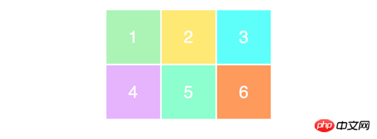
As you can see, we wrote 3 values for grid-template-columns so that we will get 3 columns. We want to get 2 rows, so we specify 2 values for grid-template-rows.
These values determine how wide we want our columns to be (100px), and how tall we want our rows to be (50px). Here's the result:

To make sure you understand correctly how these values relate to the appearance of the grid, take a look at this example.
.wrapper {
    display: grid;
    grid-template-columns: 200px 50px 100px;
    grid-template-rows: 100px 30px;
}
Copy after login
Please try to understand the above code and think about what kind of layout the above code will produce.
This is the result of the layout of the above code:

It’s very easy to understand and very simple to use, right? Now let's make it a little more difficult.
Placing items (child elements)
The next thing you need to learn is how to place items (child elements) on the grid (grid). Note in particular that this is where the super power of Grid layout comes into play, as it makes creating layouts very easy.
We use the same HTML tags as before. To help us understand better, we add a separate class to each items (child element):
<p class="wrapper">
  <p class="item1">1</p>
  <p class="item2">2</p>
  <p class="item3">3</p>
  <p class="item4">4</p>
  <p class="item5">5</p>
  <p class="item6">6</p>
</p>
Copy after login
Now, let’s create a 3×3 grid:
.wrapper {
    display: grid;
    grid-template-columns: 100px 100px 100px;
    grid-template-rows: 100px 100px 100px;
}
Copy after login
You will get the following layout:

I don’t know if you noticed it, but we only see a 3×2 grid on the page, and what we defined is a 3×3 grid. . This is because we only have 6 items (child elements) to fill the grid. If we add 3 more items (child elements), the last row will also be filled.
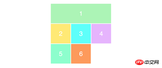
To position and resize items (child elements), we will use the grid-column and grid-row attributes to set:
.item1 {
    grid-column-start: 1;
    grid-column-end: 4;
}
Copy after login
What we want to do here is that we want item1 to occupy starting at the first grid line and ending at the fourth grid line. In other words, it will occupy the entire row by itself. Here is what is displayed on the screen:

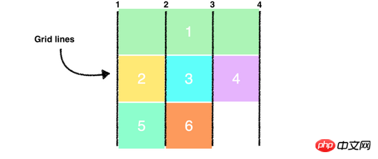
If you don’t understand that we only have 3 columns, why are there 4 grid lines? Take a look at the image below, where I drew the column grid lines in black:

Note that we are now using all the rows in the grid. When we make the first item (child element) take up the entire first row, it pushes the remaining items (child elements) to the next row.
Finally, give you an easier abbreviated way to write the above syntax:
.item1 {
    grid-column: 1 / 4;
}
Copy after login
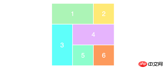
为了确保你已经正确理解了这个概念,我们重新排列其他的 items(子元素) 。
.item1 {
    grid-column-start: 1;
    grid-column-end: 3;
}
.item3 {
    grid-row-start: 2;
    grid-row-end: 4;
}
.item4 {
    grid-column-start: 2;
    grid-column-end: 4;
}
Copy after login
你可以尝试在你的脑子里过一边上面代码的布局效果,应该不会很难。
以下是页面上的布局效果:

以上内容就是五分钟教你学会 CSS Grid 布局,希望能帮助到大家。
相关推荐:
CSS Grid布局指南_html/css_WEB-ITnose
CSS Grid布局模块简介_html/css_WEB-ITnose
CSS Grid布局指南
The above is the detailed content of Teach you CSS Grid layout in five minutes. For more information, please follow other related articles on the PHP Chinese website!


