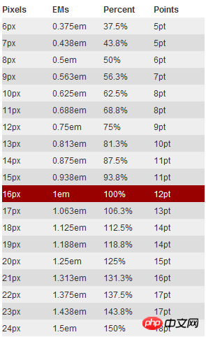
This time I will bring you a tutorial on how to use CSS3 rem (setting font size). What are the precautions when using CSS3 rem (setting font size). The following is a practical case. Let’s take a look. .
css3NewThe relative unit rem is added. Using rem is the same relative font size unit as em. The difference is that rem is relative to the HTML root element. Since many netizens mentioned rem, I will summarize one of them here.
What unit should be used to define the font size of the page in the Web? There is still a fierce debate today. Some people say that PX is a good unit, some say that EM has many advantages, and some people say that percentage is convenient. , so that there is a PK situation like CSS Font-Size: em vs. px vs. pt vs. percent. Unfortunately, there are still different pros and cons that make each technique less than ideal but still hard not to use.
Before introducing rem in detail, let us first review the two commonly used units of measurement, which are also the two most controversial ones:
PX is the unit
EM is in units
#px is in units
In the initial production of the Web page, we We all use "px" to set our text because it is more stable and precise. But there is a problem with this method. When the user browses the Web page we created in the browser, he changes the font size of the browser, and then our Web page layout will be broken. This is a big problem for users who are concerned about the usability of their websites. Therefore, it was proposed to use "em" to define the font of the Web page.
em is the unit
As mentioned before, using "px" as the unit is more convenient and consistent, but it is difficult to zoom in or zoom out in the browser. There will be a problem when using the page. To solve this problem, we can use the "em" unit.
This technique requires a reference point, which is generally based on the "font-size" of
. For example, we use "1em" equals "10px" to change the default value "1em=16px". In this way, when we set the font size to be equivalent to "14px", we only need to set its value to "1.4em".
body {
    font-size: 62.5%;/*10 ÷ 16 × 100% = 62.5%*/
}
h1 {
    font-size: 2.4em; /*2.4em × 10 = 24px */
}
p   {
    font-size: 1.4em; /*1.4em × 10 = 14px */
}
li {
    font-size: 1.4em; /*1.4 × ? = 14px ? */
}
Copy after login
Why is it a question mark whether "1.4em" of "li" is "14px"? If you understand "em", you will feel that this question is too much to ask. As briefly introduced before, when using "em" as the unit, you must know the settings of its parent element, because "em" is a relative value, and it is a value relative to the parent element. Its real calculation The formula is:
1 ÷ font-size of the parent element × pixel value to be converted = em value
In this case "1.4em" can be "14px" or " 20px", or "24px", is an uncertain value. To solve this problem, either you know the value of its parent element, or use "1em" in any child element. This may not be the method we need.
rem is the unit
With the emergence of CSS3, he also introduced some new units, including what we call rem today. Rem is described on the W3C official website like this - "font size of the root element". Let’s take a closer look at rem.
As mentioned earlier, "em" sets the font size relative to its parent element, so there will be a problem. For any element setting, you may need to know the size of its parent element. In many of our When used for the first time, there is a risk of unpredictable errors. And rem is relative to the root element , which means that we only need to determine a reference value in the root element and set the font size in the root element. This can be completely based on your own needs. You can also Refer to the picture below:

Let’s look at a simple example:
html {font-size: 62.5%;/*10 ÷ 16 × 100% = 62.5%*/}
body {font-size: 1.4rem;/*1.4 × 10px = 14px */}
h1 { font-size: 2.4rem;/*2.4 × 10px = 24px*/}
Copy after login
I defined a basic font size in the root element 62.5% (that is, 10px. Setting this value is mainly to facilitate calculation. If it is not set, it will be based on "16px"). From the above calculation results, we can use "rem" as conveniently as "px", and at the same time solve the difference between "px" and "em".
Browser compatibility
rem is a newly introduced unit of measurement in CSS3. Everyone will definitely feel frustrated and worried about browser support. In fact, there is no need to be afraid. You may be surprised that there are quite a lot of supported browsers, such as: Mozilla Firefox 3.6+, Apple Safari 5+, Google Chrome, IE9+ and Opera11+. It's just that poor IE6-8 can't, so just treat them as transparent. I've always been like this.
However, when using units to set fonts, you cannot completely ignore IE. If you want to use this REM, but also want to be compatible with the effect under IE, you can consider using "px" and "rem" together. Use "px" to achieve the effect under IE6-8, and then use "Rem" to achieve the effect of the browser. Just let IE6-8 not change with the change of text. Who makes this Ie6-8 so old!
With
I believe you have mastered the method after reading the case in this article. For more exciting information, please pay attention to other related articles on the php Chinese website!
Recommended reading:
How to use the linear-gradient linear gradient of CSS3
Detailed explanation of the mask-image attribute of CSS
How to use the hover selector
The above is the detailed content of CSS3 rem (set font size) tutorial. For more information, please follow other related articles on the PHP Chinese website!


![[Web front-end] Node.js quick start](https://img.php.cn/upload/course/000/000/067/662b5d34ba7c0227.png)


