
This time I will bring you the CSS filter to achieve the flame effect. What are the precautions for CSS filter to achieve the flame effect? The following is a practical case, let's take a look.
Last time we learned some basic knowledge of css filters, CSS filter filterThis time we will use css filters to implement a flame Effect. Explanation
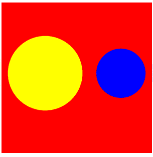
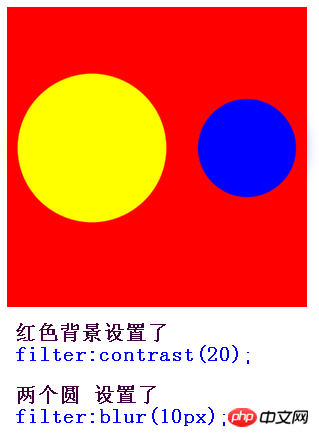
filter:contrast(20); This is very important, the two circles filter:blur(10px); If it’s not clear yet, let’s compare it.

1. First draw a triangle with a border
You must know that if width is 0, height is also 0, If only the border is used, the border is triangular. Let's see what the element looks like when width and height are both 0, but the border width is 100px
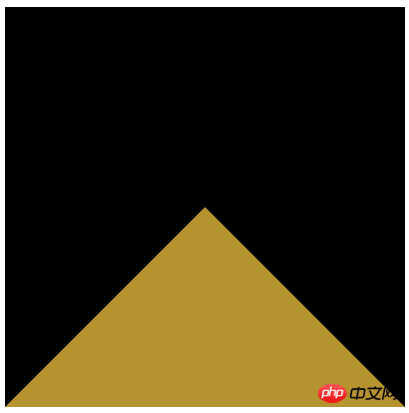
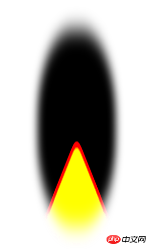
2. Adjust the size and color of the triangle to achieve a flame-like appearance
This step is very simple, we only need to Add these three lines of code to the triangle that has been implemented aboveborder-radius: 45%; transform: scaleX(.4); filter: blur(20px) contrast(30);
Rendering
3. Let the flame move
This step is more troublesome, but it is easy to understand. It is just to use the fusion effect mentioned above to make many small circles randomly pass through the triangle. Take a look at the following You can understand the principle by looking at the picture.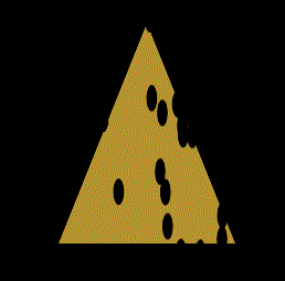
Complete code
<!doctype html>
<html lang="en">
<head>
<meta charset="UTF-8">
<style>
body {
background: #000;
}
.container {
position: relative;
width: 300px;
height: 300px;
margin: 0 auto;
background-color: #000;
}
.fire {
position: absolute;
bottom: 0;
left: 50%;
border-radius: 45%;
box-sizing: border-box;
border: 200px solid #000;
border-bottom: 200px solid #b5932f;
transform: translate(-50%, 0) scaleX(.4);
filter: blur(20px) contrast(30);
}
/* 小圆的样式 */
.dot {
position: absolute;
bottom: -110px;
left: 0;
width: 24px;
height: 24px;
background: #000;
border-radius: 50%;
}
@keyframes move {
100% {
transform: translateY(-350px);
}
}
</style>
</head>
<body>
<p class="container">
<p class="fire">
</p>
</p>
<script>
//创建一个元素,放所有的小圆
var circleBox = document.createElement('p');
//获取随机数 from 参数表示从哪个数开始 to参数表示到哪个数结束 from<= num <= to
function randomNum(from, to) {
from = Number(from);
to = Number(to);
var Range = to - from;
var num = from + Math.round(Math.random() * Range); //四舍五入
return num;
};
for (var i = 0; i < 40; i++) {
//创建小圆
var circle = document.createElement('p');
// 下面的4个变量 代表小圆随机位置 和 随机持续时间和延迟
var bottom = randomNum(-300, -250);
var left = randomNum(-200, 200);
var duration = randomNum(10, 30) / 10;
var delay = randomNum(0, 50) / 10;
//给生成的每个小圆 加上动画和位置属性
circle.style.cssText += `animation:move ${duration}s linear ${delay}s infinite;bottom:${bottom}px;left:${left}px;`;
circle.className += " dot";
//把每个小圆 都加入这个p
circleBox.appendChild(circle);
};
var fire = document.querySelector(".fire");
//把有40个随机小圆的 p 加入DOM树
fire.appendChild(circleBox);
</script>
</body>
</html>Pure css to realize the 3D effect of the photo wall
CSS loading animation effect tutorial
CSS3 rem (set font size) tutorial
The above is the detailed content of CSS filter to achieve flame effect. For more information, please follow other related articles on the PHP Chinese website!


![[Web front-end] Node.js quick start](https://img.php.cn/upload/course/000/000/067/662b5d34ba7c0227.png)


