

CSS3 dynamic prompt effect when the mouse moves into the picture
This time I will bring you the dynamic prompt effect of CSS3 when the mouse moves into the picture. What are the precautions to achieve the dynamic prompt effect of CSS3 when the mouse moves into the picture. The following is a practical case, let's take a look.
This is my first time trying to write a blog. I hope you can correct me if I have any mistakes or mistakes. Today I mainly write about some usage of transform, an important property of CSS3. These examples are from previous MOOCs. I typed it myself after taking a course from a certain teacher online.
1. Introduction
1. What is transform?
The meaning of transform is: change, deform...; transform
2. What are the common attributes of transform?
The properties of transform include: translate()/rotate() / skew() / scale() /, and they are divided into x and y respectively, such as: rotatex() and rotatey(), And so on.
transform:translate()
Meaning: change, displacement; for example, 20 pixels to the right and 50 pixels to the top (negative values to the left and down). Examples are as follows
.test01{-webkit-transform:translate(20px,50px);-moz-transform:translate(20px,50px)}transform:rotate()
Meaning: rotation; "deg" is the degree of rotation. For example, "180deg" means rotation of "180 degrees". Examples are as follows
.test02{-webkit-transform:rotate(180deg);-moz-transform:rotate(180deg)}transform:skew()
Meaning: Tilt Examples are as follows
.test03{-webkit-transform:skew(20deg);-moz-transform:skew(20deg)} transform:scale()
Meaning: Ratio 1.8 means enlarging at a ratio of 1.8. If it is an integer multiple, such as enlarging 3 times, it must be written as 3.0 The example is as follows
.test03{-webkit-transform:scale(2.5);-moz-transform:scale(2.5)}3. Example of transform
demo01 Description: After the mouse is moved in, the picture moves to the left and the content enters in sequence
Steps:
1. Write the html code and set the initial style of the content and pictures through css (the text content is on the picture);
2. Transform the description content The attribute is shifted to the left until it is no longer visible (transform:translate(-600px,0););
3. Next, set the style when the mouse moves in (:hover). Also use transform to move the content to the left. The distance is 0 (transform:translate(0,0)). The transition-delay attribute is used here mainly to delay the three contents for different times to form the effect of entering in sequence.
/*图片左移 文字依次进入*/
.test1{background: #fff;}
.test1 figcaption p{background: #fff;color:#333;margin:5px 0;transform: translate(-600px,0px);}
.test1 figcaption{padding:20px}
.test1:hover figcaption p{transform: translate(0,0);}
.test1 figcaption p:nth-of-type(1){transition-delay: 0.2s;}
.test1 figcaption p:nth-of-type(2){transition-delay: 0.3s;}
.test1 figcaption p:nth-of-type(3){transition-delay: 0.4s;}
.test1:hover img{transform: translate(-5px,0);}demo02 Description: After the mouse is moved in, the picture becomes blurred and the rectangle rotates from outside the picture into the specified position in the picture. The text flies over from the right and gradually displays
Steps:
1. Write the html code and set the initial style of the content and image through css (the rectangular text is on the image);
2. Move the rectangle to the top through the transform attribute Until you can't see it and set the rotation angle to 0 transform: translate(0,-400px) rotate(0deg);
3. Next, set the style displacement when the mouse moves in (:hover) to 0 and set it to 0. Rotate 360 degrees transform: translate(0,0) rotate(360deg);
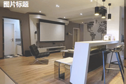
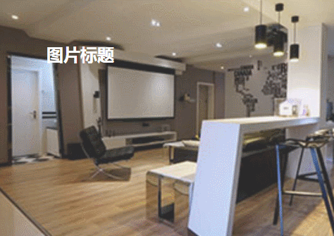
        <!--移动-->
        <figure class="test1">
            <img src="img/altimg05.jpg">
            <figcaption>
                <h2>图片标题</h2>
                <p>这里是图片的相关描述内容</p>
                <p>这里是图片的相关描述内容</p>
                <p>这里是图片的相关描述内容</p>
            </figcaption>
        </figure>
/*旋转*/
.test2{background: #ccc;}
.test2 figcaption{width: 100%;height: 100%;}
.test2 figcaption h2{margin:15% 0 0 15%}
.test2 figcaption p{margin-left:15%;transform: translate(50px,0);opacity: 0;}
.test2 figcaption p{border:2px solid #ccc;width: 80%;height: 80%;position:absolute;top:10%;left:10%;transform: translate(0,-400px) rotate(0deg);}
.test2:hover figcaption p{transform: translate(0,0) rotate(360deg);}
.test2:hover img{opacity: 0.6;}
.test2:hover figcaption p{transform: translate(0,0);opacity: 1;}demo03 Note: The distorted text is displayed normally after the mouse is moved in (because the text is distorted by 90 degrees in the example)
Steps:
1. Write the html code and set the initial style of the content and pictures through css;
2. The text content is distorted by 90 degrees transform: skew(90deg);
3. Next, set the style when the mouse moves in (:hover) to distort the text content by 0 degrees transform: skew(0);
        <!--旋转-->
        <figure class="test2">
            <img src="img/altimg05.jpg">
            <figcaption>
                <h2>图片标题</h2>
                <p>飞来飞去</p>
                <p></p>
            </figcaption>
        </figure>
/*扭曲*/
.test3{background:#CCCCCC;}
.test3 figcaption{position: absolute;left:15%;top:15%}
.test3 figcaption h2{transform: skew(90deg);}
.test3 figcaption p{transform: skew(90deg);}
.test3:hover img{opacity: 0.6;}
.test3:hover figcaption h2{transform: skew(0);}
.test3:hover figcaption p{transform: skew(0);}demo04 Description: After the mouse is moved in, the rectangle and text are displayed and reduced, and the picture is also reduced
Steps:
1. Write the html code and set it through css Good content and initial style of pictures
2. Magnify the content by 1.2 times. This is to create a shrinking effect when the magnification becomes 1 after the mouse is moved in. The transparency of the content is set to 0;
3.接下来设置鼠标移入时(:hover)的样式 内容放大倍数变成1也就是原始大小 图片缩小 透明度都变成1;
/*缩放*/
.test4{background: #000;}
.test4 figcaption{width: 100%;height: 100%;}
.test4 figcaption h2{margin:15% 0 0 15%;opacity:0;transform: scale(1.2);}
.test4 figcaption p{margin-left:15%;opacity:0;transform: scale(1.2);}
.test4 figcaption p{border:2px solid #ccc;width: 80%;height: 80%;position:absolute;top:10%;left:10%;transform: scale(1.2,1.2);opacity: 0;}
.test4:hover figcaption p{transform: scale(1,1);opacity: 1;}
.test4:hover img{opacity: 0.6;transform: scale(0.9,0.9);}
.test4:hover figcaption h2{opacity: 1;transform: scale(1);}
.test4:hover figcaption p{opacity: 1;transform: scale(1);}<!--缩放--> <figure class="test4"> <img src="img/altimg05.jpg"> <figcaption> <h2>图片标题</h2> <p>这里是图片的相关描述内容</p> <p></p> </figcaption> </figure>
demo05 说明:鼠标移入后 内容显示 并出现井字格
步骤:
1.写好html代码并通过css设置好内容和图片的初始样式(井字就是两个矩形的重叠)
2.将两个矩形缩小0.8 并设置透明度为0 内容也设置透明度为0;
3.接下来设置鼠标移入时(:hover)的样式 内容透明度设置为1 设置矩形缩放为1 这里利用到transition属性 主要是为了缩小放大过程逐渐变化;
/*井字格*/
.test5{background: #000;}
.test5 figcaption{width: 100%;height: 100%;}
.test5 figcaption h2{margin: 15% 0 0 18%;opacity: 0;}
.test5 figcaption p{margin-left: 18%;opacity: 0;}
.test5 figcaption p{position: absolute;}
.test5 figcaption p.p01{width: 80%;height:70%;border-top: 2px solid #ccc;border-bottom: 2px solid #ccc;left:10%;top:15%;opacity: 0;transform: scale(0.8);}
.test5 figcaption p.p02{width: 70%;height:80%;border-left: 2px solid #ccc;border-right: 2px solid #ccc;left: 15%;top:10%;opacity: 0;transform: scale(0.8);}
.test5:hover p.p01{opacity: 1;transform: scale(1);transition: transform 0.3s ease-in}
.test5:hover p.p02{opacity: 1;transform: scale(1);transition: transform 0.3s ease-in}
.test5:hover figcaption p{opacity: 1;}
.test5:hover figcaption h2{opacity: 1;}
.test5:hover img{opacity: 0.6;}<!--井字格--> <figure class="test5"> <img src="img/altimg05.jpg"> <figcaption> <h2>图片标题</h2> <p>这里是图片的相关描述内容</p> <p class="p01"></p> <p class="p02"></p> </figcaption> </figure>
以上是几个简单的小例子,之所以用figure和figcaption标签,主要是标签的语义化,截取动态图用到的是GifCam第一次用 挺好用的 很可爱 哈哈。
figure标签主要是用于规定独立的流内容(图片,图表,照片,代码等)而figcaption与figure标签配套使用,主要用于定义figure元素的标题
哦,对了,由于这几个例子写在一个html里面 所以提取出了部分公用的样式
body,figure,figcaption,h2,p{margin:0;padding:0;font-family: "微软雅黑";}
figure{position: relative;overflow: hidden;float: left;width:33.33%;height: 350px;}
figcaption{position: absolute;top: 0;left: 0;color:#fff;}
figure img{width:101%;height: 360px;opacity: 0.8;transition: all 0.35s}
figure figcaption p,h2,span,p{transition: all 0.35s}
@media screen and (max-width: 600px) {
    figure{width: 100%;}
}
@media screen and (min-width:601px) and (max-width: 1000px) {
    figure{width: 50%;}
}
@media screen and (min-width: 1001px) {
    figure{width: 33.33%;}
}总结:
之所以选择写博客主要是为了锻炼自己的表达能力,培养一个总结知识点的好习惯,以前看别人写的一些好的文章时都很羡慕,自己却总是不知道从何下手,直到最近投简历的时候发现很多公司都要求注明自己的博客地址,所以有必要逼着自己写一下东西啦!
相信看了本文案例你已经掌握了方法,更多精彩请关注php中文网其它相关文章!
推荐阅读:
The above is the detailed content of CSS3 dynamic prompt effect when the mouse moves into the picture. For more information, please follow other related articles on the PHP Chinese website!

Hot AI Tools

Undresser.AI Undress
AI-powered app for creating realistic nude photos

AI Clothes Remover
Online AI tool for removing clothes from photos.

Undress AI Tool
Undress images for free

Clothoff.io
AI clothes remover

Video Face Swap
Swap faces in any video effortlessly with our completely free AI face swap tool!

Hot Article
Hot Tools

Notepad++7.3.1
Easy-to-use and free code editor

SublimeText3 Chinese version
Chinese version, very easy to use

Zend Studio 13.0.1
Powerful PHP integrated development environment

Dreamweaver CS6
Visual web development tools

SublimeText3 Mac version
God-level code editing software (SublimeText3)
Hot Topics
 1653
1653
 14
1413
52
1305
25
1251
29
1224
24
14
1413
52
1305
25
1251
29
1224
24

 How to use bootstrap in vue
Apr 07, 2025 pm 11:33 PM
How to use bootstrap in vue
Apr 07, 2025 pm 11:33 PM
Using Bootstrap in Vue.js is divided into five steps: Install Bootstrap. Import Bootstrap in main.js. Use the Bootstrap component directly in the template. Optional: Custom style. Optional: Use plug-ins.
 Understanding HTML, CSS, and JavaScript: A Beginner's Guide
Apr 12, 2025 am 12:02 AM
Understanding HTML, CSS, and JavaScript: A Beginner's Guide
Apr 12, 2025 am 12:02 AM
WebdevelopmentreliesonHTML,CSS,andJavaScript:1)HTMLstructurescontent,2)CSSstylesit,and3)JavaScriptaddsinteractivity,formingthebasisofmodernwebexperiences.
 The Roles of HTML, CSS, and JavaScript: Core Responsibilities
Apr 08, 2025 pm 07:05 PM
The Roles of HTML, CSS, and JavaScript: Core Responsibilities
Apr 08, 2025 pm 07:05 PM
HTML defines the web structure, CSS is responsible for style and layout, and JavaScript gives dynamic interaction. The three perform their duties in web development and jointly build a colorful website.
 How to write split lines on bootstrap
Apr 07, 2025 pm 03:12 PM
How to write split lines on bootstrap
Apr 07, 2025 pm 03:12 PM
There are two ways to create a Bootstrap split line: using the tag, which creates a horizontal split line. Use the CSS border property to create custom style split lines.
 How to insert pictures on bootstrap
Apr 07, 2025 pm 03:30 PM
How to insert pictures on bootstrap
Apr 07, 2025 pm 03:30 PM
There are several ways to insert images in Bootstrap: insert images directly, using the HTML img tag. With the Bootstrap image component, you can provide responsive images and more styles. Set the image size, use the img-fluid class to make the image adaptable. Set the border, using the img-bordered class. Set the rounded corners and use the img-rounded class. Set the shadow, use the shadow class. Resize and position the image, using CSS style. Using the background image, use the background-image CSS property.
 How to use bootstrap button
Apr 07, 2025 pm 03:09 PM
How to use bootstrap button
Apr 07, 2025 pm 03:09 PM
How to use the Bootstrap button? Introduce Bootstrap CSS to create button elements and add Bootstrap button class to add button text
 How to set up the framework for bootstrap
Apr 07, 2025 pm 03:27 PM
How to set up the framework for bootstrap
Apr 07, 2025 pm 03:27 PM
To set up the Bootstrap framework, you need to follow these steps: 1. Reference the Bootstrap file via CDN; 2. Download and host the file on your own server; 3. Include the Bootstrap file in HTML; 4. Compile Sass/Less as needed; 5. Import a custom file (optional). Once setup is complete, you can use Bootstrap's grid systems, components, and styles to create responsive websites and applications.
 How to resize bootstrap
Apr 07, 2025 pm 03:18 PM
How to resize bootstrap
Apr 07, 2025 pm 03:18 PM
To adjust the size of elements in Bootstrap, you can use the dimension class, which includes: adjusting width: .col-, .w-, .mw-adjust height: .h-, .min-h-, .max-h-
