

Two ways to implement progress bars in CSS3
This time I will bring you two ways to implement progress bar in CSS3. What are the notes for implementing progress bar in CSS3? Here are practical cases, let’s take a look.
The renderings are as follows:
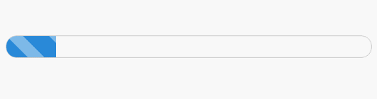
The first posture is as follows
First enter the code
<p id="progress">
      <span></span>
</p>
/*对应CSS*/
#progress{
width: 300px;
height: 30px;
border:1px solid #ccc;
border-radius: 15px;
overflow: hidden; /*注意这里*/
box-shadow: 0 0 5px 0px #ddd inset;
}
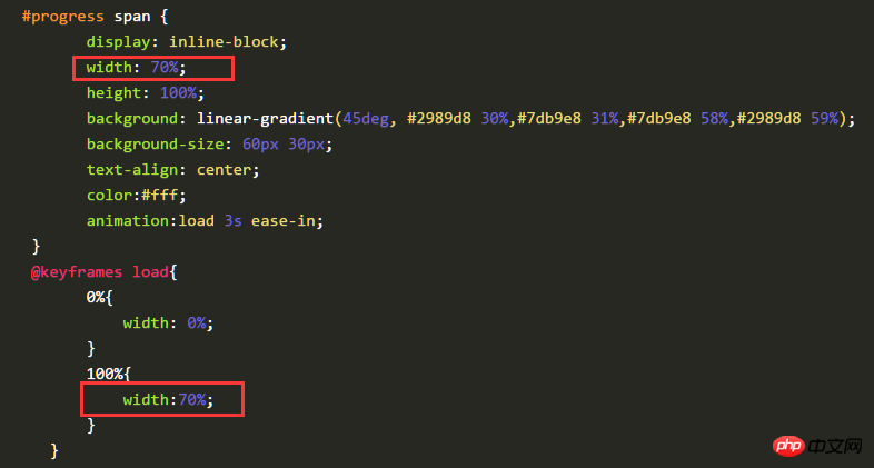
#progress span {
display: inline-block;
width: 70%;
height: 100%;
background: linear-gradient(45deg, #2989d8 30%,#7db9e8 31%,#7db9e8 58%,#2989d8 59%);
background-size: 60px 30px;
text-align: center;
color:#fff;
animation:load 3s ease-in;
}
@keyframes load{
0%{
width: 0%;
}
100%{
width:70%;
}
}The gradient color above is used Linear-gradient
linear-gradient syntax in css3
<linear-gradient> = linear-gradient([ [ <angle> | to <side-or-corner> ] ,]? <color-stop>[, <color-stop>]+)
<side-or-corner> = [left | right] || [top | bottom]
<color-stop> = <color> [ <length> | <percentage> ]?
angle: Use the angle value to specify the direction (or angle) of the gradient ).
to left: Set the gradient from right to left. Equivalent to: 270deg
to right: Set the gradient from left to right. Equivalent to: 90deg
to top: Set the gradient from bottom to top. Equivalent to: 0deg
#to bottom: Set the gradient from top to bottom. Equivalent to: 180deg. This is the default value, which is equivalent to leaving it blank.
color-stop: Used to specify the starting and ending colors of the gradient:
color: Specify the color.
length: Use the length value to specify the starting and ending color positions. Negative values are not allowed
percentage: Use percentage to specify the starting and ending color positions.
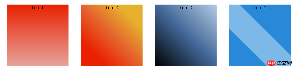
Chestnut:
.test1{
    background: linear-gradient(#EA2000, #E5A399);
}
.test2 {
    background: linear-gradient(45deg,#EA2000 20%,#E5632D 50%, #E5B12D 80%);
}
.test3 {
    background: linear-gradient(to top right, #000, #416796 50%, #B5CAE4);
}
.test4{
    background: linear-gradient(45deg, #2989d8 30%,#7db9e8 31%,#7db9e8 58%,#2989d8 59%);
}Rendering:
Animation is implemented through keyframes, and the progress effect is achieved by changing the width of span. Isn’t it simple? !
The current progress bar effect is only 70% effective. Just change the value of width. Just like the picture below, change it to a certain value.
Second posture
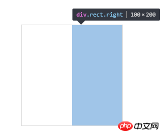
First, structure it A square p, symmetrically divide the square into two left and right pieces, as follows
What is constructed here is a square of 200px 200px, divided into two rectangles of 100px200px.
<p class="progress2">
        <p class="rect right">
        </p>
        <p class="rect left">
        </p>
 </p>
.progress2{
        width: 200px;
        height: 200px;
        margin: 100px auto;
        position: relative;
        border:1px solid #ddd;
    }

    .rect{
        width: 100px;
        height: 200px;
        position: absolute;
        top:0;
        overflow: hidden; /*注意这里*/
    }
    .right{
        right:0;
    }
    .left{
        left:0;
}The following effect
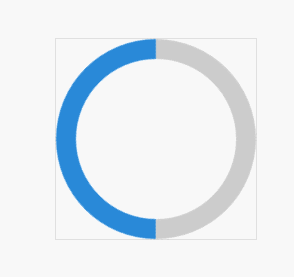
Next, construct a hollow circle in each rectangle, first construct the right half, as follows
<p class="progress2">
        <p class="rect right">
            <p class="circle rightcircle"></p>
        </p>
        <p class="rect left">

        </p>
 </p>
.circle{
        width: 160px;
        height: 160px;
        border:20px solid #ccc;
        border-radius: 50%;
        position: absolute;
        top:0;
    }
    .rightcircle{
        border-top:20px solid rgb(41,137,216);
        border-right:20px solid rgb(41,137,216);
        right:0;
}You will see the following effect

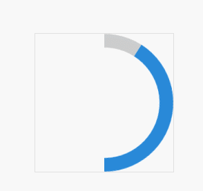
Since overflow is set to hidden in class:rect, the overflow part is After covering it, the subsequent effect realization is also closely connected with this attribute relationship.
If this property is not set, the effect will be like this.

Then you will find that part of it is covered, we can rotate it 45 degrees
.circle{
        width: 160px;
        height: 160px;
        border:20px solid #ccc;
        border-radius: 50%;
        position: absolute;
        top:0;
        transform: rotate(45deg); /*注意这里*/
}The effect is as follows

.rightcircle{
        border-top:20px solid rgb(41,137,216);
        border-right:20px solid rgb(41,137,216);
        right:0;
        animation: load_right 5s linear infinite;
    }
    @keyframes load_right{
        0%{
            transform: rotate(45deg);
        }
        50%{
            transform: rotate(225deg);
        }
        100%{
            transform: rotate(225deg);
        }
    }
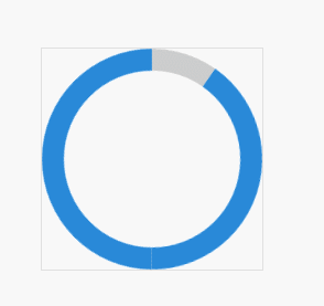
这是在class rect中设置了overflow:hidden的效果
现在,我们就可以把左半边也凑上了,同理,动画效果一开始先旋转45度,调正,然后一直保持不变,到50%之后,再开始旋转180度。这样就与右半边衔接上了。
<p class="progress2">
        <p class="rect right">
            <p class="circle rightcircle"></p>
        </p>
        <p class="rect left">
            <p class="circle leftcircle"></p>
        </p>
 </p>
.leftcircle{
        border-bottom:20px solid rgb(41,137,216);
        border-left:20px solid rgb(41,137,216);
        left:0;
        animation: load_left 5s linear infinite;
    }
    @keyframes load_left{
        0%{
            transform: rotate(45deg);
        }
        50%{
            transform: rotate(45deg);
        }
        100%{
            transform: rotate(225deg);
        }
}这是整体的效果
可以调整角度或者调整颜色即可实现反向的效果。
我是调整了颜色就可以得到最开始的动画效果啦,下面是完整的代码
<p class="progress2">
        <p class="rect right">
            <p class="circle rightcircle"></p>
        </p>
        <p class="rect left">
            <p class="circle leftcircle"></p>
        </p>
 </p>
.progress2{
        width: 200px;
        height: 200px;
        margin: 100px auto;
        position: relative;
    }

    .rect{
        width: 100px;
        height: 200px;
        position: absolute;
        top:0;
        overflow: hidden;
    }
    .right{
        right:0;
    }
    .left{
        left:0;
    }
    .circle{
        width: 160px;
        height: 160px;
        border:20px solid rgb(41,137,216);
        border-radius: 50%;
        position: absolute;
        top:0;
        transform: rotate(45deg);
    }
    .rightcircle{
        border-top:20px solid #ccc;
        border-right:20px solid #ccc;
        right:0;
        animation: load_right 5s linear infinite;
    }
    .leftcircle{
        border-bottom:20px solid #ccc;
        border-left:20px solid #ccc;
        left:0;
        animation: load_left 5s linear infinite;
    }
    @keyframes load_right{
        0%{
            transform: rotate(45deg);
        }
        50%{
            transform: rotate(225deg);
        }
        100%{
            transform: rotate(225deg);
        }
    }
    @keyframes load_left{
        0%{
            transform: rotate(45deg);
        }
        50%{
            transform: rotate(45deg);
        }
        100%{
            transform: rotate(225deg);
        }
    }
相信看了本文案例你已经掌握了方法,更多精彩请关注php中文网其它相关文章!
推荐阅读:
css的background-attachment进阶使用方法
The above is the detailed content of Two ways to implement progress bars in CSS3. For more information, please follow other related articles on the PHP Chinese website!

Hot AI Tools

Undresser.AI Undress
AI-powered app for creating realistic nude photos

AI Clothes Remover
Online AI tool for removing clothes from photos.

Undress AI Tool
Undress images for free

Clothoff.io
AI clothes remover

Video Face Swap
Swap faces in any video effortlessly with our completely free AI face swap tool!

Hot Article
Hot Tools

Notepad++7.3.1
Easy-to-use and free code editor

SublimeText3 Chinese version
Chinese version, very easy to use

Zend Studio 13.0.1
Powerful PHP integrated development environment

Dreamweaver CS6
Visual web development tools

SublimeText3 Mac version
God-level code editing software (SublimeText3)
Hot Topics
 1655
1655
 14
1414
52
1307
25
1253
29
1227
24
14
1414
52
1307
25
1253
29
1227
24

 How to use bootstrap in vue
Apr 07, 2025 pm 11:33 PM
How to use bootstrap in vue
Apr 07, 2025 pm 11:33 PM
Using Bootstrap in Vue.js is divided into five steps: Install Bootstrap. Import Bootstrap in main.js. Use the Bootstrap component directly in the template. Optional: Custom style. Optional: Use plug-ins.
 Understanding HTML, CSS, and JavaScript: A Beginner's Guide
Apr 12, 2025 am 12:02 AM
Understanding HTML, CSS, and JavaScript: A Beginner's Guide
Apr 12, 2025 am 12:02 AM
WebdevelopmentreliesonHTML,CSS,andJavaScript:1)HTMLstructurescontent,2)CSSstylesit,and3)JavaScriptaddsinteractivity,formingthebasisofmodernwebexperiences.
 The Roles of HTML, CSS, and JavaScript: Core Responsibilities
Apr 08, 2025 pm 07:05 PM
The Roles of HTML, CSS, and JavaScript: Core Responsibilities
Apr 08, 2025 pm 07:05 PM
HTML defines the web structure, CSS is responsible for style and layout, and JavaScript gives dynamic interaction. The three perform their duties in web development and jointly build a colorful website.
 How to write split lines on bootstrap
Apr 07, 2025 pm 03:12 PM
How to write split lines on bootstrap
Apr 07, 2025 pm 03:12 PM
There are two ways to create a Bootstrap split line: using the tag, which creates a horizontal split line. Use the CSS border property to create custom style split lines.
 How to insert pictures on bootstrap
Apr 07, 2025 pm 03:30 PM
How to insert pictures on bootstrap
Apr 07, 2025 pm 03:30 PM
There are several ways to insert images in Bootstrap: insert images directly, using the HTML img tag. With the Bootstrap image component, you can provide responsive images and more styles. Set the image size, use the img-fluid class to make the image adaptable. Set the border, using the img-bordered class. Set the rounded corners and use the img-rounded class. Set the shadow, use the shadow class. Resize and position the image, using CSS style. Using the background image, use the background-image CSS property.
 How to set up the framework for bootstrap
Apr 07, 2025 pm 03:27 PM
How to set up the framework for bootstrap
Apr 07, 2025 pm 03:27 PM
To set up the Bootstrap framework, you need to follow these steps: 1. Reference the Bootstrap file via CDN; 2. Download and host the file on your own server; 3. Include the Bootstrap file in HTML; 4. Compile Sass/Less as needed; 5. Import a custom file (optional). Once setup is complete, you can use Bootstrap's grid systems, components, and styles to create responsive websites and applications.
 How to use bootstrap button
Apr 07, 2025 pm 03:09 PM
How to use bootstrap button
Apr 07, 2025 pm 03:09 PM
How to use the Bootstrap button? Introduce Bootstrap CSS to create button elements and add Bootstrap button class to add button text
 How to resize bootstrap
Apr 07, 2025 pm 03:18 PM
How to resize bootstrap
Apr 07, 2025 pm 03:18 PM
To adjust the size of elements in Bootstrap, you can use the dimension class, which includes: adjusting width: .col-, .w-, .mw-adjust height: .h-, .min-h-, .max-h-
