这次给大家带来单选、复选样式美化的图文详解,单选、复选样式美化的注意事项有哪些,下面就是实战案例,一起来看一下。
前言
相信大家都知道在表单元素中,单选按钮和复选按钮都具有选中和未选中状态。要覆写这两个按钮默认样式比较困难。在CSS3中,我们可以通过状态选择器“:checked”配合其他标签实现自定义样式。利用CSS3我们可以打造非常具有个性化的用户表单,本文中实现的效果非常不错,感兴趣的朋友们下面来一起学习学习。
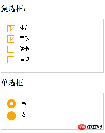
效果图如下
实例代码
<!DOCTYPE html>
<html lang="en">
<head>
    <meta charset="UTF-8">
    <title>复选单选样式</title>
    <link rel="stylesheet" href="style.css">
</head>
<style>
    form {
      border: 1px solid #ccc;
      padding: 20px;
      width: 300px;
    }
    .wrapper {
      margin-bottom: 10px;
    }
    /*复选框*/
    .checkbox-box {
      display: inline-block;
      width: 20px;
      height: 20px;
      margin-right: 10px;
      position: relative;
      border: 2px solid orange;
      vertical-align: middle;
    }
    .checkbox-box input {
      opacity: 0;
      position: absolute;
      top:0;
      left:0;
      z-index:10;
    }
    .checkbox-box span {
      position: absolute;
      top: -10px;
      right: 3px;
      font-size: 30px;
      font-weight: bold;
      font-family: Arial;
      -webkit-transform: rotate(30deg);
      transform: rotate(30deg);
      color: orange;
    }
    .checkbox-box input[type="checkbox"] + span {
      opacity:0;
    }
    .checkbox-box input[type="checkbox"]:checked + span {
      opacity: 1;
    }
    /*单选框*/
    .redio-box {
      display: inline-block;
      width: 30px;
      height: 30px;
      margin-right: 10px;
      position: relative;
      background: orange;
      vertical-align: middle;
      border-radius: 100%;
    }
    .redio-box input {
      opacity: 0;
      position: absolute;
      top:0;
      left:0;
      width: 100%;
      height:100%;
      z-index:100;/*使input按钮在span的上一层,不加点击区域会出现不灵敏*/
    }
    .redio-box span {
      display: block;
      width: 10px;
      height: 10px;
      border-radius: 100%;
      position: absolute;
      background: #fff;
      top: 50%;
      left:50%;
      margin: -5px 0  0 -5px;
      z-index:1;
    }
    .redio-box input[type="radio"] + span {
      opacity: 0;
    }
    .redio-box input[type="radio"]:checked + span {
      opacity: 1;
    }
</style>
<body>
<h2>复选框:</h2>
<form action="#">
  <p class="wrapper">
    <p class="checkbox-box">
      <input name="1" type="checkbox" checked id="usename" />
      <span>√</span>
    </p>
    <label for="usename">体育</label>
  </p>

  <p class="wrapper">
    <p class="checkbox-box">
      <input name="1" type="checkbox"  id="usepwd" />
      <span>√</span>
    </p>
    <label for="usepwd">音乐</label>
  </p>
  <p class="wrapper">
    <p class="checkbox-box">
      <input name="1" type="checkbox"  id="checkbox3" />
      <span>√</span>
    </p>
    <label for="checkbox3">读书</label>
  </p>

  <p class="wrapper">
    <p class="checkbox-box">
      <input name="1" type="checkbox"   id="checkbox4" />
      <span>√</span>
    </p>
    <label for="checkbox4">运动</label>
  </p>
</form>
<h2>单选框</h2>
<form action="#">
  <p class="wrapper">
    <p class="redio-box">
      <input type="radio" checked="checked"  id="boy" name="1" /><span></span>
    </p>
    <label for="boy">男</label>
  </p>

  <p class="wrapper">
    <p class="redio-box">
      <input type="radio"  id="girl" name="1" /><span></span>
    </p>
    <label for="girl">女</label>
  </p>
</form>
</body>
</html>注意:
+ 是css的相邻选择符。
关系选择符只有四种,是 空格 > + ~ (包含选择符、子选择符、相邻选择符、兄弟选择符)
相信看了本文案例你已经掌握了方法,更多精彩请关注php中文网其它相关文章!
推荐阅读:
以上就是单选、复选样式美化的图文详解的详细内容,更多请关注php中文网其它相关文章!

每个人都需要一台速度更快、更稳定的 PC。随着时间的推移,垃圾文件、旧注册表数据和不必要的后台进程会占用资源并降低性能。幸运的是,许多工具可以让 Windows 保持平稳运行。

 广告
广告![ThinkPHP5快速开发企业站点[全程实录]](https://img.php.cn/upload/course/000/000/068/6253d918a3ce7278.png)

Copyright 2014-2025 https://www.php.cn/ All Rights Reserved | php.cn | 湘ICP备2023035733号


 530
530