

CSS3 shape summary
This time I will bring you a summary of the shapes of Css3. What are the precautions when using Css3 shapes? The following is a practical case, let’s take a look.
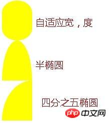
1. Adaptive ellipse
border-radius feature:
The horizontal and vertical radii can be specified separately, and the value It can be a percentage, just use / (slash) to separate the two values (adaptive width ellipse can be implemented).
You can also separately specify four horizontal and vertical radii with different angles (semi-ellipse can be realized)
Quarter ellipse, mainly It is to adjust the horizontal and vertical radius
Sample code:
.wrap{
            border-radius: 50% / 30%;
            width: 60px;
            height: 80px;
            background: yellow;
        }
        .wrap02{
            width: 60px;
            height: 80px;
            background: yellow;
            border-radius: 50% / 100% 100% 0 0;
        }
        .wrap03{
            width: 60px;
            height: 80px;
            background: yellow;
            border-radius: 100% 0 0 0;
        }
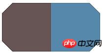
2. Flat quadrilateral
Needs to be applied to the skewX of transform for distortion
Mainly solve the problem that the container becomes a flat quadrilateral, while the internal text and elements are displayed vertically
Nested elements, internal elements can be reversely twisted using skew. Nested inner elements must be block because transform cannot be applied to inline elements.
Use pseudo-elements to distort (:before)
.wrap{
            width: 80px;
            height: 40px;
            transform: skewX(-45deg);
            background: yellow;
        }
        .wrap>p{
            transform: skewX(45deg);
        }
        .btn{
            position: relative;
            padding: 10px;
        }
        .btn:before{
            content: '';
            position: absolute;
            top: 0px;
            left: 0px;
            right: 0px;
            bottom: 0px;
            z-index: -1;
            background: #85a;
            transform: skewX(-45deg);
        }
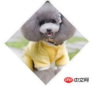
Three, rhombus
Apply the nesting of elements, and the outer and inner elements rotate with each other to achieve an octagonal shape;
Design internal elements max The width of -width is 100%, so that the entire picture can only fill the entire outer p; the
scale attribute controls the magnification of the picture, and the default is that the center point is the origin of magnification ( The Pythagorean Theorem will be used, do not specify transform-origin additionally).
.wrap{
            width: 200px;
            transform: rotate(-45deg);
            overflow: hidden;
        }
        .wrap > img{
            transform: rotate(45deg) scale(1.42);
            max-width: 100%;
        }
4. Corner cutting effect
Using linear-gradient can Set angle, multi-value and gradient transparency to achieve this.
You also need to pay attention to the settings of the background-size and background-repeat properties to prevent overlapping backgrounds from causing the effect to not take effect
.wrap{
            width: 200px;
            height: 100px;
            background: #58a;
            background: linear-gradient(-135deg, transparent 15px, #58a 0px) top right,
            linear-gradient(135deg,transparent 15px, #655 0px) top left,
            linear-gradient(-45deg, transparent 15px, #58a 0px) bottom right,
            linear-gradient(45deg, transparent 15px, #655 0px) bottom left;
            background-size: 50% 50%;
            background-repeat: no-repeat;
        }
You can use border-image to achieve corner cutting and set the value of border-image-slice (the picture border is offset inward) ;
border-image uses svg to make pictures
border sets the width + transparency, plus the border-image-slice is biased inward Shifting creates a border with cut corners;
background-clip: It must be set to padding-box, otherwise the background will extend to the border.
.wrapSvg{
            border:15px solid transparent;
            border-image: 1 url('data:image/svg+xml, <svg xmlns="http://www.w3.org/2000/svg" width="3" height="3" fill="%2358a"><polygon points="0,1 1,0 2,0 3,1 3,2 2,3 1,3 0,2"/></svg>');
            margin-top: 50px;
            width: 200px;
            height: 100px;
            background: #58a;
            background-clip: padding-box;
}Other solutions
Utilize clip-path attribute, but not fully supported
css4 will directly give the corner-path attribute to support corner cutting
5. Trapezoid pattern
Understand the basic principles of transform
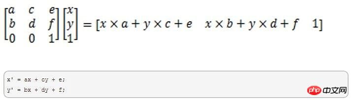
a and d represent scaling and cannot be 0; c and b control tilt; e and f control displacement
translate (displacement): matrix (1,0,0,1,x,y)
scale(scale): matrix(x,0,0,y,0,0);
skew (skew): matrix(1,tany,tanx,1,0,0), since the input is deg (angle), the angle needs to be converted into a radian value
rotate (rotation): matrix(cosN,sinN,-sinN,cosN,0,0), convert angles to radians
The above values are all applied with transform- The value of origin is related. It is the origin of rotation of the positioning element. It can be top, bottom, center, etc. You can specify three coordinate systems: x, y, and z.
perpective:透视,不可以负数,0或百分比,只能是数值;
表示观察者到被观察物体的一段距离
透视距离与物体越远,物体就会显得越小
透视只能设置在变形元素的父级或祖先级,因为浏览器会为其子级的变形产生透视效果
在3d变换上没有倾斜(skew)这个属性。

六、简单的饼图
动画饼图,效果如下:
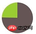
实现步骤如下:
画出一个yellowgreen的圆,并利用linear-gradient设置background-image的值,实现两种颜色各显示一半的功能:
然后加入一个伪元素,继承父级(真实元素)的背景色,然后用rotate旋转即可
要利用margin-left让其靠左
利用transform-origin设置其旋转定位点
动画展示代码如下:
@keyframes spin{
            to{ transform: rotate(.5turn); }
        }
        @keyframes bg{
            50%{ background-color: #655; }
        }
        .wrap{
            width: 100px; height: 100px;
            border-radius: 50%;
            background: yellowgreen;
            background-image: linear-gradient(to right, transparent 50%, #655 0);
        }
        .wrap::before{
            content: '';
            display: block;
            margin-left: 50%;
            background-color: inherit;
            height: 100%;
            border-radius: 0 100% 100% 0 / 50%;
            transform-origin: left;
            animation:spin 3s linear infinite,
                bg 6s step-end infinite;
}相信看了本文案例你已经掌握了方法,更多精彩请关注php中文网其它相关文章!
推荐阅读:
The above is the detailed content of CSS3 shape summary. For more information, please follow other related articles on the PHP Chinese website!

Hot AI Tools

Undresser.AI Undress
AI-powered app for creating realistic nude photos

AI Clothes Remover
Online AI tool for removing clothes from photos.

Undress AI Tool
Undress images for free

Clothoff.io
AI clothes remover

Video Face Swap
Swap faces in any video effortlessly with our completely free AI face swap tool!

Hot Article
Hot Tools

Notepad++7.3.1
Easy-to-use and free code editor

SublimeText3 Chinese version
Chinese version, very easy to use

Zend Studio 13.0.1
Powerful PHP integrated development environment

Dreamweaver CS6
Visual web development tools

SublimeText3 Mac version
God-level code editing software (SublimeText3)
Hot Topics
 1657
1657
 14
1415
52
1309
25
1257
29
1230
24
14
1415
52
1309
25
1257
29
1230
24

 How to use bootstrap in vue
Apr 07, 2025 pm 11:33 PM
How to use bootstrap in vue
Apr 07, 2025 pm 11:33 PM
Using Bootstrap in Vue.js is divided into five steps: Install Bootstrap. Import Bootstrap in main.js. Use the Bootstrap component directly in the template. Optional: Custom style. Optional: Use plug-ins.
 Understanding HTML, CSS, and JavaScript: A Beginner's Guide
Apr 12, 2025 am 12:02 AM
Understanding HTML, CSS, and JavaScript: A Beginner's Guide
Apr 12, 2025 am 12:02 AM
WebdevelopmentreliesonHTML,CSS,andJavaScript:1)HTMLstructurescontent,2)CSSstylesit,and3)JavaScriptaddsinteractivity,formingthebasisofmodernwebexperiences.
 The Roles of HTML, CSS, and JavaScript: Core Responsibilities
Apr 08, 2025 pm 07:05 PM
The Roles of HTML, CSS, and JavaScript: Core Responsibilities
Apr 08, 2025 pm 07:05 PM
HTML defines the web structure, CSS is responsible for style and layout, and JavaScript gives dynamic interaction. The three perform their duties in web development and jointly build a colorful website.
 How to write split lines on bootstrap
Apr 07, 2025 pm 03:12 PM
How to write split lines on bootstrap
Apr 07, 2025 pm 03:12 PM
There are two ways to create a Bootstrap split line: using the tag, which creates a horizontal split line. Use the CSS border property to create custom style split lines.
 How to insert pictures on bootstrap
Apr 07, 2025 pm 03:30 PM
How to insert pictures on bootstrap
Apr 07, 2025 pm 03:30 PM
There are several ways to insert images in Bootstrap: insert images directly, using the HTML img tag. With the Bootstrap image component, you can provide responsive images and more styles. Set the image size, use the img-fluid class to make the image adaptable. Set the border, using the img-bordered class. Set the rounded corners and use the img-rounded class. Set the shadow, use the shadow class. Resize and position the image, using CSS style. Using the background image, use the background-image CSS property.
 How to set up the framework for bootstrap
Apr 07, 2025 pm 03:27 PM
How to set up the framework for bootstrap
Apr 07, 2025 pm 03:27 PM
To set up the Bootstrap framework, you need to follow these steps: 1. Reference the Bootstrap file via CDN; 2. Download and host the file on your own server; 3. Include the Bootstrap file in HTML; 4. Compile Sass/Less as needed; 5. Import a custom file (optional). Once setup is complete, you can use Bootstrap's grid systems, components, and styles to create responsive websites and applications.
 How to use bootstrap button
Apr 07, 2025 pm 03:09 PM
How to use bootstrap button
Apr 07, 2025 pm 03:09 PM
How to use the Bootstrap button? Introduce Bootstrap CSS to create button elements and add Bootstrap button class to add button text
 How to resize bootstrap
Apr 07, 2025 pm 03:18 PM
How to resize bootstrap
Apr 07, 2025 pm 03:18 PM
To adjust the size of elements in Bootstrap, you can use the dimension class, which includes: adjusting width: .col-, .w-, .mw-adjust height: .h-, .min-h-, .max-h-
