Implement multiple background simulation dynamic borders
This time I will bring you the implementation of multi-background simulated dynamic borders and what are the precautions for realizing multi-background simulated dynamic borders. The following is a practical case, let's take a look.
First let’s take a look at the renderings to be achieved

Implementation method As follows
The first thing I thought of was the border attribute, but the border attribute cannot set the length. If implemented with borders, other elements need to be used to simulate it, which is more troublesome. Then I suddenly remembered that I had seen someone using CSS3 multiple backgrounds to simulate borders on the Internet, so I gave it a try.
css3 background
CSS3 has made some modifications to the background. The most obvious one is to set multiple backgrounds, which not only adds 4 new attributes, and also adjusted and enhanced the current attributes.
1. Multiple background images
In css3, you can apply multiple background images to a label element. The code is similar to the css2.0 version, but the referenced images need to be separated by "," commas. The first image is the background positioned at the top of the element, and subsequent background images are displayed below it in turn, as follows:
background-image: url(top-image.jpg), url(middle-image.jpg), url(bottom-image.jpg);
2. New attribute: Background Clip
This discussion brings us back to the issue mentioned at the beginning of the article about the background being blocked by the border. The addition of background-clip gives us complete control over the position of the background display.
The attribute values are as follows:
background-clip: border; The background begins to display under the border
background-clip: padding; The background begins to display under padding, not Start under the border border
Background-clip: content; The background starts under the content area, not under the border border or padding.
background-clip: no-clip; Default attribute value, similar to background-clip: border;
3. New attribute: Background Origin
This attribute needs to be used in conjunction with background-position. You can use background-position to calculate positioning from the border, padding or content boxes content area. (Similar to background-clip)
background-origin: border; starting from the border border position
background-origin: padding; starting from the padding position
background-origin: content; starting from the position of the content-box content area;
The difference between background-clip and background-origin is well analyzed and explained by the www.CSS3.info website .
4. New attribute: Background Size
The Background Size attribute is used to reset your background image.
There are several attribute values:
background-size: contain; Reduce the background image to fit the label element (mainly the ratio of pixels)
background-size: cover; Let the background image be enlarged and extended to the entire label element size (mainly the pixel ratio)
background-size: 100px 100px; Indicate the size of the background image to be scaled
background-size: 50% 100%; The percentage is based on the size of the content tag element to scale the size of the image
You can go to the CSS 3 specifications site to see a simple case description.
5. New attribute: Background Break
In css3, label elements can be divided into different areas (such as: allowing inline elements to span across multiple lines), background- The break attribute can control the background to be displayed in different areas.
Property value:
Background-break: continuous; This property is the default value, ignoring the gaps between areas (applying images to them is like treating them as one area)
Background-break: bounding-box; Reconsider the spacing between areas
Background-break: each-box; 对每一个独立的标签区域进行背景的重新划分。
6、背景颜色的调整
background-color属性在css3版本里面稍微做了增强,除了指定background color背景颜色之外,还可以对不使用的标签元素背景图片进行去色处理。
background-color: green / blue;此例子里,这背景颜色可能是绿色,然而,如果底部背景图片无效的话,蓝色将代替绿色来显示。如果你没有指定某个颜色的话,它将其视为透明。
7、背景重复的调整
css2里当设置背景的时候,它经常被标签元素截取而显示不全,css3介绍了2个新属性来修复此问题。 space:图片以相同的间距平铺且填充整个标签元素 round:图片自动缩放直到适应且填充整个标签元素
CSS 3 specifications网站对background-repeat: space的使用就是一个现成的例子。
8、Background Attachment 的调整
Background Attachment有了一个新属性值:local,当标签元素滚动时它才有效(如设置overflow:scroll;),当background-attachment设置为scroll时,背景图片是不随内容滚条滚动的。现在,有了background-attachment:local,就可以做到让背景随元素内容滚动而滚动了。
css3 多背景模拟元素边框
我们这里主要使用了background-img、background-size 和 background-position 三个属性。
background-image: [background-image], [background-image], [background-image];
background-position: [background-position], [background-position], [background-position];
background-repeat: [background-repeat], [background-repeat], [background-repeat];
简写形式如下:
background: [background-image] [background-position] [background-repeat],
[background-image] [background-position] [background-repeat],
[background-image] [background-position] [background-repeat];
现在我们用多背景来模拟一个元素的边框
/*CSS*/
.exammple {
    background: linear-gradient(0, #108b96 2px, #108b96 2px) no-repeat,
                linear-gradient(-90deg, #108b96 2px, #108b96 2px) no-repeat,
                linear-gradient(-180deg, #108b96 2px, #108b96 2px) no-repeat,
                linear-gradient(-270deg, #108b96 2px, #108b96 2px) no-repeat;
    background-size: 100% 2px, 2px 100%, 100% 2px, 2px 100%;
    background-position: left top, right top, right bottom, left bottom;
}<p class="exammple"></p>
我们用四个渐变的背景来模拟四个边框(为什么我们要用渐变而不是直接的Color呢?这是由于Css的多背景只能是background-image, background-color不支持多个值,所有即便是纯色的边框,我们也只能使用渐变)。
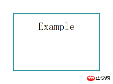
接下来我们让边框动起来
/*CSS*/
.exammple {
    transition: ease-in .3s;
    background: linear-gradient(0, #108b96 2px, #108b96 2px) no-repeat,
                linear-gradient(-90deg, #108b96 2px, #108b96 2px) no-repeat,
                linear-gradient(-180deg, #108b96 2px, #108b96 2px) no-repeat,
                linear-gradient(-270deg, #108b96 2px, #108b96 2px) no-repeat;
    background-size: 0 2px, 2px 0, 0 2px, 2px 0;
    background-position: left top, right top, right bottom, left bottom;
}
.exammple:hover {
    background-size: 100% 2px,  2px 100%, 100% 2px, 2px 100%;
}相信看了本文案例你已经掌握了方法,更多精彩请关注php中文网其它相关文章!
推荐阅读:
The above is the detailed content of Implement multiple background simulation dynamic borders. For more information, please follow other related articles on the PHP Chinese website!

Hot AI Tools

Undresser.AI Undress
AI-powered app for creating realistic nude photos

AI Clothes Remover
Online AI tool for removing clothes from photos.

Undress AI Tool
Undress images for free

Clothoff.io
AI clothes remover

Video Face Swap
Swap faces in any video effortlessly with our completely free AI face swap tool!

Hot Article

Hot Tools

Notepad++7.3.1
Easy-to-use and free code editor

SublimeText3 Chinese version
Chinese version, very easy to use

Zend Studio 13.0.1
Powerful PHP integrated development environment

Dreamweaver CS6
Visual web development tools

SublimeText3 Mac version
God-level code editing software (SublimeText3)

Hot Topics
 1664
1664
 14
14
 1423
1423
 52
52
 1317
1317
 25
25
 1268
1268
 29
29
 1246
1246
 24
24
 How to adjust window border settings on Windows 11: Change color and size
Sep 22, 2023 am 11:37 AM
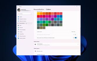
Windows 11 brings fresh and elegant design to the forefront; the modern interface allows you to personalize and change the finest details, such as window borders. In this guide, we'll discuss step-by-step instructions to help you create an environment that reflects your style in the Windows operating system. How to change window border settings? Press + to open the Settings app. WindowsI go to Personalization and click Color Settings. Color Change Window Borders Settings Window 11" Width="643" Height="500" > Find the Show accent color on title bar and window borders option, and toggle the switch next to it. To display accent colors on the Start menu and taskbar To display the theme color on the Start menu and taskbar, turn on Show theme on the Start menu and taskbar
 Fix: Windows 11's dynamic refresh rate doesn't work
Apr 13, 2023 pm 08:52 PM
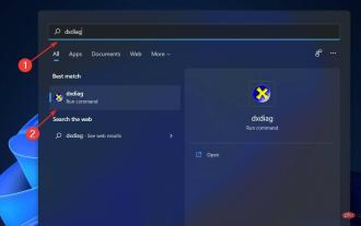
You can measure a screen's refresh rate by counting the number of times the image updates per second. DRR is a new feature included in Windows 11 that helps you save battery life while still providing a smoother display, but it's no surprise when it doesn't work properly. Screens with higher refresh rates are expected to become more common as more manufacturers announce plans to stop producing 60Hz monitors. This will result in smoother scrolling and better gaming, but it will come at the cost of reduced battery life. However, the dynamic refresh rate feature in this iteration of the OS is a nifty addition that can have a big impact on your overall experience. Read on as we discuss what to do if Windows 11’s dynamic refresh rate isn’t working
 How to Hide Dynamic Island and Red Indicator in iPhone Screen Recording
Apr 13, 2023 am 09:13 AM
On iPhone, Apple's screen recording feature records a video of what you're doing on the screen, which is useful if you want to capture gameplay, walk someone through a tutorial in an app, demonstrate a bug, or anything else. On older iPhones that have a notch at the top of the display, the notch is not visible in screen recording, as it should be. But on newer iPhones with the Dynamic Island cutout, such as the iPhone 14 Pro and iPhone 14 Pro Max, the Dynamic Island animation displays the red recording indicator, which causes the cutout to be visible in captured videos. this might
 Convert VirtualBox fixed disk to dynamic disk and vice versa
Mar 25, 2024 am 09:36 AM
When creating a virtual machine, you will be asked to select a disk type, you can select fixed disk or dynamic disk. What if you choose fixed disks and later realize you need dynamic disks, or vice versa? Good! You can convert one to the other. In this post, we will see how to convert VirtualBox fixed disk to dynamic disk and vice versa. A dynamic disk is a virtual hard disk that initially has a small size and grows in size as you store data in the virtual machine. Dynamic disks are very efficient at saving storage space because they only take up as much host storage space as needed. However, as disk capacity expands, your computer's performance may be slightly affected. Fixed disks and dynamic disks are commonly used in virtual machines
 How to convert dynamic disk to basic disk on Windows 11
Sep 23, 2023 pm 11:33 PM
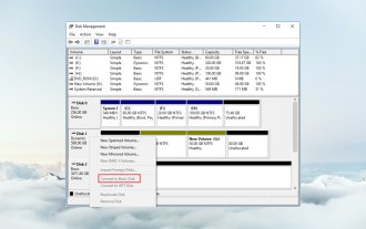
If you want to convert a dynamic disk to a basic disk in Windows 11, you should create a backup first as the process will erase all data in it. Why should you convert dynamic disk to basic disk in Windows 11? According to Microsoft, dynamic disks have been deprecated from Windows and their use is no longer recommended. Additionally, Windows Home Edition does not support dynamic disks, so you will not be able to access these logical drives. If you want to combine more disks into a larger volume, it is recommended to use Basic Disks or Storage Spaces. In this article, we will show you how to convert dynamic disk to basic disk on Windows 11 How to convert dynamic disk to basic disk in Windows 11? In the beginning
 How to Get Live Tiles on the Desktop and Start Menu in Windows 11
Apr 14, 2023 pm 05:07 PM
Imagine you are looking for something on your system but are not sure which application to open or select. This is where the Live Tiles feature comes into play. A live tile for any supported application can be added to the desktop or Windows system's Start menu, with its tiles changing frequently. LiveTiles make application widgets come alive in a very pleasing way. Not just for its appearance, but even for convenience. Suppose you are using whatsapp or facebook application on your system, wouldn't it be convenient if the number of notifications is displayed on the application icon? This is possible if any such supported app is added as a live tile. Let’s see how to do it in Windows
 How to disable dynamic display of folders and files to prevent quick access in Windows 10 and 11?
May 06, 2023 pm 04:58 PM
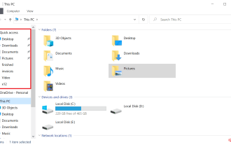
Microsoft introduced Quick Access in Windows 10 and retained the feature in the recently released Windows 11 operating system. Quick Access replaces the Favorites system in File Explorer. One of the core differences between the two features is that Quick Access adds a dynamic component to its list. Some folders appear permanently, while others appear based on usage. Fixed folders are displayed with a pin icon, while dynamic folders do not have such an icon. You can see a comparison between My Favorites and Quick Access here for more details. Quick Access is more powerful than Favorites, but dynamic folder lists add an element of clutter to it. Files that are useless or should not be highlighted in File Explorer may be displayed
 Popular science on how to set excel borders
Mar 20, 2024 am 10:30 AM
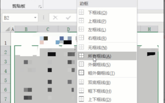
It is not uncommon for Excel to appear in our daily work and life. Whether it is the production of employee information, salary tables, or student enrollment information and transcripts, Excel is a relatively easy-to-use tool. When printing Excel, you need to set borders to meet printing requirements. In this article, the editor will introduce you to several ways to set Excel borders. Method 1. Use the function tab button. This should be a method often used by everyone. It is convenient and fast. The specific operation: select the cell area B2:H10 where you need to add a border, click the [Start] tab - [Border] drop-down on the right Button-[All Frames] to complete adding frames. Method 2. Select the cell area B2:H10 where you want to add a border.


