

This article mainly introduces to you the relevant information about the sample code of CSS implementation of triangles with rounded corners. The editor thinks it is quite good, so I will share it with you now and give it as a reference. Let’s follow the editor to take a look, I hope it can help everyone.
Preface
The target realization renderings are as follows:

Achievement
<i class="triangle triangle-up"></i>
<i class="triangle triangle-right"></i>
<i class="triangle triangle-down"></i>
<i class="triangle triangle-left"></i>
.triangle{
  display: inline-block;
  font-size: 0;
  overflow: hidden;
}

.triangle:before{
  content: "";
  position: relative;
  display: inline-block;
  border: 25px solid transparent;
}

.triangle-up{
  position: relative;
  top: 2px;
  border-top-left-radius: 50%;
  border-top-right-radius: 50%;
}
.triangle-up:before{
  bottom: 2px;
  border-top-width: 0;
  border-bottom-width: 50px;
  border-bottom-color: rgb(181, 181, 181);
}

.triangle-right{
  position: relative;
  right: 2px;
  border-top-right-radius: 50%;
  border-bottom-right-radius: 50%;
}
.triangle-right:before{
  left: 2px;
  border-right-width: 0;
  border-left-width: 50px;
  border-left-color: rgb(181, 181, 181);
}

.triangle-down{
  position: relative;
  bottom: 2px;
  border-bottom-right-radius: 50%;
  border-bottom-left-radius: 50%;
}
.triangle-down:before{
  top: 2px;
  border-bottom-width: 0;
  border-top-width: 50px;
  border-top-color: rgb(181, 181, 181);
}

.triangle-left{
  position: relative;
  left: 2px;
  border-top-left-radius: 50%;
  border-bottom-left-radius: 50%;
}
.triangle-left:before{
  right: 2px;
  border-left-width: 0;
  border-right-width: 50px;
  border-right-color: rgba(181, 181, 181, 1);
}Analysis
Extract a triangle from the above code to analyze, take triangle-down as an example.
Generally, slashes cannot be drawn in CSS, so we have to find another way. Looking at the above implementation code, you will find that border is used extensively. In fact, this is the core and it is not complicated. A picture can illustrate
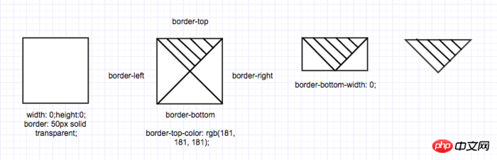
Adjusting the size or shape of the triangle can This is achieved by adjusting the size of border-width in different directions, for example, adjusting the size of triangle-down:
Adjusting height: border-top-width: 100px;;
Adjust the width: border-right-width: 50px; border-left-width: 50px;
Adjust the size of the triangle in other directions by analogy.
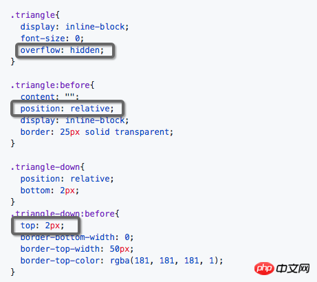
Look at the triangle-down in the "Preface" and you will find that the downward angle is not sharp, but has a little "small arc".
It is not difficult to realize this "small arc". In fact, it is not a radian, but uses overflow: hidden to "cut off" a little bit of the corner. When you zoom in, you can find that the transition is not harmonious, but because of this type of triangle In actual use, the size will be very small, so the naked eye will not perceive this disharmony and will mistakenly think it is a small rounded corner. In the above example, 2px is cut off.
Another idea that can achieve a more harmonious transition is to draw a large enough circular overflow: hidden area, and then put the triangle in it, and the three corners will be cut more harmoniously, but at this time The triangle is already quite large, so you can use transform: scale() to reduce it. It’s troublesome, isn’t it? It’s half the result with twice the effort, so I forget it...
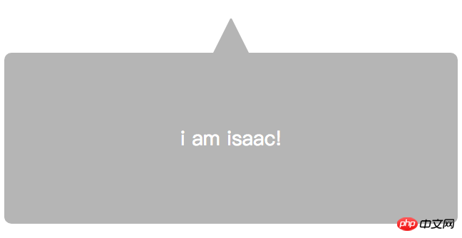
<p class="bubble-box">
  <p class="bubble-box-hat">
    <i class="triangle triangle-up"></i>
  </p>
  <p class="bubble-box-body">i am isaac!</p>
</p>.bubble-box{
font-size: 0;
margin-top: 50px;
}
.bubble-box-hat{
text-align: center;
}
.bubble-box-body{
color: #FFFFFF;
background: rgb(181, 181, 181);
font-size: 28px;
border-radius: 10px;
padding: 100px;
text-align: center;
}How to draw triangles and parallelograms with CSS
JavaScript loop practice printing triangles, Factorial and multiplication table methods
Use css to implement a transparent triangle special effect code
The above is the detailed content of How to implement rounded triangles in css. For more information, please follow other related articles on the PHP Chinese website!


![[Web front-end] Node.js quick start](https://img.php.cn/upload/course/000/000/067/662b5d34ba7c0227.png)


