

This article mainly introduces the relevant information of HTML CSS to implement dynamic background login page. Friends who need it can refer to it
1. Implement dynamic transformation of background images
First, add the image p in the body section of the HTML page. The code is as follows:
<body>
<p class="bgk">
<p class="bgk-image" style="background-image: url('${pageContext.request.contextPath}/img/1.jpg')"></p>
<p class="bgk-image" style="background-image: url('${pageContext.request.contextPath}/img/2.jpg')"></p>
<p class="bgk-image" style="background-image: url('${pageContext.request.contextPath}/img/3.jpg')"></p>
<p class="bgk-image" style="background-image: url('${pageContext.request.contextPath}/img/4.jpg')"></p>
</body>Then perform CSS design on the image. If you want to size the image, you must write the following code first:
`.bgk {
margin: auto;
position: absolute;
width: 1366px;
height: 672px;
overflow: hidden;   /*溢出部分隐藏*/
}`After the position is set ok, then set the image inside. In order to make the image large enough to cover the page, the code must have background-size: cover;
To achieve dynamic effects, then your css code must have animation design:
-webkit-animation-name: kenburns;       /*-animation-name:为@keyframes 动画规定名称,必须与-animation-duration同时使用,否则无动画效果*/
animation-name: kenburns;               /*或者:后面值为需要绑定到选择器上的keyframe名称*/
-webkit-animation-duration: 16s;    /*定义动画完成一个周期所需时间*/
animation-duration: 16s;
-webkit-animation-timing-function: linear;  /*规定动画从头到尾以相同速度播放,还有其他几个速度值*/
animation-timing-function: linear;
-webkit-animation-iteration-count: infinite;    /*规定动画播放次数,infinite为无限次*/
animation-iteration-count: infinite;
-webkit-transform: scale(1.2);      /*规定动画的缩放特效,scale:规定2D缩放*/
transform: scale(1.2);
-webkit-filter: blur(10px);       /*定义图片的模糊程度,显示为毛玻璃效果*/
filter: blur(10px);
When binding each sub-element selector, bind as many selectors as there are pictures:
.bgk-image:nth-child(1) {
-webkit-animation-name: kenburns-1;       /*选择器上的名称*/
animation-name: kenburns-1;
z-index: 3;         /*动画堆叠顺序,值越大表示越先播放,离用户越近*/
}
.bgk-image:nth-child(2) {
-webkit-animation-name: kenburns-2;
animation-name: kenburns-2;
z-index: 2;
}
.bgk-image:nth-child(3) {
-webkit-animation-name: kenburns-3;
animation-name: kenburns-3;
z-index: 1;
}
.bgk-image:nth-child(4) {
-webkit-animation-name: kenburns-4;
animation-name: kenburns-4;
z-index: 0;
}After creating the selector, you can preview your dynamic background image transformation
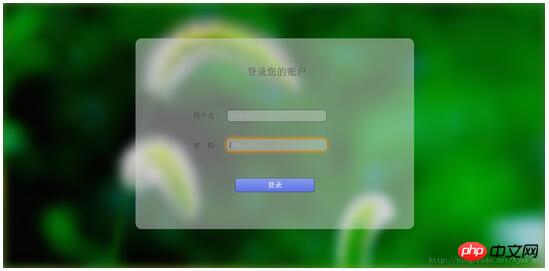
2. Design the login form
in Previously, I continued to add a form to the HTML page
<p class="form_login_p">
    <form  class="form_login" action="" method="post">
        <label class="login_title">登录您的账户</label>
        <label class="username">用户名</label><input class="input_username" id="input_username" type="text" name="username" placeholder="邮箱/手机号"/>
        <label class="password">密 码</label><input class="input_password" id="input_password" type="password" name="password" placeholder="请输入密码"/>
        <input type="submit" value="登录"/><br/>
    </form>
</p>After adding the form, it is necessary to style the form. First, you have to define a circle for the form and limit its width and height
.form_login{
    margin: auto;
    width:700px;
    height: 480px;
    top: 90px;
    left: 333px;
    position: absolute;
    border-radius: 15px;
    background: rgba(216,216,216,0.5);      /*设置form表单透明度*/
    text-align: center;
    overflow: hidden;
}Then you can position and style the labels in the form freely. design.
For the design of the input box, I only post the main style code
outline:none;       /*outline (轮廓)是绘制于元素周围的一条线,位于边框边缘的外围,可起到突出元素的作用。*/
border:1px solid rgba(0,0,0,.49);       /*输入框边框的大小,实线,rgba(red,green,blue,a为透明度),透明度处于0-1之间*/
-webkit-background-clip: padding-box;   /*background-clip 规定背景的绘制区域,padding-box为内容被裁减到内边距框*/
background-clip: padding-box;
background:rgba(216,216,216,0.4) ;
border-radius:6px;      /*对输入框进行圆角*/
padding:7px;       /*输入框中光标位置*/
When focusing on the input box, you can add a little more brilliant color
.form_login input[type="text"]:focus,input[type="password"]:focus{
    -webkit-transition:border linear .2s,-webkit-box-shadow linear .5s;     /*对边框颜色的逐步过渡高亮显示,后面是对阴影的逐步过渡*/
    border-color:rgba(255,128,0,.75);
}Finally design the submit button
text-shadow:0px -1px 0px #5b6ddc;       /*文字阴影设置*/
outline:none;
border:1px solid rgba(0,0,0,0.49);       /*按钮边框颜色与透明度设置*/
-webkit-background-clip: padding-box;   /*规定内容的绘制区域,padding-box为内边框距*/
background-clip: padding-box;
border-radius:6px;
cursor:pointer;     /*光标形状,pointer为一只手的形状*/
background-color:#768ee4;       /*按钮背景颜色*/
When the mouse is placed on the submit button Above, you can appropriately design some animation effects
.form_login input[type="submit"]:hover{
    background-color:#5f73e9;
    background-image:-webkit-linear-gradient(bottom,#5f73e9 0%,#859bef 100%);
    background-image:-moz-linear-gradient(bottom,#5f73e9 0%,#859bef 100%);
    background-image:-ms-linear-gradient(bottom,#5f73e9 0%,#859bef 100%);
    background-image:-o-linear-gradient(bottom,#5f73e9 0%,#859bef 100%);
    -webkit-box-shadow: inset 0px 1px 0px #aab9f4;      /*当鼠标放在按钮上个时边框的阴影*/
    box-shadow: inset 0px 1px 0px #aab9f4;
    margin-top:22px;
}Finally the entire design is completed and you can see your final effect
The above is the entire content of this article. I hope it will be helpful to everyone's study. For more related content, please pay attention to the PHP Chinese website!
Related recommendations:
Use CSS3 to create special effects for photo walls
HTML5 and CSS3
Realize the switching effect of spiritual animation
Html and css code to realize pure text and buttons with icons
The above is the detailed content of HTML and CSS to implement dynamic background login page. For more information, please follow other related articles on the PHP Chinese website!


![[Web front-end] Node.js quick start](https://img.php.cn/upload/course/000/000/067/662b5d34ba7c0227.png)


