

About the method of realizing hexagonal picture in css

This article mainly introduces the sample code for realizing hexagonal images with CSS. The content is quite good. I will share it with you now and give it as a reference.
This article mainly introduces the sample code for realizing hexagonal images with css and shares it with everyone. The details are as follows:
Without talking about anything else, let’s talk about the effects first:

Using a simple p with pseudo elements, you can 'draw' this hexagonal picture. The principle is that three p's of the same width and height are assembled into a hexagon through positioning and rotation, and then used Background images are layered to form a visually complete image. Let’s implement it step by step.
(1) Then the first step is, of course, to draw the container. The container is a p with width and height.
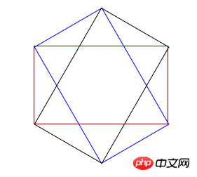
Before drawing, you must understand a problem, that is, an equilateral hexagon is made up of three p’s with the same width and height (as shown in the figure below), so the width and height of p must satisfy √ Only three times the conditions can be used to form a regular hexagon. I won’t show you how to calculate this value here. If you are interested, you can use trigonometric functions to calculate it yourself in private.
Here, I set the width of the outer container to 190px, the height to 110px, and then set the background image. The code is as follows
<!DOCTYPE html>
<html lang="en">
<head>
<meta charset="UTF-8">
<title>Document</title>
</head>
<style>
.wrap{
height:110px;
width: 190px;
position: relative;
margin: 200px auto;
background: url('./eddie.jpg') 50% 50% no-repeat;
background-size: auto 220px;
}
</style>
<body>
<p class='wrap'>
</p>
</body>
</html>The effect is a picture

(2) In the second step, draw the left p and its pseudo-element picture
In this step, use the new p to position and rotate the left side of the hexagon, and set the width and height of the new p pseudo-element and set a background image consistent with the above picture. Note that the width and height of the new p pseudo-element are the entire The width and height of the hexagon. Then rotate the pseudo element to display the picture vertically (the new p should be rotated, so the pseudo element picture is also rotated, so it needs to be reversely rotated back to the normal angle) and the position of the pseudo element must be adjusted (the new p is rotated, which affects the positioning of the pseudo element) position), and finally set the new p to exceed the hidden value, and the left side of the hexagon will be drawn
<!DOCTYPE html>
<html lang="en">
<head>
<meta charset="UTF-8">
<title>Document</title>
</head>
<style>
.wrap{
height:110px;
width: 190px;
position: relative;
margin: 200px auto;
background: url('./eddie.jpg') 50% 50% no-repeat;
background-size: auto 220px;
}
.common{
position: absolute;
height: 100%;
width: 100%;
overflow: hidden;
left:0;
23
}
.common:before{
content:'';
position: absolute;
background:url('./eddie.jpg') 50% 50% no-repeat;
background-size: auto 220px;
width: 190px;
height: 220px;
}
.left{
transform: rotate(60deg);
}
.left:before{
transform: rotate(-60deg) translate(48px,-28px);
}
</style>
<body>
<p class='wrap'>
<p class='left common'></p>
</p>
</body>
</html>The effect is as follows:

(3) Third Step 1: Draw p on the right and its pseudo-element image
The principle of this step is the same as the second part, except that the angle is reversed, so I won’t go into details and go directly to the complete code
<!DOCTYPE html>
<html lang="en">
<head>
<meta charset="UTF-8">
<title>Document</title>
</head>
<style>
.wrap{
height:110px;
width: 190px;
position: relative;
margin: 200px auto;
background: url('./eddie.jpg') 50% 50% no-repeat;
background-size: auto 220px;
}
.common{
position: absolute;
height: 100%;
width: 100%;
overflow: hidden;
left:0;
}
.common:before{
content:'';
position: absolute;
background:url('./eddie.jpg') 50% 50% no-repeat;
background-size: auto 220px;
width: 190px;
height: 220px;
}
.left{
transform: rotate(60deg);
}
.left:before{
transform: rotate(-60deg) translate(48px,-28px);
}
.right{
transform: rotate(-60deg);
}
.right:before{
transform: rotate(60deg) translate(48px,28px);
bottom: 0;
}
</style>
<body>
<p class='wrap'>
<p class='left common'></p>
<p class='right common'></p>
</p>
</body>
</html>So far , you can display the picture at the beginning of the article. Using this principle, you can also create various other shapes of picture display effects. Welcome to continue your research. In the future, picture display will no longer be a single brick line! !
The above is the entire content of this article. I hope it will be helpful to everyone's study. For more related content, please pay attention to the PHP Chinese website!
Related recommendations:
Use css3 to achieve ripple effects and H5 to achieve dynamic wave effects
How to set up CSS
Text font color
How to draw a circle loading circle animation using css3
The above is the detailed content of About the method of realizing hexagonal picture in css. For more information, please follow other related articles on the PHP Chinese website!

Hot AI Tools

Undresser.AI Undress
AI-powered app for creating realistic nude photos

AI Clothes Remover
Online AI tool for removing clothes from photos.

Undress AI Tool
Undress images for free

Clothoff.io
AI clothes remover

Video Face Swap
Swap faces in any video effortlessly with our completely free AI face swap tool!

Hot Article
Hot Tools

Notepad++7.3.1
Easy-to-use and free code editor

SublimeText3 Chinese version
Chinese version, very easy to use

Zend Studio 13.0.1
Powerful PHP integrated development environment

Dreamweaver CS6
Visual web development tools

SublimeText3 Mac version
God-level code editing software (SublimeText3)
Hot Topics
 1653
1653
 14
1413
52
1305
25
1251
29
1224
24
14
1413
52
1305
25
1251
29
1224
24

 Stacked Cards with Sticky Positioning and a Dash of Sass
Apr 03, 2025 am 10:30 AM
Stacked Cards with Sticky Positioning and a Dash of Sass
Apr 03, 2025 am 10:30 AM
The other day, I spotted this particularly lovely bit from Corey Ginnivan’s website where a collection of cards stack on top of one another as you scroll.
 Google Fonts Variable Fonts
Apr 09, 2025 am 10:42 AM
Google Fonts Variable Fonts
Apr 09, 2025 am 10:42 AM
I see Google Fonts rolled out a new design (Tweet). Compared to the last big redesign, this feels much more iterative. I can barely tell the difference
 How to Create an Animated Countdown Timer With HTML, CSS and JavaScript
Apr 11, 2025 am 11:29 AM
How to Create an Animated Countdown Timer With HTML, CSS and JavaScript
Apr 11, 2025 am 11:29 AM
Have you ever needed a countdown timer on a project? For something like that, it might be natural to reach for a plugin, but it’s actually a lot more
 HTML Data Attributes Guide
Apr 11, 2025 am 11:50 AM
HTML Data Attributes Guide
Apr 11, 2025 am 11:50 AM
Everything you ever wanted to know about data attributes in HTML, CSS, and JavaScript.
 How to select a child element with the first class name item through CSS?
Apr 05, 2025 pm 11:24 PM
How to select a child element with the first class name item through CSS?
Apr 05, 2025 pm 11:24 PM
When the number of elements is not fixed, how to select the first child element of the specified class name through CSS. When processing HTML structure, you often encounter different elements...
 Why are the purple slashed areas in the Flex layout mistakenly considered 'overflow space'?
Apr 05, 2025 pm 05:51 PM
Why are the purple slashed areas in the Flex layout mistakenly considered 'overflow space'?
Apr 05, 2025 pm 05:51 PM
Questions about purple slash areas in Flex layouts When using Flex layouts, you may encounter some confusing phenomena, such as in the developer tools (d...
 A Proof of Concept for Making Sass Faster
Apr 16, 2025 am 10:38 AM
A Proof of Concept for Making Sass Faster
Apr 16, 2025 am 10:38 AM
At the start of a new project, Sass compilation happens in the blink of an eye. This feels great, especially when it’s paired with Browsersync, which reloads
 In front-end development, how to use CSS and JavaScript to achieve searchlight effects similar to Windows 10 settings interface?
Apr 05, 2025 pm 10:21 PM
In front-end development, how to use CSS and JavaScript to achieve searchlight effects similar to Windows 10 settings interface?
Apr 05, 2025 pm 10:21 PM
How to implement Windows-like in front-end development...
