This article mainly introduces the detailed explanation of the use and pitfalls of enabling hardware acceleration in CSS3. The content is quite good. I will share it with you now and give it as a reference.
Recently I was looking at the iscroll documentation on github. Although it is in English, but in order to show off, I couldn’t bite the bullet and read it. I think the author wrote it well (I wish I had the patience to write such a long document [face covering]), and then in order to show off better , I read it again and found a lot of good things in it. For example, CCS3 hardware acceleration was extended by me on it. In order for everyone to play happily together, I will first attach the Github Link of iscroll: https://github.com/issaxite/iscroll
Enable CSS3 acceleration
Usually the CSS3 animations we write (which do not trigger hardware acceleration) are executed using the browser's slow software rendering engine, which literally means that hardware acceleration is not turned on. For example, sometimes animations written on mobile web pages (such as the simplest modal box) will have frame freezes on Android phones. It is very likely that the browser software rendering engine is used to execute the animation, and the performance cannot keep up. . It is mentioned above that hardware acceleration can solve this problem. If the performance cannot keep up, then go to Spider Man (the greater the ability, the greater the responsibility) - use hardware acceleration to improve the performance (I know this is another bad gag) ), in fact, the so-called hardware acceleration is to tell the browser to use the GPU for rendering, switch to GPU mode, and use a series of functions of the GPU.
For example:
CSS animations, transforms and transitions do not automatically turn on GPU acceleration, but are executed by the browser's slow software rendering engine. For performance, you may need to turn on hardware acceleration at this time. So how can we switch to GPU mode? Many browsers provide certain triggered CSS rules.
Chrome, FireFox, Safari, IE9 and the latest version of Opera all support hardware acceleration. When they detect that certain CSS rules are applied to a DOM element in the page, they will turn it on. The most significant characteristic element is 3D transformation.
I saw several 3D attributes that can be switched to GPU mode in other articles:
.isaax{
   -webkit-transform: translate3d(250px,250px,250px)
   rotate3d(250px,250px,250px,-120deg)
   scale3d(0.5, 0.5, 0.5);
}What I saw in the iscroll document is the following:

.isaax {
   -webkit-transform: translateZ(0);
   -moz-transform: translateZ(0);
   -ms-transform: translateZ(0);
   -o-transform: translateZ(0);
   transform: translateZ(0);
}It is said that after using the above style to trigger hardware acceleration, there will be a problem of "the page may flicker." I have not found it yet. I found two solutions on the Internet. :
Method 1
.isaax {
   -webkit-backface-visibility: hidden;
   -moz-backface-visibility: hidden;
   -ms-backface-visibility: hidden;
   backface-visibility: hidden;

   -webkit-perspective: 1000;
   -moz-perspective: 1000;
   -ms-perspective: 1000;
   perspective: 1000;
}backface-visibility (ie10) is used to hide the back side of the rotated element, is it caused by translateZ? ;
And when the perspective attribute is defined for an element, its child elements will obtain the perspective effect.
In other words, it is not to remove the flicker, but to make it transparent [The technology is too bad to dare to speak]
Method 2
If it is a webkit kernel, there is another way to solve it:
.isaax {
   -webkit-transform: translate3d(0, 0, 0);
   -moz-transform: translate3d(0, 0, 0);
   -ms-transform: translate3d(0, 0, 0);
   transform: translate3d(0, 0, 0);
}Hardware acceleration pitfalls
I only know this after reading the article of the master. Damn it, this thing is not a panacea. If you don't use it well, your female supporter will be even more ruthless. After seeing the example of opening the master, I felt deeply malicious again. The existence of the carousel animation element in the head actually causes all the relative and absolutely positioned elements below to be placed in the composite layer. . .
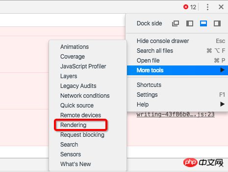
Then let’s talk about how to open the option to view the [Composite Layer] element. It seems that the method mentioned in the above article is a bit outdated:
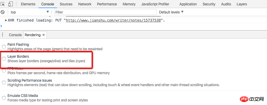
Open the console

Check the Layer Borders option, and you will find that the world suddenly becomes much clearer

Finally, here is how to skip the pit:
When using 3D hardware acceleration to improve animation performance, it is best to add a z-index attribute to the element. Artificial interference with the sorting of composite layers can effectively reduce the creation of unnecessary composite layers by Chrome and improve rendering performance. Mobile terminals The optimization effect is particularly obvious.
.isaax{
  position: relative;
  z-index: 1;  // 可以设大点,尽量设得比后面元素的z-index值高
}The above is the entire content of this article. I hope it will be helpful to everyone's study. For more related content, please pay attention to the PHP Chinese website!
Related recommendations:
About the second method of developing CSS3 flexible box model
About the grid of bootstrap3.0 System Principle
The above is the detailed content of About the use and pitfalls of turning on hardware acceleration in CSS3. For more information, please follow other related articles on the PHP Chinese website!


