In the past, to achieve this effect, we could only find a designer to make it, and then insert a picture on the page. However, with the emergence of CSS3, we can achieve it in pure code. How to achieve it? That is through the box-reflect property of CSS3. The following article will share with you how to use CSS3 to create a reflection effect. Friends in need can refer to it.
Compatibility
Since it is a property of CSS3, of course we have to take a look at the compatibility: Click to view
Next, let’s learn how to use box-reflect?
The syntax is as follows:
  -webkit-box-reflect:none | <direction> <offset>? <mask-box-image>?
  box-reflect:none | <direction> <offset>? <mask-box-image>?
Attributes Description:
none: This value is the default value, indicating no reflection;
direction: The direction in which reflection is generated
above: Specify the reflection to be above the object below: Specify the reflection to be below the object left: Specify the reflection to be on the left side of the object right: Specify the reflection to be on the right side of the object
offset: The interval between the picture and the reflection
length: Use the length value to define the distance between the reflection and the object. Can be a negative value percentage: Use percentage to define the interval between the reflection and the object. Can be a negative value
mask-box-image: used to set the mask effect of reflection;
The value can be:
none: No mask image url: Specify the mask image using an absolute or relative address. linear-gradient: Create a mask image using a linear gradient. radial-gradient: Create a mask image using a radial (radial) gradient. repeating-linear-gradient: Use a repeating linear gradient to create a backmask image. repeating-radial-gradient: Creates a mask image using a repeating radial (radial) gradient.
Just talking on paper is not enough, we still have to see the effect through examples.
The direction of the reflection
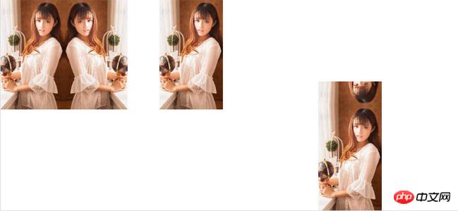
In this example, I made three img:
<p class="box1">
  <img src="http://7s1r1c.com1.z0.glb.clouddn.com/t_sdfsdfs123.jpg" alt="" />
</p>
<p class="box2">
  <img src="http://7s1r1c.com1.z0.glb.clouddn.com/t_sdfsdfs123.jpg" alt="" />
</p>
<p class="box3">
  <img src="http://7s1r1c.com1.z0.glb.clouddn.com/t_sdfsdfs123.jpg" alt="" />
</p>
css is as follows:
.box1,.box2,.box3{
  width:120px;
  float:left;
  margin-right:180px;
}
img{
  width:100%;
}
.box1 img{
  -webkit-box-reflect:right;
  box-reflect:right;
}
.box2 img,.box3 img{
  -webkit-box-reflect: above;
  box-reflect:above;
}
.box3{
  padding-top:200px;
}The rendering is as follows:

I have a question here. The pictures in box2 and box3 are both set with box-reflect:above, which generates projection at the top. Why can’t box2 see the effect? The reason is that I set padding-top:200px for box3, but not for box2. It is initially estimated that it is because there is no space for it to display the generated reflection.
The distance between the reflection and the object
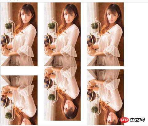
After understanding the direction of generating the reflection, let’s look at the second attribute, Let’s look at the example:
Still use three pictures, but change the style:
.box1 img{
  -webkit-box-reflect:below 30px;
  box-reflect:below 30px;
}
.box2 img{
  -webkit-box-reflect:below -30px;
  box-reflect:below -30px;
}
.box3 img{
  -webkit-box-reflect:below 5%;
  box-reflect:below 5%;
}The effect is as follows:

Next we learn the last attribute.
Mask effect
(1) Use gradient to add a mask effect to the reflection
  .box1 img{
  -webkit-box-reflect:below 0 -webkit-linear-gradient(top,rgba(250,250,250,0),rgba(250,250,250,.0) 30%,rgba(250,250,250,.3));
  box-reflect:below 0 linear-gradient(top,rgba(250,250,250,0),rgba(250,250,250,.0) 30%,rgba(250,250,250,.3));
}The effect is as follows:

Use the background image to add a mask effect to the reflection
First we need a A png picture of a five-pointed star:

##
.box2 img{
  -webkit-box-reflect:below 0 url(http://7s1r1c.com1.z0.glb.clouddn.com/t_star.png);
  box-reflect:below 0 url(http://7s1r1c.com1.z0.glb.clouddn.com/t_star.png);
}
How to use CSS3 with IE filters to achieve gradient and shadow effects
How to use CSS to achieve it The effect of icon rotation when the mouse is moved up
The above is the detailed content of How to use CSS3 box-reflect to create a reflection effect. For more information, please follow other related articles on the PHP Chinese website!


