This article mainly introduces pure CSS3 to achieve the revolving door effect. The main CSS3 technologies used are: keyframes, perspective, perspective-origin, transform (translate, rotate), animation, transform-origin. Friends in need can refer to it. Next
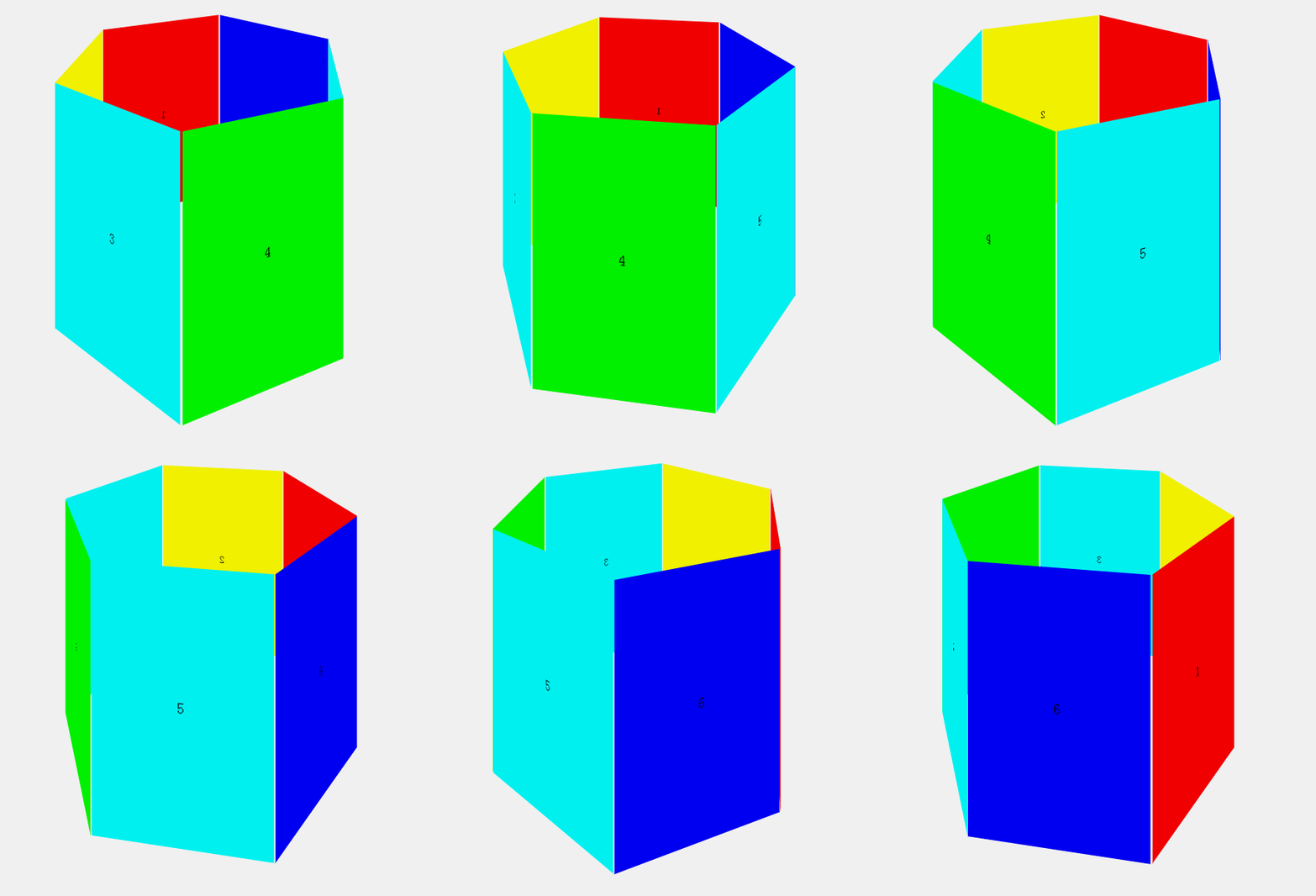
Pure css3 realizes a regular hexagonal revolving door effect. Record the learning situation of css3 animation. The effect is as follows:

Mainly used css3 Technologies include: keyframes, perspective, perspective-origin, transform (translate, rotate), animation, transform-origin, plus a little knowledge of plane geometry (calculating spacing, angles, etc.), the detailed process is as follows:
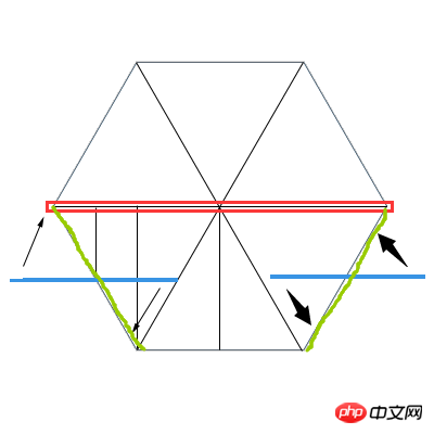
First Design the layout to be displayed (top view). The vertical lines along the way are auxiliary lines. You need to use them when calculating the offset:

The red frame is the rotating surface (i.e. revolving lantern) The structure of the effect is ultimately rotated with the midpoint of the surface as the axis of rotation), and the six surfaces are also laid out based on this surface. First look at the three surfaces under the red box. The left surface was originally at the blue line. , reach the green line through rotation. The same applies to the right side. The middle surface only needs to be moved in the Z-axis direction by a distance of three side lengths of one-half root. All surfaces are reached as shown in the figure above through offset and rotation. Structure, it should be noted that the surface with the pattern (text is used in this example, the idea is the same) should be outwards. For example, the surface in the middle above should be offset outward on the Z axis by half the root of three sides. After the distance, it needs to be rotated 180° with the midpoint as the center of the circle. All surfaces are easily accessible in the same way. One technique that needs to be kept in mind during this process is: in the three-dimensional coordinate system, starting from the coordinate origin and looking in the positive direction of the coordinate axis, the value of rotate(X/Y/Z) is a positive number when rotating counterclockwise. When rotating, the rotate(X/Y/Z) value is negative.
Set the structure: a 3D scene, a rotating surface of the revolving lantern and six sides of the revolving lantern:
<p class="wapper">        <!--场景-->
    <p class="rotate">   <!--容器-->
        <p class="item itemOne">1</p>  <!--六个面-->
        <p class="item itemTwo">2</p>
        <p class="item itemThree">3</p>
        <p class="item itemFour">4</p>
        <p class="item itemFive">5</p>
        <p class="item itemSix">6</p>
    </p>
</p>Set the 3D scene:
.wapper{
    -webkit-perspective:800;    /*观察距离800*/
    -webkit-perspective-origin:50% -100%;    /*从正前方上方斜向下观察*/
    width:400px;
    height:300px;
    margin:100px auto;
}Set the rotating surface:
@-webkit-keyframes rotation{      /*动画过程*/
    0%{-webkit-transform:rotateY(0deg);}
    100%{-webkit-transform:rotateY(-360deg);}
}
.rotate{
    -webkit-transform-style:preserve-3d;     /*3D变换*/
    -webkit-animation: rotation 6s infinite;  /*动画名称、时间、循环动画*/
    -webkit-animation-timing-function: linear;  /*匀速动画*/
    -webkit-transform-origin:center;      /*沿中间旋转*/
    width:100%;
    height:100%;
    position:relative;   /*相对定位布局*/
}Set the common styles of the six faces except the position:
.item{
   -webkit-transform-origin:center;  /*均沿中心旋转*/
   width:198px;
   height:300px;
   position:absolute;   /*绝对定位在旋转面上*/
   background:none;
   text-align:center;
   line-height:300px;
}Set the positions of the six faces respectively, taking No. 1 as an example (the green line on the left below the red box in the structure diagram above surface), all values need to be calculated through geometric calculation:
.itemOne{
    left:-50px;
    -webkit-transform:translateZ(87px) rotateY(-60deg);  /*z轴向外移动87px,沿Y轴方向旋转-60°*/
    background:#f00;
}The animation stops when the mouse hovers over the structure:
.rotate:hover{
    -webkit-animation-play-state:paused;  /*设置动画状态*/
}This example is only available in browsers with webkit kernel You can check the effect. If you want to be compatible with other modern browsers, you need to add prefixes such as -moz-. The complete code is as follows:
<!DOCTYPE html>
<html>
<head>
    <meta charset="UTF-8">
    <title>Animation Test</title>
    <style>
    *{margin:0;padding:0;}
    @-webkit-keyframes rotation{
        0%{-webkit-transform:rotateY(0deg);}
        100%{-webkit-transform:rotateY(-360deg);}
    }
    .wapper{
        -webkit-perspective:800;
        -webkit-perspective-origin:50% -100%;
        width:400px;
        height:300px;
        margin:100px auto;
    }
    .rotate{
        -webkit-transform-style:preserve-3d;
        -webkit-animation: rotation 6s infinite;
        -webkit-animation-timing-function: linear;
        -webkit-transform-origin:center;
        width:100%;
        height:100%;
        position:relative;
    }
    .item{
        -webkit-transform-origin:center;
        width:198px;
        height:300px;
        position:absolute;
        background:none;
        text-align:center;
        line-height:300px;
    }
    .itemOne{
        left:-50px;
        -webkit-transform:translateZ(87px) rotateY(-60deg);
        background:#f00;
    }
    .itemTwo{
        left:100px;
        -webkit-transform:translateZ(173px);
        background:#ff0;
    }
    .itemThree{
        left:250px;
        -webkit-transform:translateZ(87px) rotateY(60deg);
        background:#0ff;
    }
    .itemFour{
        left:250px;
        -webkit-transform:translateZ(-87px) rotateY(120deg);
        background:#0f0;
    }
    .itemFive{
        left:100px;
        -webkit-transform:translateZ(-173px) rotateY(180deg);
        background:#0ff;
    }
    .itemSix{
        left:-50px;
        -webkit-transform:translateZ(-87px) rotateY(-120deg);
        background:#00f;
    }
    .rotate:hover{
        -webkit-animation-play-state:paused;
    }
    </style>
</head>
<body>
    <p class="wapper">
        <p class="rotate">
            <p class="item itemOne">1</p>
            <p class="item itemTwo">2</p>
            <p class="item itemThree">3</p>
            <p class="item itemFour">4</p>
            <p class="item itemFive">5</p>
            <p class="item itemSix">6</p>
        </p>
    </p>
</body>
</html>Isn’t it a very cool effect? Friends, CSS3 is really a good thing. you deserve to have.
The above is the entire content of this article. I hope it will be helpful to everyone's study. For more related content, please pay attention to the PHP Chinese website!
Related recommendations:
The above is the detailed content of Use css3 to achieve the revolving lantern effect. For more information, please follow other related articles on the PHP Chinese website!


