
 Web Front-end
CSS Tutorial
About the impact of css attribute selection on animation performance
Web Front-end
CSS Tutorial
About the impact of css attribute selection on animation performance
About the impact of css attribute selection on animation performance

The following article brings you an in-depth understanding of the impact of css attribute selection on animation performance. The content is quite good. I would like to share it with you now and give it as a reference.
Nowadays, the proportion of mobile phones is getting higher and higher, and all kinds of cool pages are emerging one after another. These special effects are inseparable from CSS animation. When it comes to CSS animation, the mainstream situations are nothing more than these two categories: displacement and deformation. When we write an animation special effect, how can we improve its performance? Of course, first we need to understand the basic concepts, such as the working principle of browser rendering, etc. I have a certain understanding of these after reading relevant articles written by several experts. I will not go into details here. Interested students can go find out. To put it simply and crudely, the purpose of this article is actually what CSS properties we should use to draw animations, which can effectively improve the performance of the browser in the rendering and drawing process.
Used left and transform respectively to translate 500px to the right in 2 seconds. The code is as follows:
<style>
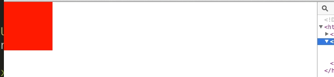
.box-ps,.box-tf{position:absolute;top:0;left:0;width:100px;height:100px;background-color:red;}
.box-ps{-webkit-animation:box-ps 2s linear;}
.box-tf{-webkit-animation:box-tf 2s linear;}
@-webkit-keyframes box-ps{
0%{
left:0;
}100%{
left:500px;
}
}
@-webkit-keyframes box-tf{
0%{
-webkit-transform:translate(0,0);
}100%{
-webkit-transform:translate(500px,0);
}
}
</style>
<body>
<p class="box-ps"></p>
<p class="box-tf"></p>
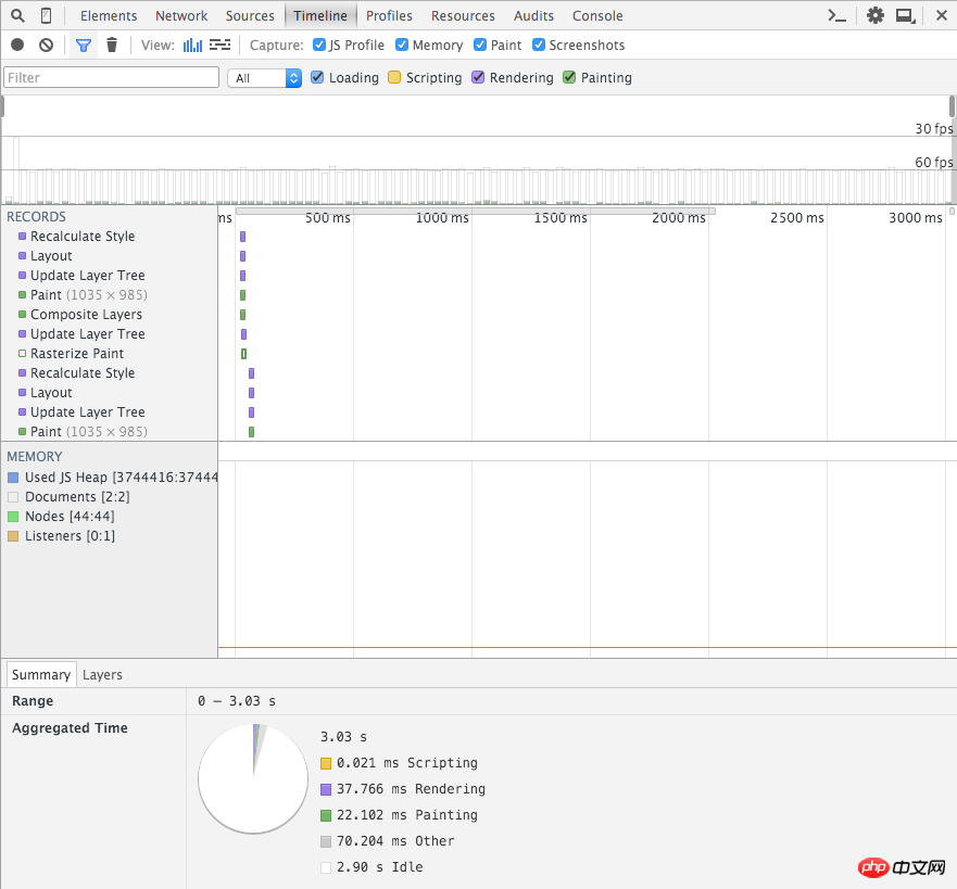
</body>Then I got the following results under chrome. The first one is a screenshot using left, and the second one is a screenshot using transform:
Transform screenshot
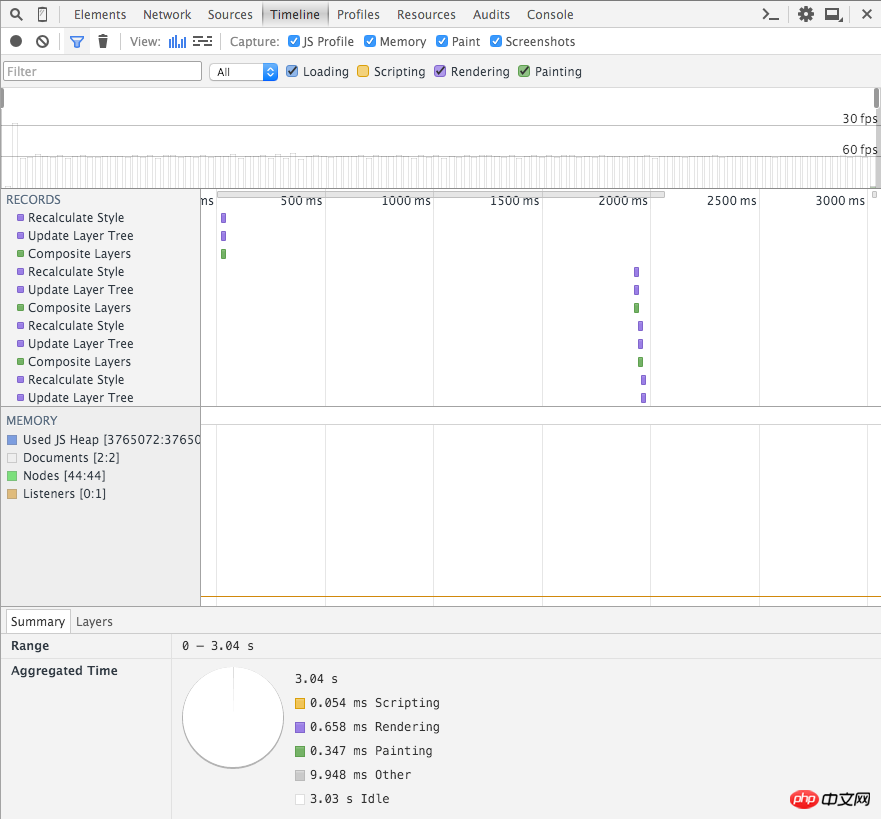
Let's use chrome's show paint rectangles to observe the difference between the rendering and drawing areas during the animation process. The first one is a screenshot using left, and the second one is a screenshot using transform:

Screenshot of transform
The properties that will not be re-layout include: transform (translate, rotate, scale among them), color, background, etc.
Instructions on the use of css3 animation effect animate and introduction to browser compatibility
About css Use of the background-attachment attribute
The above is the detailed content of About the impact of css attribute selection on animation performance. For more information, please follow other related articles on the PHP Chinese website!

Hot AI Tools

Undresser.AI Undress
AI-powered app for creating realistic nude photos

AI Clothes Remover
Online AI tool for removing clothes from photos.

Undress AI Tool
Undress images for free

Clothoff.io
AI clothes remover

Video Face Swap
Swap faces in any video effortlessly with our completely free AI face swap tool!

Hot Article
Hot Tools

Notepad++7.3.1
Easy-to-use and free code editor

SublimeText3 Chinese version
Chinese version, very easy to use

Zend Studio 13.0.1
Powerful PHP integrated development environment

Dreamweaver CS6
Visual web development tools

SublimeText3 Mac version
God-level code editing software (SublimeText3)
Hot Topics
 1676
1676
 14
1429
52
1333
25
1278
29
1257
24
14
1429
52
1333
25
1278
29
1257
24

 How to use bootstrap in vue
Apr 07, 2025 pm 11:33 PM
How to use bootstrap in vue
Apr 07, 2025 pm 11:33 PM
Using Bootstrap in Vue.js is divided into five steps: Install Bootstrap. Import Bootstrap in main.js. Use the Bootstrap component directly in the template. Optional: Custom style. Optional: Use plug-ins.
 Understanding HTML, CSS, and JavaScript: A Beginner's Guide
Apr 12, 2025 am 12:02 AM
Understanding HTML, CSS, and JavaScript: A Beginner's Guide
Apr 12, 2025 am 12:02 AM
WebdevelopmentreliesonHTML,CSS,andJavaScript:1)HTMLstructurescontent,2)CSSstylesit,and3)JavaScriptaddsinteractivity,formingthebasisofmodernwebexperiences.
 The Roles of HTML, CSS, and JavaScript: Core Responsibilities
Apr 08, 2025 pm 07:05 PM
The Roles of HTML, CSS, and JavaScript: Core Responsibilities
Apr 08, 2025 pm 07:05 PM
HTML defines the web structure, CSS is responsible for style and layout, and JavaScript gives dynamic interaction. The three perform their duties in web development and jointly build a colorful website.
 How to insert pictures on bootstrap
Apr 07, 2025 pm 03:30 PM
How to insert pictures on bootstrap
Apr 07, 2025 pm 03:30 PM
There are several ways to insert images in Bootstrap: insert images directly, using the HTML img tag. With the Bootstrap image component, you can provide responsive images and more styles. Set the image size, use the img-fluid class to make the image adaptable. Set the border, using the img-bordered class. Set the rounded corners and use the img-rounded class. Set the shadow, use the shadow class. Resize and position the image, using CSS style. Using the background image, use the background-image CSS property.
 How to write split lines on bootstrap
Apr 07, 2025 pm 03:12 PM
How to write split lines on bootstrap
Apr 07, 2025 pm 03:12 PM
There are two ways to create a Bootstrap split line: using the tag, which creates a horizontal split line. Use the CSS border property to create custom style split lines.
 How to set up the framework for bootstrap
Apr 07, 2025 pm 03:27 PM
How to set up the framework for bootstrap
Apr 07, 2025 pm 03:27 PM
To set up the Bootstrap framework, you need to follow these steps: 1. Reference the Bootstrap file via CDN; 2. Download and host the file on your own server; 3. Include the Bootstrap file in HTML; 4. Compile Sass/Less as needed; 5. Import a custom file (optional). Once setup is complete, you can use Bootstrap's grid systems, components, and styles to create responsive websites and applications.
 How to resize bootstrap
Apr 07, 2025 pm 03:18 PM
How to resize bootstrap
Apr 07, 2025 pm 03:18 PM
To adjust the size of elements in Bootstrap, you can use the dimension class, which includes: adjusting width: .col-, .w-, .mw-adjust height: .h-, .min-h-, .max-h-
 How to use bootstrap button
Apr 07, 2025 pm 03:09 PM
How to use bootstrap button
Apr 07, 2025 pm 03:09 PM
How to use the Bootstrap button? Introduce Bootstrap CSS to create button elements and add Bootstrap button class to add button text
