这篇文章主要介绍了使用css3编写灰阶滤镜来制作黑白照片效果的方法,css3中的filter十分强大,文中还介绍了对ie兼容的方法,需要的朋友可以参考下
CSS3 中的滤镜(filter)功能让我们轻松方便简单的处理图片,而不需要使用 PhotoShop 或者使用很多 JavaScript、PHP 代码。这个属性已经得到比较新的 Firefox、Safari、Chrome 浏览器支持,而且我们可以通过综合的可替代的技术来模拟实现这个效果——甚至是 IE 浏览器。
本文中,我们将使用标准测试图片 Lena Söderberg (译者注:Lena 这张美女照片,被作为图片压缩的标准测试用图片)作为演示,使用 CSS 将其转换成黑白图片。在下面我将讲解如何使用 CSS 的这个功能实现调整色调、模糊、亮度、对比度和一些其他的效果。效果图: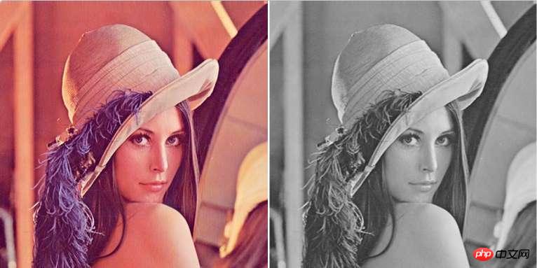
CSS3 的灰阶滤镜
使用 CSS3 来稀释一个图片的颜色,再简单不过了。我们可以把这个 CSS 语句写成一个类,这样遇到想要效果的图片,直接加上个类就可以了。
立即学习“前端免费学习笔记(深入)”;
img.desaturate { filter: grayscale(100%); }当然,当前的浏览器在使用 CSS3 的时候,要加上他们自己的浏览器功能实验性前缀,所以,我们首先要做的,就是写上浏览器的前缀:
img.desaturate { filter: grayscale(100%);
-webkit-filter: grayscale(100%);
-moz-filter: grayscale(100%);
-ms-filter: grayscale(100%);
-o-filter: grayscale(100%);
}想要用在某个图片上很简单,加上一个类:
@@##@@
这就可以了。 ## 增加一个 SVG 的滤镜效果 这个功能目前只在 Chrome 18+ 有效,其他浏览器马上就会增加支持。为了在 Firefox 4+ 中得到相同的效果,我们可以需要使用 SVG 滤镜。我把新建了一个单独的文件 的 saturate.svg ,代码如下:
<svg version="1.1" xmlns="http://www.w3.org/2000/svg">
<filter id="greyscale">
<feColorMatrix type="matrix" values="0.3333 0.3333 0.3333 0 0
0.3333 0.3333 0.3333 0 0
0.3333 0.3333 0.3333 0 0
0  0  0  1 0"/>
</filter>
</svg>
不要被这段 SVG 代码吓住了——虽然上面的矩阵数列有点复杂。这段代码我推荐你直接复制粘贴成一个通用的“小文件”。我会再写一篇文章详细介绍一下上面矩阵变化,在这里不再赘述。 加上上面的 SVG 文件引用,我们要插入 HTML 页面的 CSS 代码如下:
img.desaturate{
filter: grayscale(100%);
-webkit-filter: grayscale(100%); -moz-filter: grayscale(100%);
-ms-filter: grayscale(100%); -o-filter: grayscale(100%);
filter: url(desaturate.svg#greyscale);
}为 IE 做兼容:
到现在我们的代码可以兼容未来的浏览器,和最新版的 Chrome 、 Firefox 4+。为了让 IE 6-9 加入兼容列表,我们需要使用微软的笨拙但是有效的 filter 滤镜:
img.desaturate{
filter: grayscale(100%);
-webkit-filter: grayscale(100%); -moz-filter: grayscale(100%);
-ms-filter: grayscale(100%); -o-filter: grayscale(100%);
filter: url(desaturate.svg#greyscale);
filter: gray;
}如果你还想做老版本的 Webkit 内核浏览器的兼容:
img.desaturate{
filter: grayscale(100%);
-webkit-filter: grayscale(100%); -moz-filter: grayscale(100%);
-ms-filter: grayscale(100%); -o-filter: grayscale(100%);
filter: url(desaturate.svg#greyscale);
filter: gray;
-webkit-filter: grayscale(1);
}如果你想要在所有的浏览器中实现这个视觉效果(假设你的访问者都支持 JavaScript)你可以使用 jQuery 或者 Greyscale.js 来修改你的图片,使其去色。
上面咱们写的 CSS 代码可以让我们不需要使用 PhotoShop 就可以把图片变成黑白的。使用 CSS 来实现这个功能,可以非常容易修改:例如,你可以看到当我们把去色程度参数从 100% 变成 50% 的时候图片会是原色和黑白融合在一起的效果。
其他效果:
此外,黑白照片上还可以添加其他的一些filter的效果有:
-webkit-filter:blur(5px);  //模糊,此处为5像素
-webkit-filter:sepia(0.5);  //叠加褐色,取值范围0-1,此处表示50%的褐色
-webkit-filter:brightness(0.5);  //亮度,取值范围0-1,5倍亮度(数字为0时为正常样式,为1时表示的是100%亮度,无法看到图片)
-webkit-filter:hue-rotate(30deg); //色相(按照色相环进行旋转,顺时针方向,红-橙-黄-黄绿-绿-蓝绿-蓝-蓝紫-紫-紫红-红)此处为叠加黄色滤镜
-webkit-filter:invert(1);  //反色,取值范围0-1,0为原图,1为彻底反色之后,0.5为灰色
-webkit-filter:saturate(4);  //饱和度,取值范围0~*,0为无饱和度,1为原图,值越高饱和度越大
-webkit-filter:contrast(2);  //对比度,取值范围0~*,0为无对比度(灰色),1为原图,值越高对比度越大
-webkit-filter:opacity(0.8);  //透明度,取值范围0~1,0为全透明,1为原图
-webkit-filter:drop-shadow(17px 17px 20px black); //阴影
以上就是本文的全部内容,希望对大家的学习有所帮助,更多相关内容请关注PHP中文网!
相关推荐:
以上就是使用CSS3编写灰阶滤镜来制作黑白照片效果的详细内容,更多请关注php中文网其它相关文章!

每个人都需要一台速度更快、更稳定的 PC。随着时间的推移,垃圾文件、旧注册表数据和不必要的后台进程会占用资源并降低性能。幸运的是,许多工具可以让 Windows 保持平稳运行。

 广告
广告![ThinkPHP5快速开发企业站点[全程实录]](https://img.php.cn/upload/course/000/000/068/6253d918a3ce7278.png)
 收藏
收藏

 收藏
收藏
Copyright 2014-2025 https://www.php.cn/ All Rights Reserved | php.cn | 湘ICP备2023035733号


 758
758