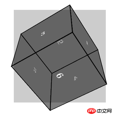
This article mainly introduces you to the CSS3 method of using three-dimensional deformation to realize three-dimensional blocks. The article gives a complete example code. Interested friends can run it themselves and see the effect. Only by doing it yourself can you get better. Let’s take a look at the learning below.
Preface
Three-dimensional transformations use the same properties based on two-dimensional transformations. If you are familiar with two-dimensional transformations, you will find that the functions of 3D transformations and 2D transforms function similarly. The biggest difference between 3D deformation and 2D deformation is that the reference coordinate axes are different. The coordinate axes of 2D deformation are planar, with only X and Y axes, while the coordinate axes of 3D deformation are composed of three axes: X, Y, and Z. In the three-dimensional space, the positive direction of the X-axis is toward the right, the positive direction of the Y-axis is downward, and the positive direction of the Z-axis is toward the outside of the screen.
The static rendering is as follows:

##Example code
<!DOCTYPE HTML>
<html>
    <head>
        <meta charset="utf-8">
        <meta name="apple-mobile-web-app-capable" content="yes" />
        <meta name="viewport" content="width=device-width, initial-scale=1.0, maximum-scale=1.0, user-scalable=0" />
        <title>CSS3三维变形</title>
        <!--  -->
        <style type="text/css">
         * {
          margin: 0;
          padding: 0;
         }

         .box {
          position:relative;
          top: 100px;
          width:300px;
          height: 300px;
          margin: 0 auto;
          background-color: #ccc;
          /*
           透视效果
           越大透视距离越平面,反之亦然
          */
          perspective:800px;
         }
         .content {
          /*3d视图*/
          transform-style: preserve-3d;
          /*过度动画*/
          transition: all 3s linear;
          width:200px;
          height: 200px;
          position: absolute;
          top: 50px;
       left: 50px;
         }
         /*
          经过顺时针旋转
         */
         .content:hover {
          transform: rotateX(180deg) rotateY(180deg);
         }
         /*
          方块公共样式
         */
         .side {
          position: absolute;
       height: 200px;
       width: 200px;
       border: 2px solid #000;
       background: rgba(0,0,0,0.3);
       color: #fff;
       line-height: 200px;
       font-size: 30px;
       font-weight: bold;
       text-align: center;
       text-shadow: 0 -1px 0 rgba(0,0,0,0.2);
         }
         /*
          前
         */
         .side1 {
           transform: translateZ(100px);
         }
         /*
          后
         */
         .side2 {
          transform: rotateX(180deg) translateZ(100px);
         }
         /*
          左
         */
         .side3 {
          transform: rotateY(-90deg) translateZ(100px);
         }
         /*
          右
         */
         .side4 {
          transform: rotateY(90deg) translateZ(100px);
         }
         /*
          上
         */
         .side5 {
          transform: rotateX(90deg) translateZ(100px);
         }
         /*
          下
         */
         .side6 {
          transform: rotateX(-90deg) translateZ(100px);
         }
        </style>
    </head>
    <body>
     <!-- begin -->
     <p class="box">
      <p class="content">
       <p class="side side1">1</p>
             <p class="side side2">2</p>
             <p class="side side3">3</p>
             <p class="side side4">4</p>
             <p class="side side5">5</p>
             <p class="side side6">6</p>
      </p>
     </p>
     <!-- end -->
    </body>
</html>About the usage of css3 image border border-image
About 20 loading animations produced by CSS3 Effect
About the method of drawing hexagons in CSS3
The above is the detailed content of CSS3 three-dimensional deformation to realize three-dimensional square. For more information, please follow other related articles on the PHP Chinese website!


