Analysis of transform model rendering in CSS3
This article mainly introduces the analysis of transform transformation model rendering in CSS3. It has certain reference value. Now I share it with you. Friends in need can refer to it.
Transform is implemented through a set of functions Regarding the 2D or 3D transformation of the box size, position, and angle, here we will mainly explain in depth the rendering of the transform transformation model in CSS3. Especially friends who are concerned about the web-side 3D rendering animation must not miss it
Introduction
Transform is completed through a series of matrix transformations. Transform-functions such as scale are all encapsulations of matrix. The explanation in
w3 is that transform is based on the visual formatting model (is this the right translation?) and draws a coordinate system for it, and all operations performed in this coordinate system, such as Right and downward are all expressed in pixels within this coordinate system. Setting the transform on an element will not change the document flow in which the element is located. Its layout is still governed by the box model, so the effect of the transformation here is Can coexist with floating and positioning.
When an element is set to transform, a coordinate system will be defined for the element, and a matrix transformation will be performed within the coordinate system, and the transformation result will be mapped to the user coordinate system (that is, the actual context).
Multiple matrix transformation functions will be calculated from left to right in sequence, such as transform:translate(80px, 80px) scale(1.5, 1.5). The browser will first calculate the displacement and then scale by 1.5 times. The following two codes have the same effect:
html
<p style="transform: translate(80px, 80px)">
  <p style="transform: scale(1.5, 1.5)">
       <p style="transform: rotate(45deg)"></p>
  </p>
</p>html
<p style="transform: translate(80px, 80px) scale(1.5, 1.5) rotate(45deg);">
 </p>
The position of the coordinate origin is affected by the attribute transform-origin Impact.
If it is a 3D transformation, it will also be added to a 3D rendering context. According to my personal understanding, no matter how many elements are converted to 3D, they will always be within this context and may affect each other, similar to multiple absolutely positioned elements in a document.
Any transform value other than none will cause the creation of a stacking context and containing block.
Transform rendering modelSpecifying a value other than none for the transform attribute will create a new local coordinate system on the element and apply it to the element. Through the element's transformation model, the element can be drawn and rendered with its own coordinate system. Transformations can be cumulative. That is, an element can establish its own local coordinate system through the coordinate system of its parent element. From the user's perspective, an element can not only effectively accumulate the transform attribute from its ancestor elements, but also add the transform attribute to itself and apply it to itself. The accumulation of these transformations describes the current transformation model for the element.
Coordinate space with two axes: the X-axis is positive horizontally to the right, and the Y-axis is positive vertically downward. The three-dimensional transformation function adds a coordinate space and extends it to a three-dimensional space. The added Z-axis is perpendicular to the screen, and the direction facing the observer is positive (that is, us in front of the computer screen). As shown in the picture.
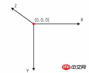 The transformation model is calculated through the following transform and transform-origin attributes
Through transfrom-origin Calculate the values of
#p {
transform: translate(100px,100px);
}
EXAMPLE2
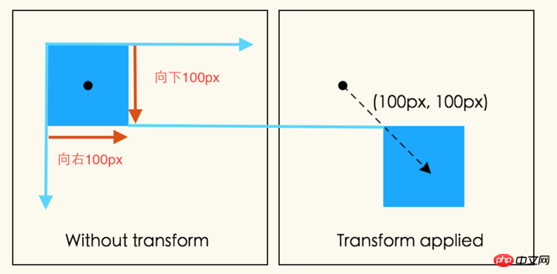 ##
##
p {
  height: 100px;
  width: 100px;
  transform-origin: 50px 50px;
  transform:rotate(45deg)
}transform-origin passes in the X, Y axis direction Move 50px above each to move the origin. The element is rotated 45° clockwise around the origin. When all transform functions are applied, the translated origin moves -50px on the X and Y axes, returning to its original position. As shown in the figure
Understanding
The above words mean that the starting point of transform-origin is at the origin, and the rotation revolves around transform- origin is rotating, and the move of transform-origin starts from the origin, not the default position of transform-origin (the default is the center of the element, and the above example happens to be moved to the center of the element), and transform-origin is moved. After that, and after the transform functions have been applied to the element, the translated origin will return to its original position. That is to say, the next time the position of transform-origin is changed, it will still be calculated from the starting point (that is, the previous origin). 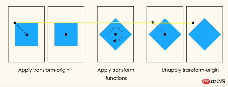
EXAMPLE3
The dark green parts of the pictures below are the original appearance of the elements without using the transform attribute.
p {
  height: 100px;
  width: 100px;
  transform: translate(80px,80px) scale(1.5,1.5) rotate(45deg);
}注意:缩放和旋转,都是通过元素的中心进行运转的,因为元素的默认transfrom-origin值为50% 50%。
通过嵌套元素可以实现与上面相同的效果
<p style="transform: translate(80px, 80px)">
  <p style="transform: scale(1.5, 1.5)">
      <p style="transform: rotate(45deg)"></p>
  </p>
</p>3D变换渲染
通常,元素都是依照平面进行渲染,并且被渲染的元素与它们的包含块的平面一致。平面的transform functions可以改变元素的表现,但是它仍然在与它的包含块相同的平面里进行渲染。
三维的变换会导致变换模型有着一个非0的Z组件(Z轴投射在屏幕的外面)。这样可以造成元素可以在不同的平面进行渲染,而不是在它的包含块的平面内进行渲染。这也可能会影响一个元素和与之有联系的另一个元素从前到后的渲染顺序,同时和导致与其他元素发生交叉。这样的表现依赖于这个元素是否为3D rendering context中的一员,正如下所说
上面的描述并不会完全准确的在WebKit中是实现。也许它会被改变来适应现在的是实现?See,Bug 19637
EXAMPLE4
p {
  height: 150px;
  width: 150px;
}
.container {
  border: 1px solid black;
  background-color: #ccc;
}
.transformed {
  transform: rotateY(50deg);
  background-color: blue;
}<p class="container"> <p class="transformed"></p> </p>
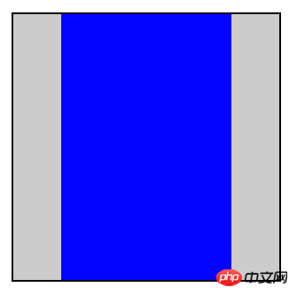
这次变换是一个围绕着垂直的Y轴进行的50度旋转。但是为什么这次变换为什么使的盒子便窄了呢?而不是变得立体呢?
perspective和perspective-origin属性可以通过使元素在Z轴变得更高而使元素显得更大,以此来增加观者在空间深度上的感知,同时也可以通过同样的方法使之显得越小。缩放比例的比例项公式是d/(d-Z),perspective的值就是从绘制平面到假设的观者眼睛的位置。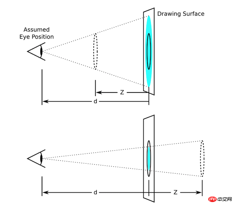
上图用图形解释了缩放比例是如何依赖于perspective属性和Z的值。在上面的那张图,Z值是d的一半。原始的圆圈(实线圆圈)出现在Z上(虚线圈),为了是它呈现在画面中,圆圈通过以上两个要素按比例放大,最后在画面中呈现出来了放大的浅蓝色圆圈。下面的图形,圆圈通过比例进行缩小出现在原始位置后面的1/3圆圈,最后在画面中呈现出了缩小的浅蓝色圆圈。
通常假设观察者眼睛的位置在画面的中央。但是,如果想的话,这个位置也是可以移动的-例如,如果一个网页包含了很多图画那么大家通过设置perspective-origin的值来分享相同的视角。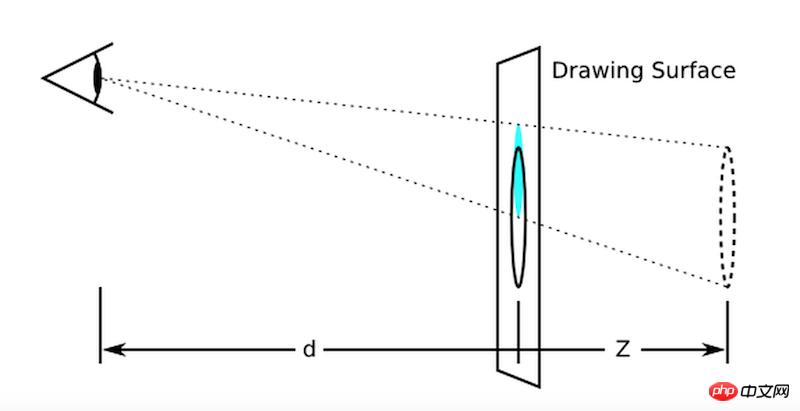
图形表现了向上移动perspective origin对表现效果的影响
透视模型按如下进行计算:
1.从具体的模型开始
2.通过 设置的perspective-origin的X,Y的计算值进行移动
3.通过获得perspective属性的值应用在模型上
4.使之前设置的perspective- origin的值无效并进行移动
EXAMPLE5
这个例子表现了透视可以被用来表达立体的变换从而显现出更多真实的细节
p {
  height: 150px;
  width: 150px;
}
.container {
  perspective: 500px;
  border: 1px solid black;
  background-color: #ccc;
}
.transformed {
  transform: rotateY(50deg);
  background-color: blue;
}<p class="container"> <p class="transformed"></p> </p>
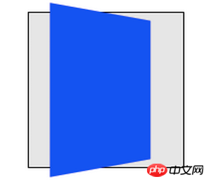
里面的元素和在前面的例子中有着相同的变换,但是它的渲染被父元素上的perspective属性所影响。透视给予了一个显现的深度,导致顶点有了Z坐标(靠近观察者)使其在X,Y轴被放大,并且更进一步的(在负的Z轴上)也会被缩小。
一个并不包含在3D渲染上下文中的立体变换元素有着合适的transform值进行渲染,但是也不会与其他任何元素发生相交。在这个EXAMPLE4中的立体变换可以被考虑为一种绘画效果,就像平面中的变换。相似的,变换不会影响渲染命令。举个例子,在transform中设置Z的值使元素进行移动可能使元素变得更大,但是并不会导致元素去渲染它前面没有设置Z值的元素
一个包含在3D渲染上下文的立体变换元素在同样的3D渲染上下文中可以与其他元素相交;参与相同3D渲染上下文的元素,根据它们的变换结果,可能会互相隐藏或者相交。在同样的3D坐标空间摆放,使它们好像全部都是兄弟姐妹。一个元素在立体空间中摆放的位置决定于从建立3D渲染上下文的包含块中积累的变换模型所决定。
EXAMPLE6
p {
  height: 150px;
  width: 150px;
}
.container {
  perspective: 500px;
  border: 1px solid black;
  background: #ccc;
}
.transformed {
  transform: rotateY(50deg);
  background-color: blue;
}
.child {
  transform-origin: top left;
  transform: rotateX(40deg);
  background-color: lime;
}<p class="container">
<p class="transformed">
<p class="child"></p>
</p>
</p>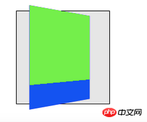
这个例子表现了嵌套的3D变换元素在缺少transform-style: preserve-3d时是如何渲染的。蓝色的p和之前的例子变换结果是一样的,都是被父元素的perspective属性所影响。绿黄色的元素同样有绕着X轴进行旋转的3D变换。然而,绿黄色元素在它的父元素所在平面进行渲染因为他不是3D渲染上下文中的一员;父元素是二维的。
按照如下规则,元素可建立并参与在3D渲染上下文中:
3D渲染上下文通过有着transform-style: preserved-3d值的变换元素创建并且它自己并不是3D渲染上下文中的一员。这样的元素通常都是一个包含块。一个元素建立3D渲染上下文同样也参与其中。
一个有着transform-style: preserved-3d值的元素,参与在它自己创建的3D渲染上下文中,扩大了3D渲染上下文,而不是建立了一个新的3D渲染上下文。
一个元素参与3D渲染上下文,除非它的包含块建立了3D渲染上下文或者扩展了3D渲染上下文
最后的变换结果通常是在3D渲染上下文中渲染的元素3D变换模型的积累,如下:
从具体的模型开始
对于每一个在3D变换根元素和元素之间的包含块,考虑以下几点:
1.在元素的包含块上积累perspective matrix(如果可以的话)。包含块并不一定要成为3D渲染上下文中的一员
2.元素的offset-parent是相对于它的包含块的,元素应用计算后的移动值等同于垂直水平移动。
3.累加变换效果
EXAMPLE7
p {
  height: 150px;
  width: 150px;
}
.container {
  perspective: 500px;
  border: 1px solid black;
  background: #ccc;
}
.transformed {
  transform-style: preserve-3d;
  transform: rotateY(50deg);
  background: blue;
}
.child {
  transfom-origin: top left;
  transform: rotateX(40deg);
  background-color: lime;
}这个例子和前面的例子是相同的,除了加了一个transform-style: preserve-3d值在蓝色的元素上。蓝色的元素建立的3D渲染上下文,绿黄色元素是其中一员。现在蓝色和绿黄色元素都被容器中的perspective所影响,并且同时分享了一个相同的立体空间,所以浅绿色的元素在它的父元素上摆动。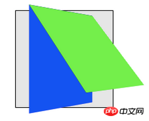
元素在同样的3D渲染上下文中可能会彼此相交。
在3D渲染上下文中不变换的元素在Z=0的平面上也有可能与变换元素相交。
在3D渲染上下文里,在应用完积累的变换后,没有相交的元素的渲染顺序基于在Z轴上的位置。元素在Z轴的位置相同则渲染顺序由层叠上下文决定。
EXAMPLE8
p {
 width: 150px;
}
.container {
 height: 145px;
 background-color: rgba(0,0,0,0.3);
 border: 1px solid black;
 transform-style: preserve-3d;
 perspective: 500px;
}
.container>p {
 position: absolute;
 left: 0;
}
.container> :first-child {
 transform: rotateY(45deg);
 background-color: orange;
 top: 10px;
 height: 135px;
}
.container> :last-child {
 transform: translateZ(40px);
 background-color: rgba(0,0,255,0.75);
 top: 50px;
 height: 100px;
}<p class="container"> <p></p> <p></p> </p>
这个例子展示了,在3D渲染上下文中元素是可以相交的。容器元素为自己创建了3D渲染上下文并且他有两个子元素。子元素互相相交,同时橘黄色的元素也与容器相交。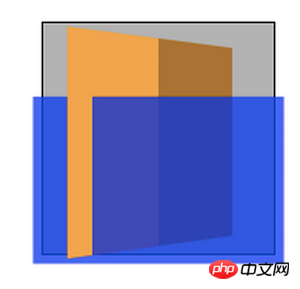
使用立体变换,让一个元素的背面朝着观者是完全有可能的。3D变换元素在两面展示相同的内容,所以反面看起来就像镜子中的正面(就像元素映射在一片镜子上一样)。通常,元素的反面朝着观者都会隐藏。然而,backface-visiblity:hidden属性允许作者使其不可见当元素的反面朝着观者时。如果一个带有backface-visiblity:hidden属性的元素是有效的,那么他的前面和背面便会交替的隐藏,然后,只有当前面朝向观者时元素才是可见的。
理解backface-visibility属性
.wrap {
  width: 200px;
  height: 200px;
  border: 1px solid black;
  perspective: 200px;
  color: #fff;
  text-align: center;
  font-size: 50px;
}
.inner {
  width: 50px;
  height: 50px;
  margin: 20px auto;
  background: orange;
  line-height: 50px;
  transform: rotateY(180deg);//旋转180
}<p class="wrap"> <p class="inner">2</p> </p>
图左为旋转前,图右为旋转后。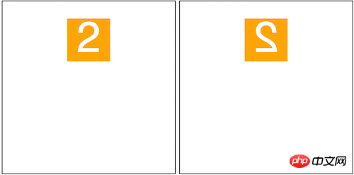
可以看出图右就像平时我们照镜子在镜子中的投影一样。这个就是元素的背面。
接下来当我们在元素inner上加backface-visibility:hidden属性则元素便会被隐藏,看起来消失了一样。如图
以上就是本文的全部内容,希望对大家的学习有所帮助,更多相关内容请关注PHP中文网!
相关推荐:
The above is the detailed content of Analysis of transform model rendering in CSS3. For more information, please follow other related articles on the PHP Chinese website!

Hot AI Tools

Undresser.AI Undress
AI-powered app for creating realistic nude photos

AI Clothes Remover
Online AI tool for removing clothes from photos.

Undress AI Tool
Undress images for free

Clothoff.io
AI clothes remover

Video Face Swap
Swap faces in any video effortlessly with our completely free AI face swap tool!

Hot Article

Hot Tools

Notepad++7.3.1
Easy-to-use and free code editor

SublimeText3 Chinese version
Chinese version, very easy to use

Zend Studio 13.0.1
Powerful PHP integrated development environment

Dreamweaver CS6
Visual web development tools

SublimeText3 Mac version
God-level code editing software (SublimeText3)

Hot Topics
 1676
1676
 14
14
 1429
1429
 52
52
 1333
1333
 25
25
 1278
1278
 29
29
 1257
1257
 24
24
 How to achieve wave effect with pure CSS3? (code example)
Jun 28, 2022 pm 01:39 PM
How to achieve wave effect with pure CSS3? This article will introduce to you how to use SVG and CSS animation to create wave effects. I hope it will be helpful to you!
 Use CSS skillfully to realize various strange-shaped buttons (with code)
Jul 19, 2022 am 11:28 AM
This article will show you how to use CSS to easily realize various weird-shaped buttons that appear frequently. I hope it will be helpful to you!
 How to use CSS to achieve the rotating background animation effect of elements
Nov 21, 2023 am 09:05 AM
How to use CSS to implement rotating background image animation effects of elements. Background image animation effects can increase the visual appeal and user experience of web pages. This article will introduce how to use CSS to achieve the rotating background animation effect of elements, and provide specific code examples. First, we need to prepare a background image, which can be any picture you like, such as a picture of the sun or an electric fan. Save the image and name it "bg.png". Next, create an HTML file and add a div element in the file, setting it to
 How to hide elements in css without taking up space
Jun 01, 2022 pm 07:15 PM
Two methods: 1. Using the display attribute, just add the "display:none;" style to the element. 2. Use the position and top attributes to set the absolute positioning of the element to hide the element. Just add the "position:absolute;top:-9999px;" style to the element.
 It turns out that text carousel and image carousel can also be realized using pure CSS!
Jun 10, 2022 pm 01:00 PM
How to create text carousel and image carousel? The first thing everyone thinks of is whether to use js. In fact, text carousel and image carousel can also be realized using pure CSS. Let’s take a look at the implementation method. I hope it will be helpful to everyone!
 How to implement lace borders in css3
Sep 16, 2022 pm 07:11 PM
In CSS, you can use the border-image attribute to achieve a lace border. The border-image attribute can use images to create borders, that is, add a background image to the border. You only need to specify the background image as a lace style; the syntax "border-image: url (image path) offsets the image border width inward. Whether outset is repeated;".
 How to enlarge the image by clicking the mouse in css3
Apr 25, 2022 pm 04:52 PM
Implementation method: 1. Use the ":active" selector to select the state of the mouse click on the picture; 2. Use the transform attribute and scale() function to achieve the picture magnification effect, the syntax "img:active {transform: scale(x-axis magnification, y Axis magnification);}".
 How to compress and format images in Vue?
Aug 25, 2023 pm 11:06 PM
How to compress and format images in Vue? In front-end development, we often encounter the need to compress and format images. Especially in mobile development, in order to improve page loading speed and save user traffic, it is critical to compress and format images. In the Vue framework, we can use some tool libraries to compress and format images. Compression using the compressor.js library compressor.js is a JavaS for compressing images


