这篇文章主要介绍了关于如何使用Css实现圆角边框的效果,有着一定的参考价值,现在分享给大家,有需要的朋友可以参考一下
一、css3圆角的优点
传统的圆角生成方案,必须使用多张图片作为背景图案。CSS3的出现,使得我们再也不必浪费时间去制作这些图片了,而且还有其他多个优点:
* 减少维护的工作量。图片文件的生成、更新、编写网页代码,这些工作都不再需要了。
* 提高网页性能。由于不必再发出多余的HTTP请求,网页的载入速度将变快。
* 增加视觉可靠性。某些情况下(网络拥堵、服务器出错、网速过慢等等),背景图片会下载失败,导致视觉效果不佳。CSS3就不会发生这种情况。
立即学习“前端免费学习笔记(深入)”;
二、border-radius属性
CSS3圆角只需设置一个属性:border-radius(含义是"边框半径")。你为这个属性提供一个值,就能同时设置四个圆角的半径。所有合法的CSS度量值都可以使用:em、ex、pt、px、百分比等等。
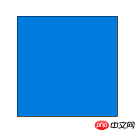
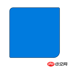
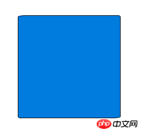
比如,下面是一个div方框:
现在设置它的圆角半径为15px:
border-radius: 15px;
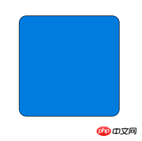
这条语句同时将每个圆角的"水平半径"(horizontal radius)和"垂直半径"(vertical radius)都设置为15px。
border-radius可以同时设置1到4个值。如果设置1个值,表示4个圆角都使用这个值。如果设置两个值,表示左上角和右下角使用第一 个值,右上角和左下角使用第二个值。如果设置三个值,表示左上角使用第一个值,右上角和左下角使用第二个值,右下角使用第三个值。如果设置四个值,则依次 对应左上角、右上角、右下角、左下角(顺时针顺序)。
border-radius: 15px 5px;
border-radius: 15px 5px 25px;
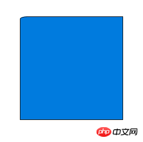
border-radius: 15px 5px 25px 0px;

(左下角的半径为0,就变成直角了。)
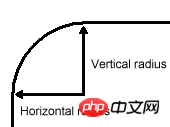
border-radius还可以用斜杠设置第二组值。这时,第一组值表示水平半径,第二组值表示垂直半径。第二组值也可以同时设置1到4个值,应用规则与第一组值相同。
border-radius: 15px 5px / 3px;
border-radius: 15px 5px 25px / 3px 5px;
border-radius: 15px 5px 25px 5px / 3px 5px 10px 15px;

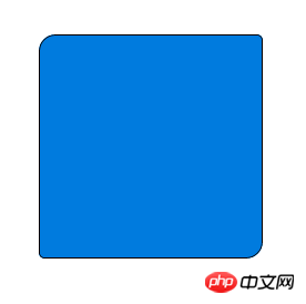
三、单个圆角的设置
除了同时设置四个圆角以外,还可以单独对每个角进行设置。对应四个角,CSS3提供四个单独的属性:
* border-top-left-radius
* border-top-right-radius
* border-bottom-right-radius
* border-bottom-left-radius
这四个属性都可以同时设置1到2个值。如果设置1个值,表示水平半径与垂直半径相等。如果设置2个值,第一个值表示水平半径,第二个值表示垂直半径。
border-top-left-radius: 15px;

border-top-left-radius: 15px 5px;
四、浏览器支持
IE 9、Opera 10.5、Safari 5、Chrome 4和Firefox 4,都支持上述的border-radius属性。早期版本的Safari和Chrome,支持-webkit-border-radius属性,早期版 本的Firefox支持-moz-border-radius属性。
目前来看,为了保证兼容性,只需同时设置-moz-border-radius和border-radius即可。
-moz-border-radius: 15px;
  border-radius: 15px;
(注意:border-radius必须放在最后声明,否则可能会失效。)
另外,早期版本Firefox的单个圆角的语句,与标准语法略有不同。
* -moz-border-radius-topleft(标准语法:border-top-left-radius)
* -moz-border-radius-topright(标准语法:border-top-right-radius)
* -moz-border-radius-bottomleft(标准语法:border-bottom-left-radius)
* -moz-border-radius-bottomright(标准语法:border-bottom-right-radius)
五、注意事项
虽然各大浏览器都支持border-radius,但是在某些细节上,实现都不一样。当四个角的颜色、宽度、风格(实线框、虚线框等)、单位都 相同时,所有浏览器的渲染结果基本一致;一旦四个角的设置不相同,就会出现很大的差异。比如,下面这段代码在不同的浏览器中,渲染结果就相差很大。
border-color: black;
  border-style: solid dashed;
  border-width: 1px 2px 3px;
  border-top-color: red;
  border-radius: 5%;

另外,并非所有浏览器,都支持将圆角半径设为一个百分比值。
因此,目前最安全的做法,就是将每个圆角边框的风格和宽度,都设为一样的值,并且避免使用百分比值。
以上是CSS3的写法
如下是传统的css圆角边框的代码:
<html>
<head>
<style>
#a{
    border-left:1px #333 solid;
    border-right:1px #333 solid;
    width:300px;
    height:200px;
    background:#99FFFF;
}
.b{
    height:1px;
    overflow:hidden;
    border-left:1px #333 solid;
    border-right:1px #333 solid;
    background:#99FFFF;
}
textarea{
    width:294px;
    height:200px;
    background:#99FFFF;
    border:0;
    border-color:#99FFFF;
    overflow:hidden;
}
</style>
</head>
<body>
<div>

    <div class="b" style="margin-left:3px;width:294px;background:#333"></div>

    <div class="b" style="margin-left:2px;width:296px;"></div>
    <div class="b" style="margin-left:1px;width:298px"></div>

    <div id="a">
    <textarea>
    以我的能力,纯DIV+CSS实现的效果只能做到这样了。这里是放置内容的地方,自己看一看代码的规律,很容易明白。

    代码很简单,a层为放置内容的层,其width值为300,然后向外以2像素的宽度递减,用一个像素来控制圆角。最外一层要加上background为个属性,目的是要将上、下两线条呈现出来。

    这里实现了3像素的圆角边框,b层的数量决定了要实现多少个像素边框。建议不要多于3层,最好是2层,即2像素圆角边框,或者1层,因为层数越多,圆角的表现就越不圆滑。在firefox  IE6 都通过测试。
    </textarea>
    </div>
    <div class="b" style="margin-left:1px;width:298px"></div>
    <div class="b" style="margin-left:2px;width:296px;"></div>
    <div class="b" style="margin-left:3px;width:294px;background:#333"></div>

</div>
</body>
</html>

---------------------------------------------------------------

<html>
 <head>
   <style type="text/css">

   u.corner u
   {
       height: 1px;
       font-size:1px;
       display: block;
       overflow: hidden;
       text-decoration: none;
       border-color:#CC0033;
       border-style:solid;
   }

   u.corner u.h1{margin: 0 5px;}
   u.corner u.h2{margin: 0 3px;}
   u.corner u.h3{margin: 0 2px;}
   u.corner u.h4{margin: 0 1px; height: 2px}
   /*
     用一个像素的点和控制边距控制显示位置。这个缺点是只能通过背景色来控制。不能设置边框
   */
   </style>
 <head>
 <body>
   <div>
   <u class="corner"><u class="h1"></u><u class="h2"></u><u class="h3"></u><u class="h4"></u></u>
     <div style="border-color:#CC0033;border-style:solid; height: 210;border-width:0 1px;">content</div>
   <u class="corner"><u class="h4"></u><u class="h3"></u><u class="h2"></u><u class="h1"></u></u>
   </div>
 </body>

</html>

========================================
<fieldset style="width:500px;">
  <legend>
  标题圆角效果
  </legend>
  内容比DIV好的圆角效果
</fieldset>


--------------------------------------
<style type="text/css">

#xsnazzy h1, #xsnazzy h2, #xsnazzy p {margin:0 10px; letter-spacing:1px;}
#xsnazzy h1 {font-size:2.5em; color:#fff;}
#xsnazzy h2 {font-size:2em;color:#06a; border:0;}
#xsnazzy p {padding-bottom:0.5em;}
#xsnazzy h2 {padding-top:0.5em;}
#xsnazzy {background: transparent; margin:1em;}

.xtop, .xbottom {display:block; background:transparent; font-size:1px;}
.xb1, .xb2, .xb3, .xb4 {display:block; overflow:hidden;}
.xb1, .xb2, .xb3 {height:1px;}
.xb2, .xb3, .xb4 {background:#ccc; border-left:1px solid #08c; border-right:1px solid #08c;}
.xb1 {margin:0 5px; background:#08c;}
.xb2 {margin:0 3px; border-width:0 2px;}
.xb3 {margin:0 2px;}
.xb4 {height:2px; margin:0 1px;}

.xboxcontent {display:block; background:#ccc; border:0 solid #08c; border-width:0 1px;}


</style>

<div id="xsnazzy">
<b class="xtop"><b class="xb1"></b><b class="xb2"></b><b class="xb3"></b><b class="xb4"></b></b>
<div class="xboxcontent">
<h1>Snazzy Borders</h1>
<p>Based on Nifty Corners By Alessandro Fulciniti<br />http://pro.html.it/esempio/nifty/</p>

content
</div>
<b class="xbottom"><b class="xb4"></b><b class="xb3"></b><b class="xb2"></b><b class="xb1"></b></b>
</div>相关推荐:
以上就是如何使用Css实现圆角边框的效果的详细内容,更多请关注php中文网其它相关文章!

每个人都需要一台速度更快、更稳定的 PC。随着时间的推移,垃圾文件、旧注册表数据和不必要的后台进程会占用资源并降低性能。幸运的是,许多工具可以让 Windows 保持平稳运行。

 广告
广告![ThinkPHP5快速开发企业站点[全程实录]](https://img.php.cn/upload/course/000/000/068/6253d918a3ce7278.png)
 收藏
收藏

 收藏
收藏
Copyright 2014-2025 https://www.php.cn/ All Rights Reserved | php.cn | 湘ICP备2023035733号


 530
530