 Web Front-end
 CSS Tutorial
 Summarizing the development history of CSS layout, the fourth generation of CSS layout technology is the most powerful.
Summarizing the development history of CSS layout, the fourth generation of CSS layout technology is the most powerful.
I am also an old man who has been in the front-end industry for several years. CSS web page layout has become richer, so I am constantly learning and progressing. Otherwise, I really can’t keep up with the trend of the times. When I become the fourth generation of CSS When the grid layout of layout technology appeared in front of me, it seemed familiar, but it was also very unfamiliar and I had to learn it all over again. Every previous developer had a frontpage installed on their computer, and even dreamwaver8 found it very beautiful. Times are changing, let’s take a look at the fourth generation of CSS layout technology. apache php mysql
2006 is destined to be an extraordinary year. That year Microsoft sentenced fontpage to death, and that year XMLHttpRequest was officially included in the standard by W3C , that year Google’s sexiest girl, Gmail, was already two years old. The key point was that jquery, which once dominated more than 90% of PC websites, was released by John Resig. jQuery was born, and the first js brother was born. From then on, the front-end engineer has made a lot of people proud. The melancholy career sprung up and is still going strong today, and of course dreamwaver 8 was released.
Everything is so beautiful, except for the disgusting first-generation table layout.

First generation table layout
As the earliest user of table said, I poured the fried sauce and noodles together, and there was no Can't separate him. Translated into human words, as the business becomes more and more complex, it is nonsense to change a well-made web page, and it is particularly difficult to change. 
Then the second generation layout css p layout appeared.
To be precise, this thing existed more than 10 years ago, but it has only grown into a big girl now. Then he was completely doted on by him as soon as he was born, and the table layout was immediately relegated to the sidelines. From then on, the p css era officially started.
There is a reason why this product is popular. It should be flexibly modified. If the table layout is for semi-permanent eyebrow tattoos, the p css layout is for eyebrow tattoos. You can change it however you want without cutting the bones (moving the DOM) ), of course it is very mainstream now, but I think CSS is not without its shortcomings. Personally, I think this crap is too complicated for non-programmers, and it is too tedious even for programmers, who have to go through it one by one. Control is like a girl who wants to put on makeup. She has 20 eyebrow pencils and 30 colors of lipstick. How can she cooperate? It's too troublesome...
If you have a patch, it would be great to have a patch. You can draw your eyebrows just by applying them online, and after another patch, your face will be rosy. Don't ask me to apply the foundation one stroke at a time and apply the blush one by one.
Yes, you know, because the ink mark in the CSS layout, especially the floating layout and other things like clearing floats, is just like having to wipe your nose after picking it, it’s really disgusting.
Based on these disgusting problems, css, (rest assured that this guy is the only one who dominates the world now, there is no other stuff, I am still very happy about this, unlike html trying to make XHTML2.0 or html5, js is even more extreme, doing typescript or something) slap on the thigh, what float, what disgusting positions, width and height objects are horizontally and vertically centered, what float elements are internal elements are centered, these are disgusting and not rubbish, brother, I have them A simpler way to solve it for you,
The third generation network layout system flex.
There are two ridiculously simple things about the application of flex
The first one is that the element is centered vertically and horizontally.
Look here, look here, look here, look at the picture!
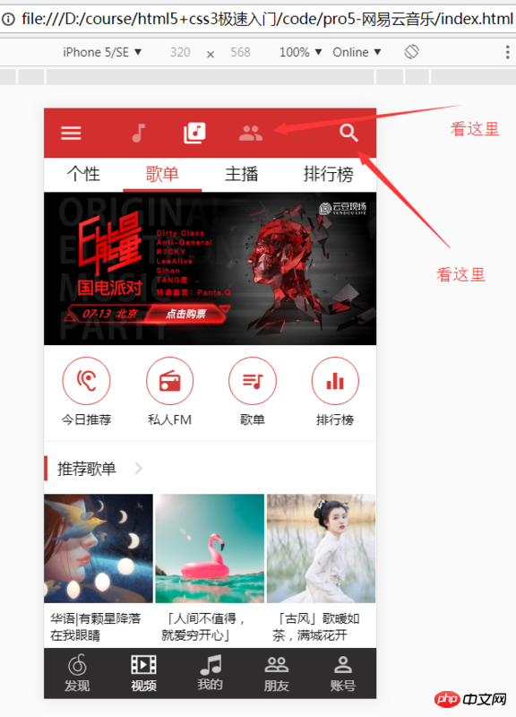
Let’s see that NetEase Cloud Music APP is implemented with css layout. If the traditional left and right icons float to both sides respectively, then the equidistant centering of the three element icons in the middle is a problem. It is not easy to deal with giving width or not giving width. If we use absolute positioning, not only do we consider that absolute positioning does not take up space, we need to occupy space, and When it comes to the processing of left spacing and vertical spacing, to ensure that the horizontal and vertical positions are always at that position under different resolution screens, we must use rem layout js to dynamically calculate, and rem must consider the retina screen. Everyone wants to curse, I just I want several icons to be centered vertically and spaced horizontally, the same on every screen. Why is it so troublesome? Fortunately we have flex layout.
#toolbar{
    display: flex;
    align-items: center;
    justify-content: space-between;
}Okay, the two icons are neatly occupied by each other.
#iconTool {
    display: flex;
    justify-content: center;
}Nothing wrong, the middle part is divided properly.
You don’t need to learn a lot of useless things, just remember the parent element,
#toolbar{
    display: flex;
    align-items: center;//这个负责纵向居中
    justify-content: space-between;//这个负责横向居中或者两边站
}What should I do if I want #iconTool to occupy the space except for the two icons,
flex-grow:1;
Some students will say why the teacher doesn’t use it
flex:1;
You’re just using it for nothing, you just think too much, flex includes flex-grow, flex-shrink, flex-basis, you want to use it yourself Confused?
Don’t mess with useless things, just remember the two items just now. Most of your flex layout problems have been solved. If you don’t know how to google, don’t just want to learn everything comprehensively. When the time comes, Nothing.
第二个,“豆腐块”布局。
直接看图!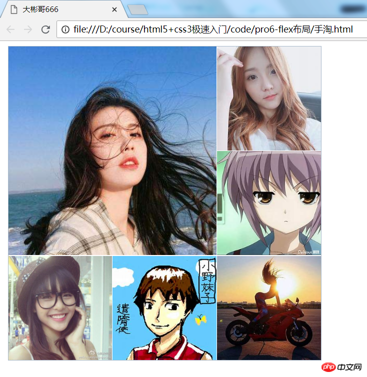
大家看我红圈圈起来的部分,基本上每一个app都用,但是大家知道的,有时候可恶心了,有时候左边右边间距不一样了,或者左边右边要边,中间又只要一个边,而不是两个边,用first-child 和last-child 选择器还要考虑兼容。另外还要使用box-sizing,里面的图片不同设备宽高比例又不对了,反正怎么搞都特么不爽。还得图片跟文字也得居中,老师想想就得包很多层,是不是还得用dl dd,别想太多,看我怎么做。现在我就告诉你一个好方法解放军叔叔来了,大家看我怎么搞,其实简单的又让人发指了。我已最上面的今日推荐部分举例
#recommend-items {
    display: flex;
    justify-content: space-around;//横向子元素排列方式,不用记住,用的时候试试就OK
    border-bottom: 1px solid #eee;
}
#recommend-items .item {
    flex-grow: 1;
    text-align: center;
    display: flex;
    flex-direction: column;//子元素纵向排列
    align-items: center;
    justify-content: center;
    height: 0.93rem;
}别瞅了,看我生活不要太美好,这样就鸟了,你觉得这样就够了吗?显然不是,
牛掰666的第四代网格布局系统来了。
有同学说老师这个不挺好吗?好,你一定要记住,没有无缘无故的爱也没有无缘无故的恨。翻译成技术的话就是,没有问题就不会有解决方案。技术是为解决问题服务的,flex布局肯定变成怂蛋才会发明更牛掰的玩意。我们看这样一种情况:

大家看这么个破玩意,这个是手机淘宝APP里面的一个布局,别看妹子,看我,我不想墨迹咱们看看flex怎么实现,你不是牛掰么,看代码
<!DOCTYPE html>
<html>
<head>
    <meta charset="utf-8">
    <title>大彬哥666</title>
    <style>
        /** 实战版 **/
        .flex-item {
            background: #f55;
            text-align: center;
            vertical-align: middle;
        }

        .wrap-box {
            display: flex;
            width: 500px;
            border: 1px solid #abc;
            margin-bottom: 10px;
            margin-left: 10px;
        }

        .flex-inner {
            display: flex;
            flex-grow: 1;
        }

        .flex-item {
            flex-grow: 1;
            font-size: 0;
            position: relative;
        }

        .wrap-6 {
            /* -webkit-box-orient: horizontal; */
        }

        .wrap-6 .flex-inner {
            display: flex;
            flex-direction: column;
        }

        .wrap-6 .flex-inner:first-child {
            width: 66.6%;
        }

        .wrap-6 .flex-inner:last-child {
            width: 33.3%;
        }

        .wrap-6 .flex-item {
            padding-top: 100%;
        }

        .wrap-6 .flex-box2 .flex-item {
            padding-top: 50%;
        }

        .wrap-6 .flex-box2 {
            display: flex;
        }

        .wrap-6 .flex-inner:first-child,
        .wrap-6 .flex-box2 .flex-item:first-child {
            margin-right: 1px;
        }

        .wrap-6 .flex-box1,
        .wrap-6 .flex-inner:last-child .flex-item:first-child,
        .wrap-6 .flex-inner:last-child .flex-item:nth-child(2) {
            margin-bottom: 1px;
        }

        img {
            height: 100%;
            width: 100%;
            position: absolute;
            left: 0;
            top: 0;
        }
    </style>
</head>

<body>
    <p class="wrap-box wrap-6">
        <p class="flex-inner">
            <p class="flex-box1 flex-item">
                <img src="/static/imghw/default1.png"  data-src="img/1.jpg"  class="lazy"   alt="">
            </p>
            <p class="flex-box2">
                <p class="flex-item">
                    <img src="/static/imghw/default1.png"  data-src="img/2.jpg"  class="lazy"   alt="">

                </p>
                <p class="flex-item">
                    <img src="/static/imghw/default1.png"  data-src="img/3.jpg"  class="lazy"   alt="">

                </p>
            </p>
        </p>
        <p class="flex-inner">
            <p class="flex-item">
                <img src="/static/imghw/default1.png"  data-src="img/4.jpg"  class="lazy"   alt="">

            </p>
            <p class="flex-item">
                <img src="/static/imghw/default1.png"  data-src="img/5.jpg"  class="lazy"   alt="">

            </p>
            <p class="flex-item">
                <img src="/static/imghw/default1.png"  data-src="img/6.jpg"  class="lazy"   alt="">

            </p>
        </p>
    </p>
</body>

</html>老实说,如果让一些前端开发者 在用flex实现这个布局和闻大彬哥的香之间做个选择的话,很多开发者估计会
痛快的说愿闻其详,因为不闻的话,自己可能卡出香来。
不是flex 怂蛋,是因为人家就是和一维的布局,二维就废了。翻译成人话就是flex布局适合一个方向布局,同时要搞横向和纵向就搞不动了。有些人说flex布局和网格布局还有一个内容优先和布局优先的问题,这里我就要忍不住吐槽了,我们学技术是为了应用到工作中,因为没有工作你吃啥,没有工作了你穿啥,吃穿都没了你还臭嘚瑟啥?你知道不知道内容优先和布局优先对能够更快更好的布局完活儿没有半毛钱关系,程序员头发已经够少了,少学点没用的东西。
那么就开始看看第四代网络布局神奇grid布局的强大之处。
网上有些文章类似于5分钟学会 CSS Grid 布局之类的文章,这些文章入门挺好的但是要想看完这个文章5分钟就能够工作中用还是有点费劲的。我又不是大自然的搬运工,能搜到的东西我就不讲了,咱们不墨迹直接就上来一梭子代码看看刚才的实际手淘布局怎么实现。
<!DOCTYPE html>
<html lang="en">
<head>
    <meta charset="UTF-8">
    <meta name="viewport" content="width=device-width, initial-scale=1.0">
    <meta http-equiv="X-UA-Compatible" content="ie=edge">
    <title>Document</title>
</head>
<style>
    * {
        margin: 0;
        padding: 0;
    }

    .wrapper {
        display: grid;
        width: 500px;
        height: 500px;
        grid-template-columns: 1fr 1fr 1fr;
        grid-template-rows: 1fr 1fr 1fr;
        grid-gap: 1px;
    }

    .item1 {
        grid-column: 1 / 3;
        grid-row: 1 / 3;
    }
    img{
        width: 100%;
        max-height: 100%;
    }

</style>

<body>
    <p class="wrapper">
        <p class="item1" style="background: red">
            <img src="/static/imghw/default1.png"  data-src="img/1.jpg"  class="lazy"   alt="">
        </p>
        <p class="item2" style="background: orange">
            <img src="/static/imghw/default1.png"  data-src="img/1.jpg"  class="lazy"   alt="">
        </p>
        <p class="item3" style="background: yellow">
            <img src="/static/imghw/default1.png"  data-src="img/1.jpg"  class="lazy"   alt="">
        </p>
        <p class="item4" style="background: green">
            <img src="/static/imghw/default1.png"  data-src="img/1.jpg"  class="lazy"   alt="">
        </p>
        <p class="item5" style="background: aqua">
            <img src="/static/imghw/default1.png"  data-src="img/1.jpg"  class="lazy"   alt="">
        </p>
        <p class="item6" style="background: blue">
            <img src="/static/imghw/default1.png"  data-src="img/1.jpg"  class="lazy"   alt="">
        </p>
    </p>
</body>
</html>有同学说 老师你不讲讲这玩意,
只讲两点,第一点
.wrapper {
        display: grid;
        width: 500px;
        height: 500px;
        grid-template-columns: 1fr 1fr 1fr;//你把他理解成跟像素一样的单位
        grid-template-rows: 1fr 1fr 1fr;
        grid-gap: 1px;
    }

    .item1 {
        grid-column: 1 / 3;//这里不是三分之一 是第一条线到第三条线
        grid-row: 1 / 3;
}第二点,他很简单千万别想太复杂说什么我要好好学学,系统学学,学你妹啊,拿起来就用别有点新东西就事儿事儿的想大块时间学,到最后也没学,别想了,拿起键盘就是干就对了。
这里有同学会说,老师你瞎忽悠,flex和grid都是新技术,他们没有办法谁替代谁。
首先我告诉你,你说的没错甚至table布局是初代布局系统也有商榷,因为有人觉得从第一个网页出来那个是第一代。我想说的是不管怎么分,你能说的很有道理就行,有自己思考在里面就行,别跟别人屁股后面人家说啥你跟着跑,对了内个词儿叫人云亦云就行。而第四代布局系统也是我总结出来的为什么他是第四代,而flex是第三代呢?
原因:
1.flex对标的是float,本质上还是一维布局,这就跟别人开着夏利,你开奔驰都是地面上跑没啥本质区别一样。但是grid升维了,grid是飞机,在地面马路这条线一维之上让人能够思考高度这个维度,以前是汽车一维交通工具(你只只能在水平方向的人一个方向开),飞机是二维(能俯冲了(横向、纵向同时)),所以grid可以说是拓宽了css布局的维度,不排除将来会有三维布局的出现,不仅仅能css控制 横向布局,纵向布局,还可以深度布局(这个要依赖于三维展示的出现,如VR,AR三维立体的展示设备出现)。
2. The grid layout adopts "visual layout (template part, what you see is what you get)". This subverts the traditional development method of writing a line of code and swiping the browser. It is not ruled out that the code will be the effect in the future. development model. For example, if you draw an area on a device and then draw a carousel, it is similar to the vc control but in a smarter and more friendly way. Who says it's impossible? Don't forget that the grid layout comes from the long-abandoned table layout. Speaking of which, let me say one more funny thing about Microsoft. Frontpage is not popular, Dreamwaver is popular, VML, which first proposed the concept of "canvas", is not popular, and finally HTML5 canvas is popular. Even CSS3 grid layout is a module created by Microsoft. In the end, when it became popular, no one knew him. Feel sorry for me for a second.
end:
1. Understand the development history of grid layout in order to have an objective understanding of the development of future layout technology Decide whether the right choice is to study.
2. Learn to use flex layout to write actual projects, instead of just memorizing a few attributes.
3. Learn to use grid layout to write actual projects, instead of saying that I find time to study.
4. Finally, I wish everyone a happy study!
Related articles:
Interpretation of CSS Development History_Basic Tutorial##This may be the most comprehensive summary of CSS adaptive layout in history
Use DIV CSS to layout a complete website homepage
The above is the detailed content of Summarizing the development history of CSS layout, the fourth generation of CSS layout technology is the most powerful.. For more information, please follow other related articles on the PHP Chinese website!

Hot AI Tools

Undresser.AI Undress
AI-powered app for creating realistic nude photos

AI Clothes Remover
Online AI tool for removing clothes from photos.

Undress AI Tool
Undress images for free

Clothoff.io
AI clothes remover

Video Face Swap
Swap faces in any video effortlessly with our completely free AI face swap tool!

Hot Article

Hot Tools

Notepad++7.3.1
Easy-to-use and free code editor

SublimeText3 Chinese version
Chinese version, very easy to use

Zend Studio 13.0.1
Powerful PHP integrated development environment

Dreamweaver CS6
Visual web development tools

SublimeText3 Mac version
God-level code editing software (SublimeText3)

Hot Topics
 1655
1655
 14
14
 1414
1414
 52
52
 1307
1307
 25
25
 1255
1255
 29
29
 1228
1228
 24
24
 How to use bootstrap in vue
Apr 07, 2025 pm 11:33 PM
Using Bootstrap in Vue.js is divided into five steps: Install Bootstrap. Import Bootstrap in main.js. Use the Bootstrap component directly in the template. Optional: Custom style. Optional: Use plug-ins.
 Understanding HTML, CSS, and JavaScript: A Beginner's Guide
Apr 12, 2025 am 12:02 AM
WebdevelopmentreliesonHTML,CSS,andJavaScript:1)HTMLstructurescontent,2)CSSstylesit,and3)JavaScriptaddsinteractivity,formingthebasisofmodernwebexperiences.
 The Roles of HTML, CSS, and JavaScript: Core Responsibilities
Apr 08, 2025 pm 07:05 PM
HTML defines the web structure, CSS is responsible for style and layout, and JavaScript gives dynamic interaction. The three perform their duties in web development and jointly build a colorful website.
 How to write split lines on bootstrap
Apr 07, 2025 pm 03:12 PM
There are two ways to create a Bootstrap split line: using the tag, which creates a horizontal split line. Use the CSS border property to create custom style split lines.
 How to insert pictures on bootstrap
Apr 07, 2025 pm 03:30 PM
There are several ways to insert images in Bootstrap: insert images directly, using the HTML img tag. With the Bootstrap image component, you can provide responsive images and more styles. Set the image size, use the img-fluid class to make the image adaptable. Set the border, using the img-bordered class. Set the rounded corners and use the img-rounded class. Set the shadow, use the shadow class. Resize and position the image, using CSS style. Using the background image, use the background-image CSS property.
 How to set up the framework for bootstrap
Apr 07, 2025 pm 03:27 PM
To set up the Bootstrap framework, you need to follow these steps: 1. Reference the Bootstrap file via CDN; 2. Download and host the file on your own server; 3. Include the Bootstrap file in HTML; 4. Compile Sass/Less as needed; 5. Import a custom file (optional). Once setup is complete, you can use Bootstrap's grid systems, components, and styles to create responsive websites and applications.
 How to use bootstrap button
Apr 07, 2025 pm 03:09 PM
How to use the Bootstrap button? Introduce Bootstrap CSS to create button elements and add Bootstrap button class to add button text
 How to resize bootstrap
Apr 07, 2025 pm 03:18 PM
To adjust the size of elements in Bootstrap, you can use the dimension class, which includes: adjusting width: .col-, .w-, .mw-adjust height: .h-, .min-h-, .max-h-


