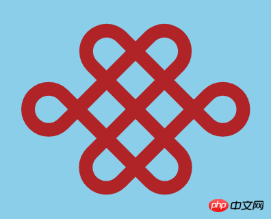
The content of this article is about how to use css to achieve the effect of Chinese knot (code). It has certain reference value. Friends in need can refer to it. I hope it will be helpful to you.
Today I would like to share with you a tutorial on how to draw a Chinese knot using CSS.
The final effect is as follows:

First, we define the structure needed to draw a Chinese knot:
<div>
    <span></span>
    <span></span>
    <span></span>
    <span></span>
</div>
Then start writing the style , let the Chinese knot be displayed in the center:
body {
  margin: 0;
  padding: 0;
  height: 100vh;
  display: flex;
  align-items: center;
  justify-content: center;
}Set the container style of the Chinese knot:
.knot {
  box-sizing: border-box;
  font-size: 100px;
  width: 2em;
  height: 1.6em;
  background: skyblue;
  display: flex;
  align-items: center;
  justify-content: center;
}I split the basic style of the Chinese knot into 4 rectangles. First, define the basic style of the rectangle:
.box {
  position: absolute;
  box-sizing: border-box;
  width: 1em;
  height: 0.4em;
  border: var(--b) solid firebrick;
  --b: 0.1em;
}Then we adjust the style of each rectangle and combine them into the basic shape of the knot:
.knot .box:nth-child(1) {
  transform: rotate(45deg) translate(-15%, -38%);
  border-radius: 20% 0% 0% 20% / 50% 0 0 50%;
}

.knot .box:nth-child(2) {
  transform: rotate(45deg) translate(15%, 37%);
  border-radius: 0% 20% 20% 0% / 0% 50% 50% 0%;
}

.knot .box:nth-child(3) {
  transform: rotate(-45deg) translate(15%, -38%);
  border-radius: 0% 20% 20% 0% / 0% 50% 50% 0%;
}

.knot .box:nth-child(4) {
  transform: rotate(-45deg) translate(-15%, 37%);
  border-radius: 20% 0% 0% 20% / 50% 0 0 50%;
}Finally, we use the pseudo-elements of the first and second rectangles to draw the rest The two small circles:
.knot .box:nth-child(1)::after {
  box-sizing: border-box;
  content: '';
  position: absolute;
  width: 0.4em;
  height: 0.4em;
  border: var(--b) solid firebrick;
  border-radius: 50% 50% 50% 0%;
  top: -0.4em;
  right: -0.4em;
}

.knot .box:nth-child(2)::after {
  box-sizing: border-box;
  content: '';
  position: absolute;
  width: 0.4em;
  height: 0.4em;
  border: var(--b) solid firebrick;
  border-radius: 50% 0% 50% 50%;
  top: 0.2em;
  right: 0.8em;
}Related recommendations:
How to use pure CSS to realize the motion model animation of the sun, the earth and the moon
The above is the detailed content of How to use css to achieve the effect of Chinese knot (code). For more information, please follow other related articles on the PHP Chinese website!