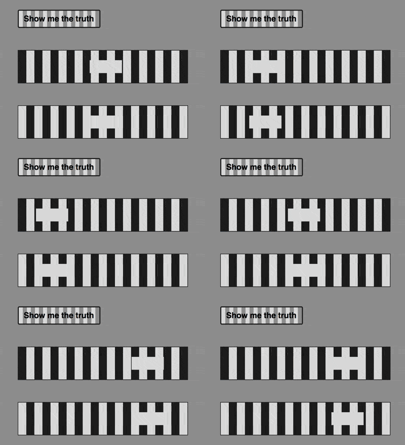
The content of this article is about how to use pure CSS to achieve the stripe illusion animation effect (source code attached). It has certain reference value. Friends in need can refer to it. I hope it will be helpful to you.

https://github.com/comehope/front-end-daily -challenges
Define dom, the container contains 2 elements, representing 2 tracks respectively:
<div>
    <span></span>
    <span></span>
</div>
Centered display:
body {
    margin: 0;
    height: 100vh;
    display: flex;
    align-items: center;
    justify-content: center;
    background-color: #999;
}Definition Container size and layout of child elements:
.container {
    font-size: 30px;
    width: calc(13em + 0.5em);
    height: 8em;
    display: flex;
    flex-direction: column;
    justify-content: space-between;
}Define 2 color values, one light and one dark:
.container {
    --dark: #222;
    --light: #ddd;
}Draw the outline of 2 tracks:
.track {
    width: inherit;
    height: 2em;
    border: 1px solid var(--dark);
}is the background pattern of the two tracks. The pattern is alternating light and dark stripes, but the second track is offset by half a grid:
.track {
    background: linear-gradient(
        90deg,
        var(--dark) 50%,
        var(--light) 50%
    );
    background-size: 1em;
}

.track:nth-child(2) {
    background-position: 0.5em;
}Use pseudo elements to draw two rectangles:
.track {
    position: relative;
    display: flex;
    align-items: center;
}

.track::before {
    content: '';
    position: absolute;
    width: 2em;
    height: 0.8em;
    background-color: var(--light);
}Let these two rectangles move back and forth on the track:
.track::before {
    animation: move 5s linear infinite alternate;
}

@keyframes move {
    from {
        left: 0;
    }

    to {
        left: calc(100% - 2em);
    }
}At this time, the two rectangles appear to be moving forward one after the other, but in fact they start at the same moment and move at the same speed. move. Next let’s reveal the truth.
Add a child element to the dom as a button;
<p>
    <span></span>
    <span></span>
    <span>Show me the truth</span>
</p>
Set the style of the button:
.toggle {
    order: -1;
    width: 10em;
    height: 2em;
    border: 2px solid var(--dark);
    border-radius: 0.2em;
    font-size: 0.5em;
    font-family: sans-serif;
    font-weight: bold;
    color: black;
    text-align: center;
    line-height: 2em;
    cursor: pointer;
    user-select: none;
}Set a background similar to the track style for the button, as well as mouse hover Effect:
.toggle {
    background-image: linear-gradient(to right, #ddd 50%, #999 50%);
    background-size: 1em;
    transition: 0.5s;
}

.toggle:hover {
    background-position: 5em;
}Add a script that is triggered when the button is clicked to switch the style of the track element:
let $toggle = document.getElementsByClassName('toggle')[0]
let $tracks = Array.from(document.getElementsByClassName('track'))

$toggle.addEventListener('click', function() {
    $tracks.forEach(track => track.classList.toggle('highlights'))
})Finally, the answer was revealed after switching the style:
.track::before {
    box-sizing: border-box;
    border: solid var(--dark);
    border-width: 0;
}

.track.highlights::before {
    background-color: white;
    border-width: 0.1em;
}You're done!
Related recommendations:
How to use pure CSS to implement block jumping animation (source code attached)
The above is the detailed content of How to use pure CSS to achieve stripe illusion animation effect (source code attached). For more information, please follow other related articles on the PHP Chinese website!