This chapter shows you how to draw a beating heart using pure CSS? (Code example) has certain reference value. Friends in need can refer to it. I hope it will be helpful to you.
Let me show you the renderings first:
Principle of implementation:
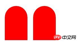
1. This heart can be divided into two parts, two Rectangle;
Set border-radius respectively;

After the two graphics overlap, set transform: rotate respectively (), the set rotate() value should be opposite, one positive value and one negative value;
When setting the left value of one of them, it becomes
In order to look three-dimensional, you can set the box-shadow shadow on the left;
Then cooperate with @keyframes and transform attributes to achieve a jumping effect.
Code example:
<!DOCTYPE html>
<html>
<head>
<meta charset="UTF-8">
<title>纯css画一下心</title>
<style>
body{
height: 100%;
margin: 0;
}
.demo{
width: 1px;
height: 1px;
margin: 300px auto;
position: relative;
animation: tiaodong .8s linear infinite;
}
.demo::before,.demo::after{
content: '';
position: absolute;
width: 80px;
height: 120px;
background-color: red;
border-radius: 50px 50px 0 0;
}
.demo::after{
left: 28px;
transform: rotate(45deg);
}
.demo::before{
transform: rotate(-45deg);
box-shadow: -5px -5px 10px grey;
}
@keyframes tiaodong{
0%{
transform: scale(1);
}
50%{
transform: scale(1.05);
}
100%{
transform: scale(1);
}
}
</style>
</head>
<body>
<div class="demo"></div>
</body>
</html>is implemented using after and before pseudo-elements, without considering compatibility, and will not be displayed before IE 10.
Can be solved by replacing after and before with span elements.
Need to add: -ms-transform.
If you use span elements to draw, you need to set the z-index attribute on the right block.
The above is the detailed content of How to draw a beating heart using pure CSS? (code example). For more information, please follow other related articles on the PHP Chinese website!