 Web Front-end
 CSS Tutorial
 Detailed explanation of the usage of flex-grow attribute in CSS (with code)
Detailed explanation of the usage of flex-grow attribute in CSS (with code)
In this article we will use the flex-grow property in Flexbox to implement the behavior of widening the width of the frame when the width of the frame wraps and becomes larger than necessary.
Use the flex-grow property to specify the width of the frame width in Flexbox when it is wider than necessary.
Syntax:
flex-grow :(数量)
Code example:
flex-grow.html
<!DOCTYPE html>
<html>
<head>
<meta charset="utf-8" />
<title></title>
<link rel="stylesheet" href="flex-grow.css" />
</head>
<body>
<div class="container">
    <div class="frameA">第一个内容<br/>php中文网<br />php中文网</div>
    <div class="frameB">第二个内容<br />php中文网<br /></div>
    <div class="frameC">第三个内容<br />php中文网<br />php中文网</div>
    <div class="frameD">第四个内容<br />php中文网<br />php中文网</div>
    <div class="frameE">第五个内容<br />php中文网<br />php中文网</div>
  </div>
</body>
</html>flex-grow.css
.container {
    display: flex;
}
.frameA {
    border: 1px solid #e9006b;
    flex-grow: 5;
}
.frameB {
    border: 1px solid #ff6a00;
    flex-grow: 4;
}
.frameC {
    border: 1px solid #d0b106;
    flex-grow: 3;
}
.frameD {
    border: 1px solid #4aae20;
    flex-grow: 2;
}
.frameE {
    border: 1px solid #01b9b3;
    flex-grow: 1;
}Instructions:
We set frame-A flex-grow to 5, frame B flex-grow to 4, frame C flex-grow 3, frame D flex-2 to frameE flex-grow 1 . With this setting, the width of the frame will expand further even if it becomes wider than necessary to display the text. In this case, the extent of frame extension, frameA:frameB:frame C:frame D:frameE = 5:4:3:2:1 ratio extension
Display results
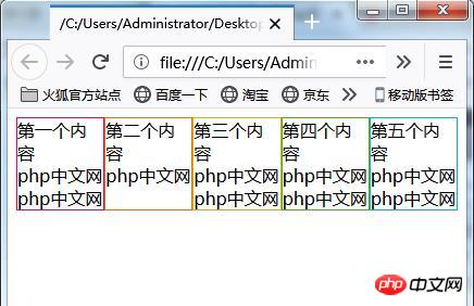
Use a web browser to display the above HTML file. The screen shown below will be displayed. When the window width is narrow, each frame is displayed with the same width.
Increase the window width. In states where wrapping is required to display text in a frame, the width of the frame is still displayed at the same width.
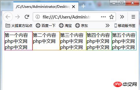
#When the text inside the box displays an unnecessary width, display it with the same width.
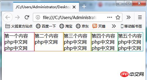
If you widen the window size beyond the width required to display the frames without wrapping text, the size of each frame will expand. The frame size increase is frameA:frameB:frameC:frameD:frameE = 5:4:3:2:1 ratio.

Set the flex-grow property in only one box
Change the CSS code to the following and set only one flex-grow property.
flex-grow.css
.container {
    display: flex;
}
.frameA {
    border: 1px solid #e9006b;
    flex-grow: 1;
}
.frameB {
    border: 1px solid #ff6a00;
}
.frameC {
    border: 1px solid #d0b106;
}

.frameD {
    border: 1px solid #4aae20;
}
.frameE {
    border: 1px solid #01b9b3;
}Use a web browser to display the page. When the window width is narrower, the displayed frame width is the same as in the previous case.
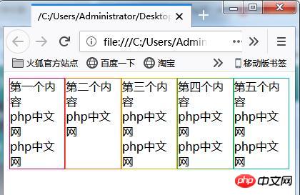
Increase the web browser window width. In the state where line wrapping is required during display, the width of each frame is the same.

Further increase the window size. Shows the width of the text without breaking in the middle.
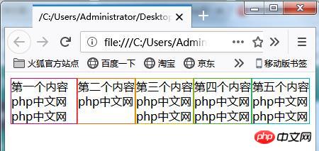
Further widen the window width. Frame-A with the flex-grow property has its width further increased, but the width of other borders without the flex-grow property specified remains the same.
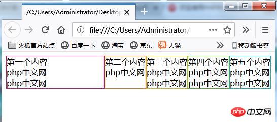
# Even if the window width is further widened, only frameA has a wider width.
The above is the detailed content of Detailed explanation of the usage of flex-grow attribute in CSS (with code). For more information, please follow other related articles on the PHP Chinese website!

Hot AI Tools

Undresser.AI Undress
AI-powered app for creating realistic nude photos

AI Clothes Remover
Online AI tool for removing clothes from photos.

Undress AI Tool
Undress images for free

Clothoff.io
AI clothes remover

Video Face Swap
Swap faces in any video effortlessly with our completely free AI face swap tool!

Hot Article

Hot Tools

Notepad++7.3.1
Easy-to-use and free code editor

SublimeText3 Chinese version
Chinese version, very easy to use

Zend Studio 13.0.1
Powerful PHP integrated development environment

Dreamweaver CS6
Visual web development tools

SublimeText3 Mac version
God-level code editing software (SublimeText3)

Hot Topics
 1669
1669
 14
14
 1428
1428
 52
52
 1329
1329
 25
25
 1273
1273
 29
29
 1256
1256
 24
24
 A Comparison of Static Form Providers
Apr 16, 2025 am 11:20 AM
Let’s attempt to coin a term here: "Static Form Provider." You bring your HTML
 A Proof of Concept for Making Sass Faster
Apr 16, 2025 am 10:38 AM
At the start of a new project, Sass compilation happens in the blink of an eye. This feels great, especially when it’s paired with Browsersync, which reloads
 Weekly Platform News: HTML Loading Attribute, the Main ARIA Specifications, and Moving from iFrame to Shadow DOM
Apr 17, 2025 am 10:55 AM
In this week's roundup of platform news, Chrome introduces a new attribute for loading, accessibility specifications for web developers, and the BBC moves
 Some Hands-On with the HTML Dialog Element
Apr 16, 2025 am 11:33 AM
This is me looking at the HTML element for the first time. I've been aware of it for a while, but haven't taken it for a spin yet. It has some pretty cool and
 Paperform
Apr 16, 2025 am 11:24 AM
Buy or build is a classic debate in technology. Building things yourself might feel less expensive because there is no line item on your credit card bill, but
 Where should 'Subscribe to Podcast' link to?
Apr 16, 2025 pm 12:04 PM
For a while, iTunes was the big dog in podcasting, so if you linked "Subscribe to Podcast" to like:
 Options for Hosting Your Own Non-JavaScript-Based Analytics
Apr 15, 2025 am 11:09 AM
There are loads of analytics platforms to help you track visitor and usage data on your sites. Perhaps most notably Google Analytics, which is widely used
 Weekly Platform News: Text Spacing Bookmarklet, Top-Level Await, New AMP Loading Indicator
Apr 17, 2025 am 11:26 AM
In this week's roundup, a handy bookmarklet for inspecting typography, using await to tinker with how JavaScript modules import one another, plus Facebook's


