How to achieve the repeating linear gradient effect in css3: first create an HTML sample file; then create a div in the body; finally use the "repeating-linear-gradient()" function in css3 to achieve the repeating gradient effect That’s it.

The operating environment of this article: Windows7 system, HTML5&&CSS3 version, Dell G3 computer.

#For front-end learning friends, the gradient effect is certainly no stranger. Everyone should know that there are linear gradients and radial gradients in CSS3. And in the previous article, we have also introduced to you the effect of CSS3 to achieve linear gradient and CSS3 to achieve the effect of radial gradient. Friends who need it can refer to it first.
This section mainly introduces to you css3 method to achieve repeated linear gradient effect.
The repeating linear gradient effect may sound unfamiliar to some friends, but it is also a common gradient effect in our daily lives.
Code examples are as follows:
<!DOCTYPE>
<html>
<meta charset="utf-8">
<head>
    <title>CSS3创建重复线性渐变效果</title>
    <style type="text/css">
        .container{
            text-align:center;
            padding:20px 0;
            width:960px;
            margin: 0 auto;
        }

        .container div{
            width:200px;
            height:150px;
            display:inline-block;
            margin:2px;
            color:#ec8007;
            vertical-align: top;
            line-height: 230px;
            font-size: 20px;
        }
        .repeating-linear{
            background:repeating-linear-gradient(-45deg, #4b6c9c, #5ac4ed 5px, #fff 5px, #fff 10px);
        }
    </style>
</head>
<body>
<div class="container">
 <div class="repeating-linear">重复线性渐变</div>
</div>
</body>
</html>Recommended reference study: "CSS3 Tutorial"
The repeated linear effect is as follows Picture:

As shown in the picture, the linear gradient effect of blue and white strip intervals. Repeat the gradient from -45 degrees linear gradient (which is 45 degrees in the lower right corner), from #4b6c9c to #5ac4ed and white to white.
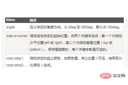
The repeating-linear-gradient() function in css3 is used to create a repeating linear gradient "image".
Syntax:
background: repeating-linear-gradient(angle | to side-or-corner, color-stop1, color-stop2, ...);

Note: Internet Explorer 9 and earlier versions of IE browsers do not support gradients.
This article is an introduction to the method of achieving repeated linear gradient effects in CSS3. It is very simple. I hope it will be helpful to friends in need!
The above is the detailed content of How to achieve repeated linear gradient effect in CSS3. For more information, please follow other related articles on the PHP Chinese website!
 CMD close port command
 How to use the print function in python
 What are the reasons why a mobile phone has an empty number?
 How to type the inscription on the coin circle?
 Thunder 7 crack patch
 How to implement recursive query in mysql
 How do I set up WeChat to require my consent when people add me to a group?
 What does linux df -h mean?