 Web Front-end
 CSS Tutorial
 Graphics and text of application examples of green color matching on web pages
Graphics and text of application examples of green color matching on web pages
Green is a more moderate color between yellow and blue (warm and cold), which makes green the most peaceful, stable, generous and tolerant character. It is a soft, quiet, contented, graceful and popular color. It is also one of the most widely used colors on web pages.
Green is closely related to human beings. It is the natural color of eternal prosperity, represents life and hope, and is also full of youthful vitality. Green symbolizes peace and security, development and vitality, comfort and tranquility, and relaxation. With rest, it can relieve eye fatigue.
It has a certain feeling related to nature and health, so it is often used on sites related to nature and health. Green is also often used in some companies’ public relations or educational sites.
Green can make our mood particularly bright. Yellow-green represents freshness, calmness, ease, peace, softness, spring, youth, and upgraded psychological feelings.
Below we will do different examples and analyzes based on color combinations such as adjacent colors with different attributes of the green system, high purity and low purity of the same color, contrasting colors, etc.

Green color analysis:
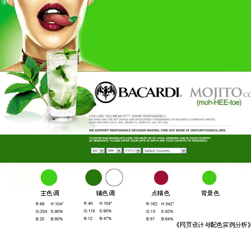
From the main colors in the picture above, It can be seen from the numerical value of the secondary hue HSB mode that the two colors only differ in brightness, and the displayed hue and saturation are the same. True green is 120 degrees. In terms of RGB values, these two colors are mixed with other colors to varying degrees, so they are slightly different from true green. Due to the characteristics of green itself, the entire webpage looks very stable and comfortable.
The auxiliary color only reduces the brightness, giving the page a sense of layering and space.
The white block surface brings out the best of the green characteristics and enhances the visual rhythm.
The finishing touch of color perfectly reflects the wonderful touch of "the finishing touch", which is extremely tempting. The entire page suddenly becomes vivid and refreshing, enhancing the expressive power of the page theme.
Conclusion:
The main and auxiliary colors belong to the same color green system. Through the change of different brightness, the change can be more gradual and gentle, but also more obvious. It reflects the color layering of the page. If it is not analyzed and judged through numerical values, some friends may judge based on experience, and it is easy to mistakenly believe that the purity of the two colors may be different except for the brightness. At this time, it is easy to get the correct conclusion by using the numerical mode appropriately.
The entire page has very few colors: emerald green for the largest color block, white for the second area, and dark green for the third area, but the effect obtained is strong and eye-catching, fully displaying the product theme. Purpose.
Dark green gives people a psychological feeling of lushness, health, maturity, stability, life, and openness.

Green system analysis: (High purity color matching: green contrast color combination )
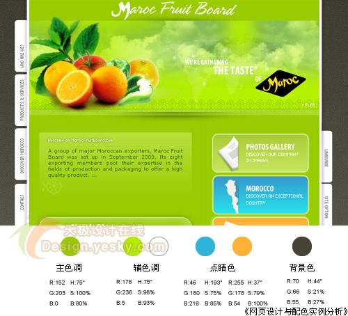
HSB value H shows that 60 degrees is true yellow, and the main and auxiliary colors are only tilted a little bit towards green - H is 75 degrees. A large area of yellow-green with slightly lower brightness is the main color, but the saturation is very high, reaching 100%. The auxiliary colors use tender green and white to increase the brightness. These two auxiliary colors not only increase the layering of the page, but also It can give the entire page a translucent color scheme and enhance the green characteristics. The dark brown background undoubtedly makes all the solid colors in the foreground shine brightly on the stage.
This page has two sets of small contrasting colors, one is yellow-green and orange-red, and the other is orange-yellow and sky blue. Strictly speaking, these two sets of colors are not contrasting colors, because there are so many colors. Some deviations. Although their saturation is reduced, they are enough to constitute the loudest tones in this page, making the entire page very active and vivid.
Conclusion:
The main and auxiliary colors of yellow and green are not dazzling when used in large areas, but make the page look very energetic and energetic.
When appropriately using contrasting color combinations of different purity, which are not strictly contrasting colors, the main role that can usually be played is to clarify the relationship between primary and secondary. Although the contrast characteristics of non-"standard" contrasting colors are weakened and the page colors look easy to coordinate and soft, they can still highlight the theme. → An example of a light green webpage of the same color:

Green color analysis: ( Similar color (light green)
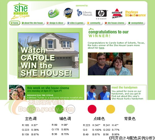
The main color green attribute is light green with high brightness. As mentioned earlier, usually the higher the brightness, the lower the saturation, and the lower the saturation, the lower the page color. Reduce the color, unless the color itself has its own characteristics, and add a large area of auxiliary color white, the entire page looks very light, soft, tranquil, and even warm.
Gradient light green is used on the page, making the entire page visually softer and more comfortable.
Although the accent color only appears on the main logo and only a little on the buttons, it also brings some color highlights to the entire page. In particular, the H value of the red HSB mode shows that the color is close to true red, and the saturation reaches the highest value. Another key color is yellow, which visually appears on the page as a contrasting color of green and red, which plays a role in relaxing the vision. Because on the color wheel, yellow is the transition color between green and red.
Conclusion:
Light green has a feeling of elegance, rest, security, harmony, tranquility and softness.
The gradient effect can further deepen this impression. However, when there are too many light colors in the page color scheme, the entire page will easily appear "grey". This requires adding an appropriate amount of slightly higher purity colors, such as the auxiliary color green block in the lower left corner. Appropriate bright accents can be very good. Solve this problem.

Hot AI Tools

Undresser.AI Undress
AI-powered app for creating realistic nude photos

AI Clothes Remover
Online AI tool for removing clothes from photos.

Undress AI Tool
Undress images for free

Clothoff.io
AI clothes remover

Video Face Swap
Swap faces in any video effortlessly with our completely free AI face swap tool!

Hot Article

Hot Tools

Notepad++7.3.1
Easy-to-use and free code editor

SublimeText3 Chinese version
Chinese version, very easy to use

Zend Studio 13.0.1
Powerful PHP integrated development environment

Dreamweaver CS6
Visual web development tools

SublimeText3 Mac version
God-level code editing software (SublimeText3)

Hot Topics
 How to send web pages to desktop as shortcut in Edge browser?
Mar 14, 2024 pm 05:22 PM
How to send web pages to the desktop as a shortcut in Edge browser? Many of our users want to display frequently used web pages on the desktop as shortcuts for the convenience of directly opening access pages, but they don’t know how to do it. In response to this problem, the editor of this issue will share the solution with the majority of users. , let’s take a look at the content shared in today’s software tutorial. The shortcut method of sending web pages to the desktop in Edge browser: 1. Open the software and click the "..." button on the page. 2. Select "Install this site as an application" in "Application" from the drop-down menu option. 3. Finally, click it in the pop-up window
 Develop web voting system using JavaScript
Aug 09, 2023 pm 01:30 PM
Using JavaScript to develop a web voting system Abstract: With the rapid development of the Internet, online voting has become a convenient and fast way to collect public opinions and make decisions. This article will introduce the use of JavaScript to develop a simple web voting system, which enables users to select options and submit votes. Introduction: A web voting system is a program that displays multiple options on a web page and allows users to choose. It can be used in many scenarios, such as election voting, product surveys, opinion collection, etc. This article
 What should I do if the images on the webpage cannot be loaded? 6 solutions
Mar 15, 2024 am 10:30 AM
Some netizens found that when they opened the browser web page, the pictures on the web page could not be loaded for a long time. What happened? I checked that the network is normal, so where is the problem? The editor below will introduce to you six solutions to the problem that web page images cannot be loaded. Web page images cannot be loaded: 1. Internet speed problem The web page cannot display images. It may be because the computer's Internet speed is relatively slow and there are more softwares opened on the computer. And the images we access are relatively large, which may be due to loading timeout. As a result, the picture cannot be displayed. You can turn off the software that consumes more network speed. You can go to the task manager to check. 2. Too many visitors. If the webpage cannot display pictures, it may be because the webpages we visited were visited at the same time.
 How to set up web page automatic refresh
Oct 26, 2023 am 10:52 AM
To set the automatic refresh of a web page, you can use the HTML "meta" tag, the JavaScript "setTimeout" function, the "setInterval" function or the HTTP "Refresh" header. Detailed introduction: 1. Use the "meta" tag of HTML. In the "<head>" tag of the HTML document, you can use the "meta" tag to set the automatic refresh of the web page; 2. The "setTimeout" function of JavaScript, etc.
 What to do if the web page cannot be accessed
Sep 06, 2023 am 09:36 AM
Solutions to inaccessible web pages include checking the network connection, clearing the browser cache, checking the web page address, trying to use other browsers, checking the server status, checking the domain name resolution, checking the firewall and security settings and contacting the website administrator. Detailed introduction: 1. Check the network connection to ensure that the network connection is normal. You can try to open other web pages or use other devices to access to determine whether it is a network connection problem. If other web pages can be accessed normally, it may be a problem with the web page; 2. Clear the browser cache. The browser cache may cause the web page to fail to load, etc.
 Possible reasons why the network connection is normal but the browser cannot access the web page
Feb 19, 2024 pm 03:45 PM
The browser cannot open the web page but the network is normal. There are many possible reasons. When this problem occurs, we need to investigate step by step to determine the specific cause and solve the problem. First, determine whether the webpage cannot be opened is limited to a specific browser or whether all browsers cannot open the webpage. If only one browser cannot open the web page, you can try to use other browsers, such as Google Chrome, Firefox, etc., for testing. If other browsers are able to open the page correctly, the problem is most likely with that specific browser, possibly
 What to do if the webpage cannot be opened
Feb 21, 2024 am 10:24 AM
How to solve the problem of web pages not opening With the rapid development of the Internet, people increasingly rely on the Internet to obtain information, communicate and entertain. However, sometimes we encounter the problem that the web page cannot be opened, which brings us a lot of trouble. This article will introduce you to some common methods to help solve the problem of web pages not opening. First, we need to determine why the web page cannot be opened. Possible reasons include network problems, server problems, browser settings problems, etc. Here are some solutions: Check network connection: First, we need
 How to open php on the web page
Mar 22, 2024 pm 03:20 PM
Executing PHP code in a web page requires ensuring that the web server supports PHP and is properly configured. PHP can be opened in three ways: * **Server environment:** Place the PHP file in the server root directory and access it through the browser. * **Integrated Development Environment: **Place PHP files in the specified web root directory and access them through the browser. * **Remote Server:** Access PHP files hosted on a remote server via the URL address provided by the server.


