ul list mark design web page multi-column layout_HTML/Xhtml_web page production

WBOY
Release: 2016-05-16 16:46:02
Original
1858 people have browsed it

I suddenly thought of this method when I was writing a three-column layout with CSS a few days ago. This idea seems a bit crazy to me. If there is anything wrong with it, please feel free to give me some advice.
When I need to write a three-column layout, I usually choose to use the following DIV layout method:
Figure 1 DIV layout
Using such a nesting method can undoubtedly reduce the probability of code errors a lot, but at the same time, such a layout is also slightly complicated and slightly inconvenient for later maintenance. A method we often use when laying out navigation is to use
    lists for layout. Navigation can be described as a multi-column layout. In this case, we can also use
      for page layout. Multi-column layout.
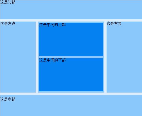
      Figure 2 DIV layout
      This is a fixed-width layout, which means it is not very fluid. The fluid layout has not been tested yet. I will try it again when I have time. Paste the code of this layout below:

      ldquo;-//W3C//DTD XHTML 1.0 Transitional//EN” “http://www.w3.org/TR/xhtml1/DTD/xhtml1-transitional.dtd”>


      Using UL for multi-column layout
      * {margin:0; padding:0;}
      body {width:100%;
      height:100%;background:#ddedfb;
      }
      #mainContent {
      width:600px;
      margin:10px auto;
      }
      #header,#footer {
      background:#8AC7FA;
      height:80px;
        clear:both;
        }
      • #footer {
      • clear:both;
        padding-top:10px;
      • }
        #content {
          height:300px;
          margin:10px auto;
        • }
        • #content ul {
          list-style:none;
        • height:100%;
        • }
          #content ul li {
        width :150px;
        height:100%;
      • background:#8AC7FA;
        float:left;
      • }
      • #content ul li#li2 {
        width:280px;
      margin:0 10px;
      }
      #content ul li#li2 ul li {
      width:270px;
      height:140px;
      margin:5px;
      background:#0581F0;
      }


      This is the headThis is the left sideThis is the upper part in the middleThis is the lower part in the middleThis is the right sideThis is the bottom This code can be displayed normally under IE7 and FF3. Other browsers have not been tested. If you have a better method, please suggest it.
Related labels:
source:php.cn
Statement of this Website
The content of this article is voluntarily contributed by netizens, and the copyright belongs to the original author. This site does not assume corresponding legal responsibility. If you find any content suspected of plagiarism or infringement, please contact admin@php.cn
Popular Tutorials
More>
Latest Downloads
More>
Web Effects
Website Source Code
Website Materials
Front End Template
About us Disclaimer Sitemap
php.cn:Public welfare online PHP training,Help PHP learners grow quickly!