Code sharing of Html+CSS layout techniques
Single column layout horizontally centered
Horizontally centeredPage layout中The most common form of layout, which mostly appears in titles and the organization of content areas. Here are four ways to achieve horizontal centering (Note: What is implemented in each example below is the alignment operation of the child element. The parent container of the child element It is the parent element)
Use inline-block and text-align to achieve
.parent{text-align: center;}.child{display: inline-block;} Advantages: good compatibility;
Disadvantages: need to set child elements and parent elements at the same time
Use margin:0 auto to implement
.child{width:200px;margin:0 auto;} Advantages: good compatibility
Disadvantages: need to specify the width
Use table to implement
.child{display:table;margin:0 auto;} Advantages: only need to specify the width of itself Setting up
Disadvantage: IE6,7 needs to adjust the structure
Use absolute positioningAchievement
.parent{position:relative;}/*或者实用margin-left的负值为盒子宽度的一半也可以实现,不过这样就必须知道盒子的宽度,但兼容性好*/
.child{position:absolute;left:50%;transform:translate(-50%);}Disadvantage: Poor compatibility, available for IE9 and above
Practical flex layout implementation
/*第一种方法*/.parent{display:flex;justify-content:center;}
/*第二种方法*/.parent{display:flex;}.child{margin:0 auto;}Disadvantages: Poor compatibility, if a large-area layout is performed, efficiency may be affected
Vertical centering
We all know that everyone has different hobbies. Some people like to eat sweets, some people like to eat spicy things, some people don’t like to eat celery, and some people don’t like it. Eat mutton, etc. The same is true for some elements in CSS. Some are only interested in milk, and some only like to eat nuts and jelly, but hate milk. Vertical-align is a picky eater and only likes milk. Eat jelly. I grew up eating jelly. Without jelly, it will get angry and ignore you. I call it "jelly-dependent element", also called "inline-block dependent element". In other words, only if an element belongs to the inline or inline-block (table-cell can also be understood as the inline-block level) level, the vertical-align attribute on it will work. -Some understanding and understanding of -vertical-align
When using vertical-align, since the alignment baseline is marked by the line-height baseline, you need to set line-heightOr set display:table-cell;
/*第一种方法*/.parent{display:table-cell;vertical-align:middle;height:20px;}/*第二种方法*/.parent{display:inline-block;vertical-align:middle;line-height:20px;}Practical absolute positioning
.parent{position:relative;}
.child{positon:absolute;top:50%;transform:translate(0,-50%);}Practical flex implementation
.parent{display:flex;align-items:center;}Horizontal and vertical centering
Use vertical-align , text-align, inline-block implementation
.parent{display:table-cell;vertical-align:middle;text-align:center;}.child{display:inline-block;}Using absolute positioning to implement
.parent{position:relative;}.child{position:absolute;top:50%;left:50%;transform:translate(-50%,-50%);}Using flex to implement
.parent{display:flex;justify-content:center;align-items:center;}Multi-column layout, the left column has a fixed width, and the right column is adaptive
This layout method is very common. It is suitable for layouts where the fixed-width side is often navigation and the adaptive side is content.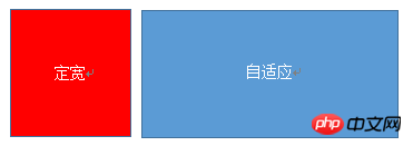
Using float+margin to implement
.left{float:left;width:100px;}.right{margin-left;margin-left:100px;}Note: IE6 will have a 3px bug
Use float+margin(fix) to implement
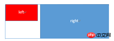
<p class="parent">
 <p class="left"></p>
 <p class="right-fix">
   <p class="right"></p>
  </p>
</p>
.left{width:100px;float:left;}
.right-fix{width:100%;margin-left:-100px;float:right;}
.right{margin-left:100px;}Use float+overflow to implement
.left{width:100px;float:left;}
.right{overflow:hidden;}overflow:hidden, triggers bfc mode, floating cannot affect, isolate other elements, IE6 does not support it, set margin-left on the left as the margin between left and right, right Use overflow:hidden to form bfc mode
If we need to set the two columns to equal heights, we can use the following method to set the "background" to equal heights. In fact, it is not the equal heights of the content
.left{width:100px;float:left;}
.right{overflow:hidden;}
.parent{overflow:hidden;}
.left,.right{padding-bottom:9999px;margin-bottom:-9999px;}Use table implementation
.parent{display:table;table-layout:fixed;width:100%;}
.left{width:100px;}
.right,.left{display:table-cell;}Practical flex implementation
.parent{display:flex;}
.left{width:100px;}
.right{flex:1;}Use the flex:1 of the right container to evenly divide the remaining width and achieve the same effect. The default value of align-items is stretch, so the heights of the two are equal
The right column has a fixed width and the left column is adaptive
Practical float+margin implementation
.parent{background:red;height:100px;margin:0 auto;}
.left{background:green;margin-right:-100px;width:100%;float:left;}
.right{float:right;width:100px;background:blue;}Use table to implement
.parent{display:table;table-layout:fixed;width:100%;}
.left{display:table-cell;}
.right{width:100px;display:table-cell;}Practical flex implementation
.parent{display:flex;}
.left{flex:1;}
.right{width:100px;}Two columns with fixed width and one column with adaptive width

The basic html structure is that the parent container is parent, and since The containers are left, center, and right. Among them, left and center have fixed widths, and right is adaptive
Use float+margin to implement
.left,.center{float:left:width:200px;}
.right{margin-left:400px;}Use float+overflow to implement
.left,.center{float:left:width:200px;}
.right{overflow:hidden;}Use table implementation
.parent{display:table;table-layout:fixed;width:100%;}
.left,.center,.right{display:table-cell;}
.left,.center{width:200px;}Use flex to implement
.parent{display:flex;}
.left,.center{width:100px;}
.right{flex:1}Fixed width on both sides, adaptive middle column

Use float+margin to implement
.left{width:100px;float:left;}
.center{float:left;width:100%;margin-right:-200px;}
.right{width:100px;float:right;}Use table to implement
.parent{width:100%;display:table;table-layout:fixed}
.left,.center,.right{display:table-cell;}
.left{width:100px;}
.right{width:100px;}Use flex to implement
.parent{display:flex;}
.left{width:100px;}
.center{flex:1;}
.right{width:100px;}One column has variable width and one column is adaptive
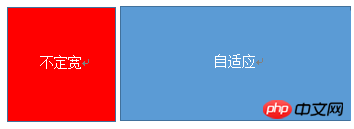
Use float+ overflow implementation
.left{float:left;}.right{overflow:hidden;}Use table implementation
.parent{display:table;table-layout:fixed;width:100%;}
.left{width:0.1%;}
.left,.right{display:table-cell;}Use flex implementation
.parent{display:flex;}
.right{flex:1;}Multi-column equal distribution layout
多列等分布局常出现在内容中,多数为功能的,同阶级内容的并排显示等。
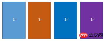
html结构如下所示
<p class="parent">
<p class="column">1</p>
<p class="column">1</p>
<p class="column">1</p>
<p class="column">1</p>
</p>
实用float实现
.parent{margin-left:-20px}/*假设列之间的间距为20px*/
.column{float:left;width:25%;padding-left:20px;box-sizing:border-box;}利用table实现
.parent-fix{margin-left:-20px;}
.parent{display:table;table-layout:fixed;width:100%;}
.column{display:table-cell;padding-left:20px;}利用flex实现
.parent{display:flex;}
.column{flex:1;}
.column+.column{margin-left:20px;}九宫格布局
使用table实现
<p class="parent">
  <p class="row"><p class="item"></p><p class="item"></p><p class="item"></p></p>
  <p class="row"><p class="item"></p><p class="item"></p><p class="item"></p></p>
  <p class="row"><p class="item"></p><p class="item"></p><p class="item"></p></p>
</p>
.parent{display:table;table-layout:fixed;width:100%;}
.row{display:table-row;}
.item{display:table-cell;width:33.3%;height:200px;}实用flex实现
<p class="parent"><p class="row"><p class="item"></p><p class="item"></p><p class="item"></p>
</p><p class="row"><p class="item"></p><p class="item"></p><p class="item"></p>
</p><p class="row"><p class="item"></p><p class="item"></p><p class="item"></p></p></p>
.parent{display:flex;flex-direction:column;}
.row{height:100px;display:flex;}
.item{width:100px;background:red;}全屏布局
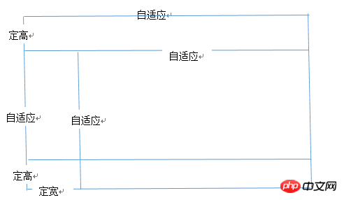
利用绝对定位实现
<p class="parent"><p class="top">top</p><p class="left">left</p><p class="right">right</p><p class="bottom">bottom</p></p>
html,body,parent{height:100%;overflow:hidden;}
.top{position:absolute:top:0;left:0;right:0;height:100px;}
.left{position:absolute;top:100px;left:0;bottom:50px;width:200px;}
.right{position:absolute;overflow:auto;left:200px;right:0;top:100px;bottom:50px;}
.bottom{position:absolute;left:0;right:0;bottom:0;height:50px;}利用flex实现
<p class="parent"><p class="top">top</p><p class="middle"><p class="left">left</p><p class="right">right</p></p><p class="bottom">bottom</p></p>
.parent{display:flex;flex-direction:column;}
.top{height:100px;}
.bottom{height:50px;}
.middle{flex:1;display:flex;}
.left{width:200px;}
.right{flex:1;overflow:auto;}meta标签的实用
设置布局宽度等于设备宽度,布局viewport等于度量viewport
<meta name="viewport" content="width=device-width,initial-scale=1">
HTML 4和CSS 2目前支持为不同的媒体类型设定专有的样式表, 比如, 一个页面在屏幕上显示时使用无衬线字体,
而在打印时则使用衬线字体, screen 和 print 是两种已定义的媒体类型, 媒体查询让样式表有更强的针对性,
扩展了媒体类型的功能;媒体查询由媒体类型和一个或多个检测媒体特性的条件表达式组成,
媒体查询中可用于检测的媒体特性有width、height和color(等), 使用媒体查询, 可以在不改变页面内容的情况下,
为特定的一些输出设备定制显示效果。
语法
@media screen and (max-width:960px){....}<link rel="stylesheet" media="screen and (max-width:960px)" href='xxx.css' /The above is the detailed content of Code sharing of Html+CSS layout techniques. For more information, please follow other related articles on the PHP Chinese website!

Hot AI Tools

Undresser.AI Undress
AI-powered app for creating realistic nude photos

AI Clothes Remover
Online AI tool for removing clothes from photos.

Undress AI Tool
Undress images for free

Clothoff.io
AI clothes remover

Video Face Swap
Swap faces in any video effortlessly with our completely free AI face swap tool!

Hot Article

Hot Tools

Notepad++7.3.1
Easy-to-use and free code editor

SublimeText3 Chinese version
Chinese version, very easy to use

Zend Studio 13.0.1
Powerful PHP integrated development environment

Dreamweaver CS6
Visual web development tools

SublimeText3 Mac version
God-level code editing software (SublimeText3)

Hot Topics
 1655
1655
 14
14
 1413
1413
 52
52
 1306
1306
 25
25
 1252
1252
 29
29
 1226
1226
 24
24
 How to use bootstrap in vue
Apr 07, 2025 pm 11:33 PM
Using Bootstrap in Vue.js is divided into five steps: Install Bootstrap. Import Bootstrap in main.js. Use the Bootstrap component directly in the template. Optional: Custom style. Optional: Use plug-ins.
 Understanding HTML, CSS, and JavaScript: A Beginner's Guide
Apr 12, 2025 am 12:02 AM
WebdevelopmentreliesonHTML,CSS,andJavaScript:1)HTMLstructurescontent,2)CSSstylesit,and3)JavaScriptaddsinteractivity,formingthebasisofmodernwebexperiences.
 The Roles of HTML, CSS, and JavaScript: Core Responsibilities
Apr 08, 2025 pm 07:05 PM
HTML defines the web structure, CSS is responsible for style and layout, and JavaScript gives dynamic interaction. The three perform their duties in web development and jointly build a colorful website.
 React's Role in HTML: Enhancing User Experience
Apr 09, 2025 am 12:11 AM
React combines JSX and HTML to improve user experience. 1) JSX embeds HTML to make development more intuitive. 2) The virtual DOM mechanism optimizes performance and reduces DOM operations. 3) Component-based management UI to improve maintainability. 4) State management and event processing enhance interactivity.
 How to write split lines on bootstrap
Apr 07, 2025 pm 03:12 PM
There are two ways to create a Bootstrap split line: using the tag, which creates a horizontal split line. Use the CSS border property to create custom style split lines.
 How to insert pictures on bootstrap
Apr 07, 2025 pm 03:30 PM
There are several ways to insert images in Bootstrap: insert images directly, using the HTML img tag. With the Bootstrap image component, you can provide responsive images and more styles. Set the image size, use the img-fluid class to make the image adaptable. Set the border, using the img-bordered class. Set the rounded corners and use the img-rounded class. Set the shadow, use the shadow class. Resize and position the image, using CSS style. Using the background image, use the background-image CSS property.
 How to set up the framework for bootstrap
Apr 07, 2025 pm 03:27 PM
To set up the Bootstrap framework, you need to follow these steps: 1. Reference the Bootstrap file via CDN; 2. Download and host the file on your own server; 3. Include the Bootstrap file in HTML; 4. Compile Sass/Less as needed; 5. Import a custom file (optional). Once setup is complete, you can use Bootstrap's grid systems, components, and styles to create responsive websites and applications.
 How to use bootstrap button
Apr 07, 2025 pm 03:09 PM
How to use the Bootstrap button? Introduce Bootstrap CSS to create button elements and add Bootstrap button class to add button text


